[1] "numeric"Lecture 2: Summarizing Data
STAT 205: Introduction to Mathematical Statistics
Scatterplots
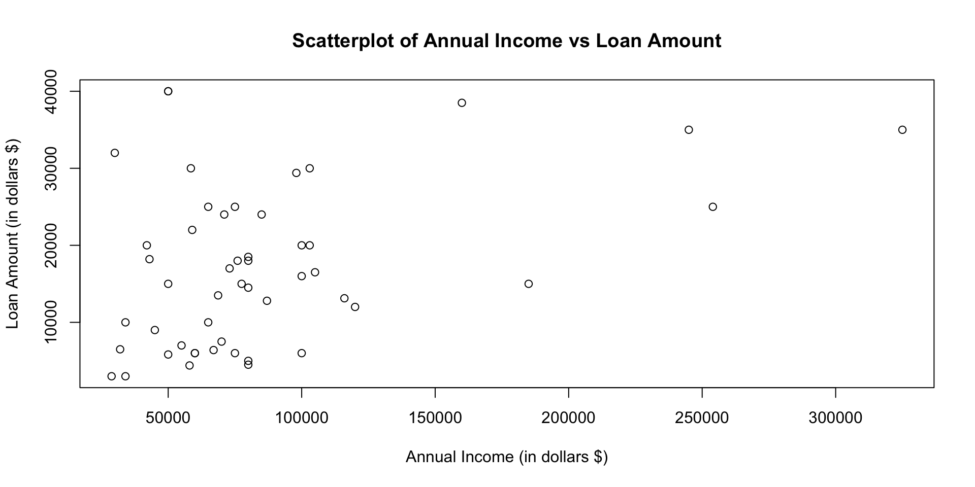
Scatterplot in ggplot

Dot Plot
A dot plot is a one-variable scatterplot
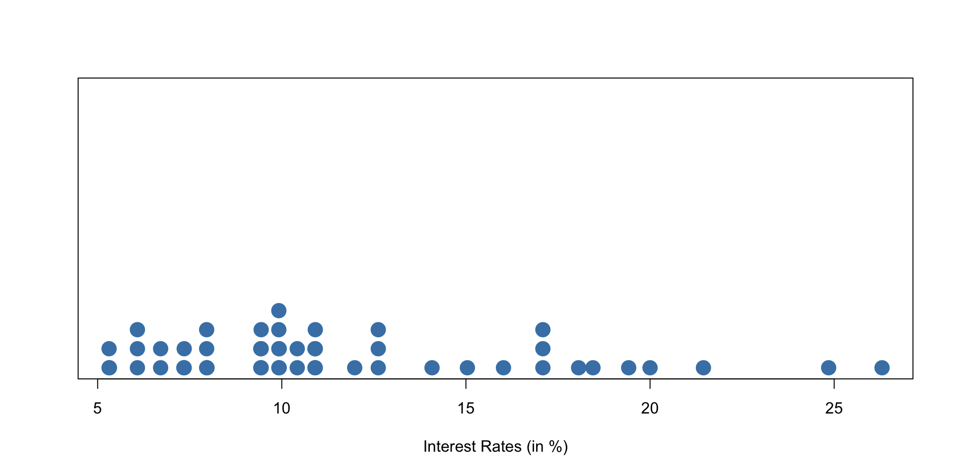
An example of a dotchart using the interest rate of 50 loans
Stacked dot plot
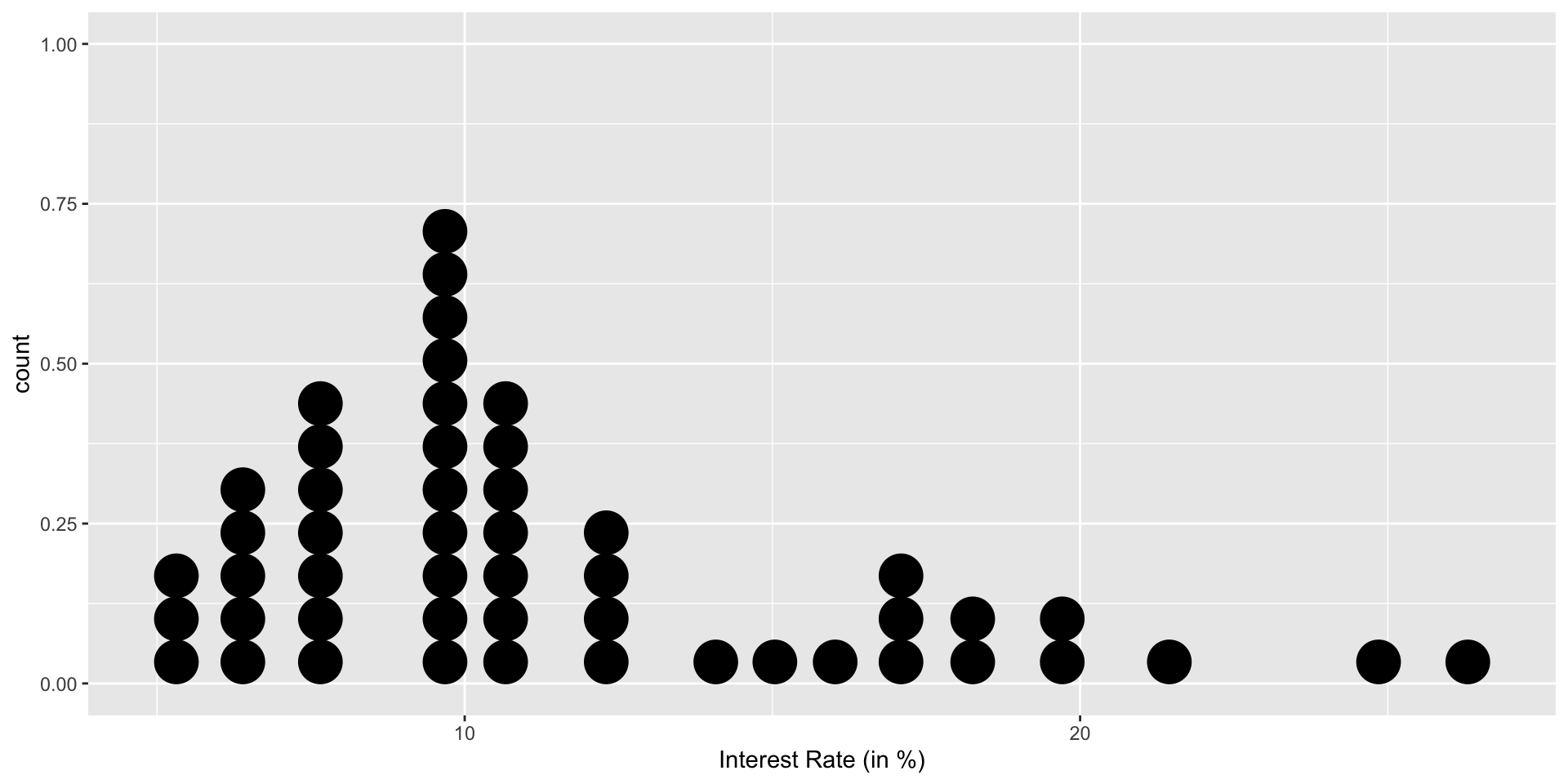
Dotplot with mean

A stacked dot plot of interest_rate for the loan50 data set. The distribution’s mean is shown as a red triangle.
Dot plot with median
Code
# Create a dot plot with mean and median using ggplot2

median_value = median(interest_rate)
ggplot(loan50, aes(x = interest_rate)) +
  geom_dotplot() + labs(x = "Interest Rate (in %)") +
  geom_point(aes(x = mean_value, y = 0), color = "red", size = 5, shape = 17) +
geom_point(aes(x = median_value, y = 0), color = "green", size = 5, shape = 15) 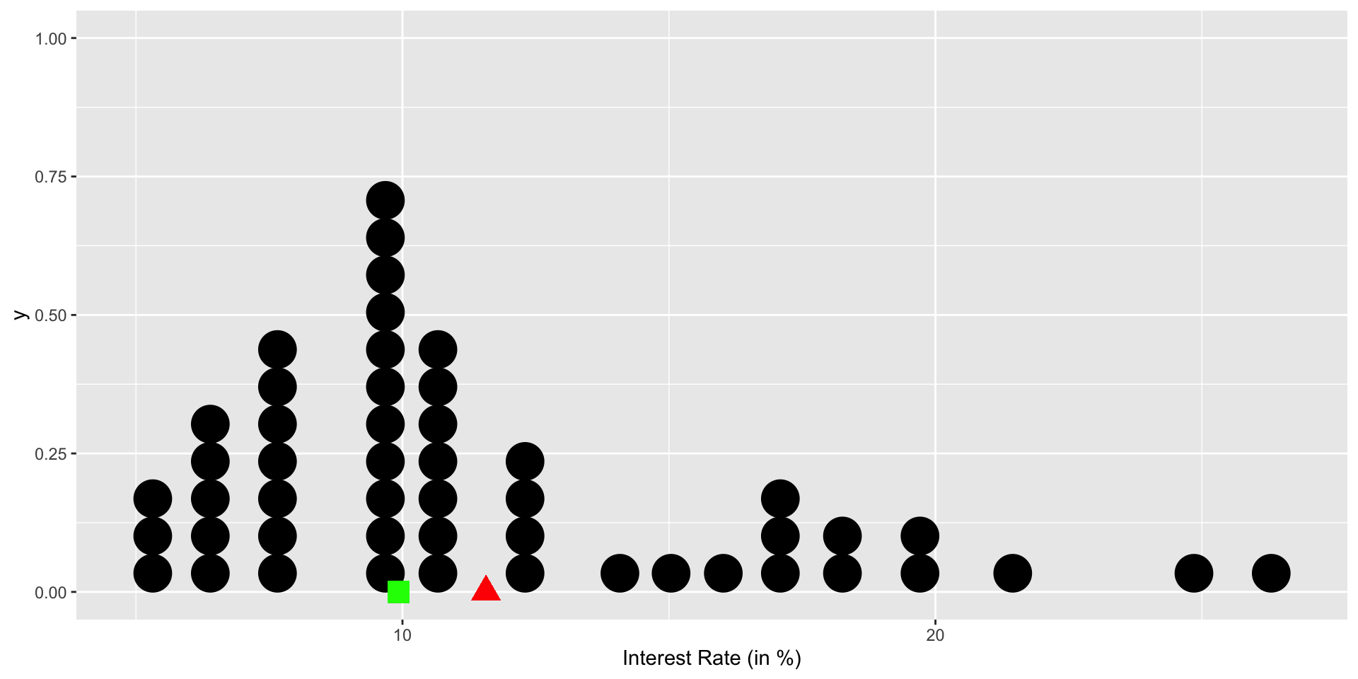
A stacked dot plot of interest_rate for the loan50 data set. The distribution’s mean is shown as a red triangle, the median is shown as a green square.
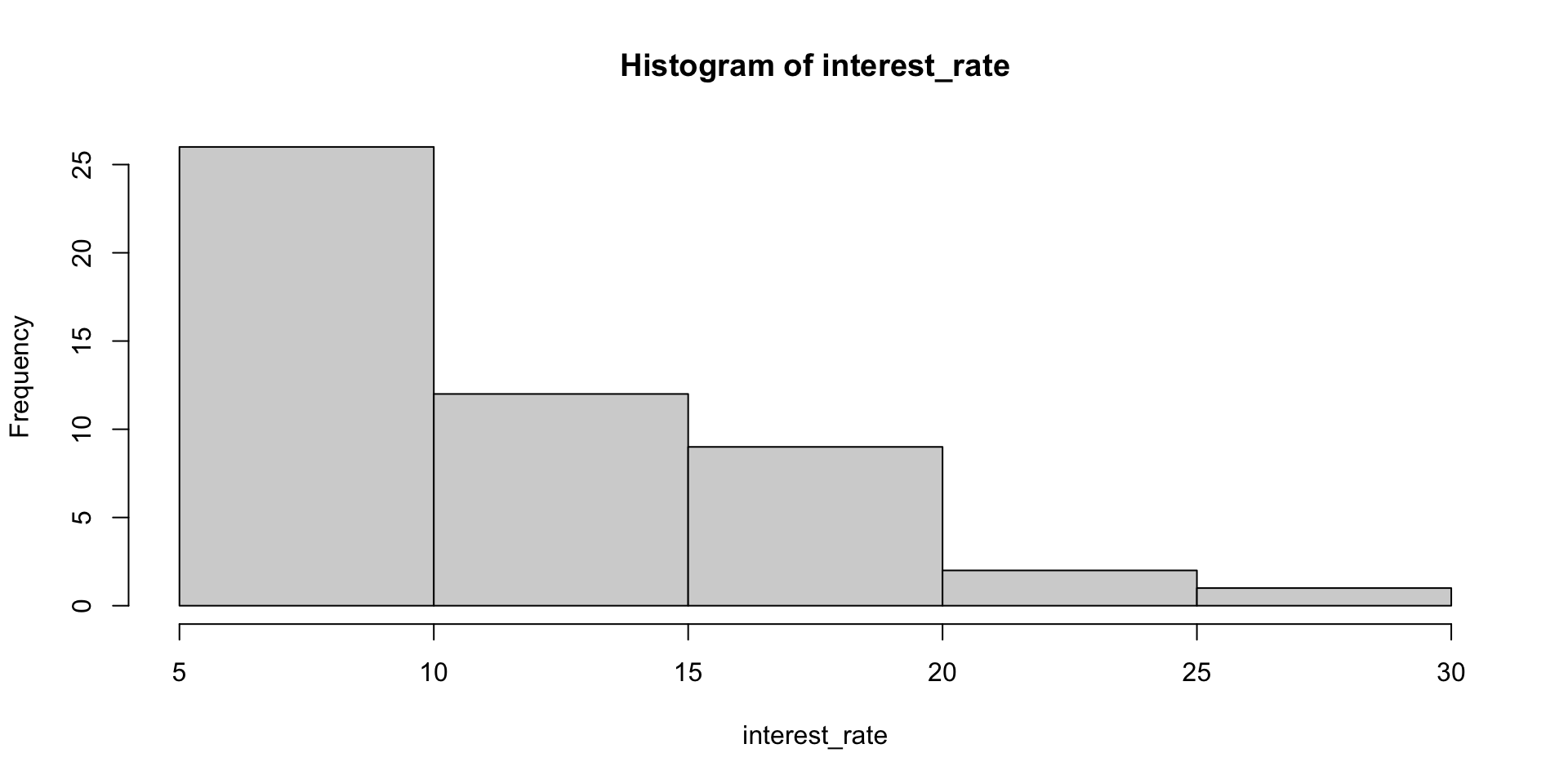
Histogram in R
More breaks
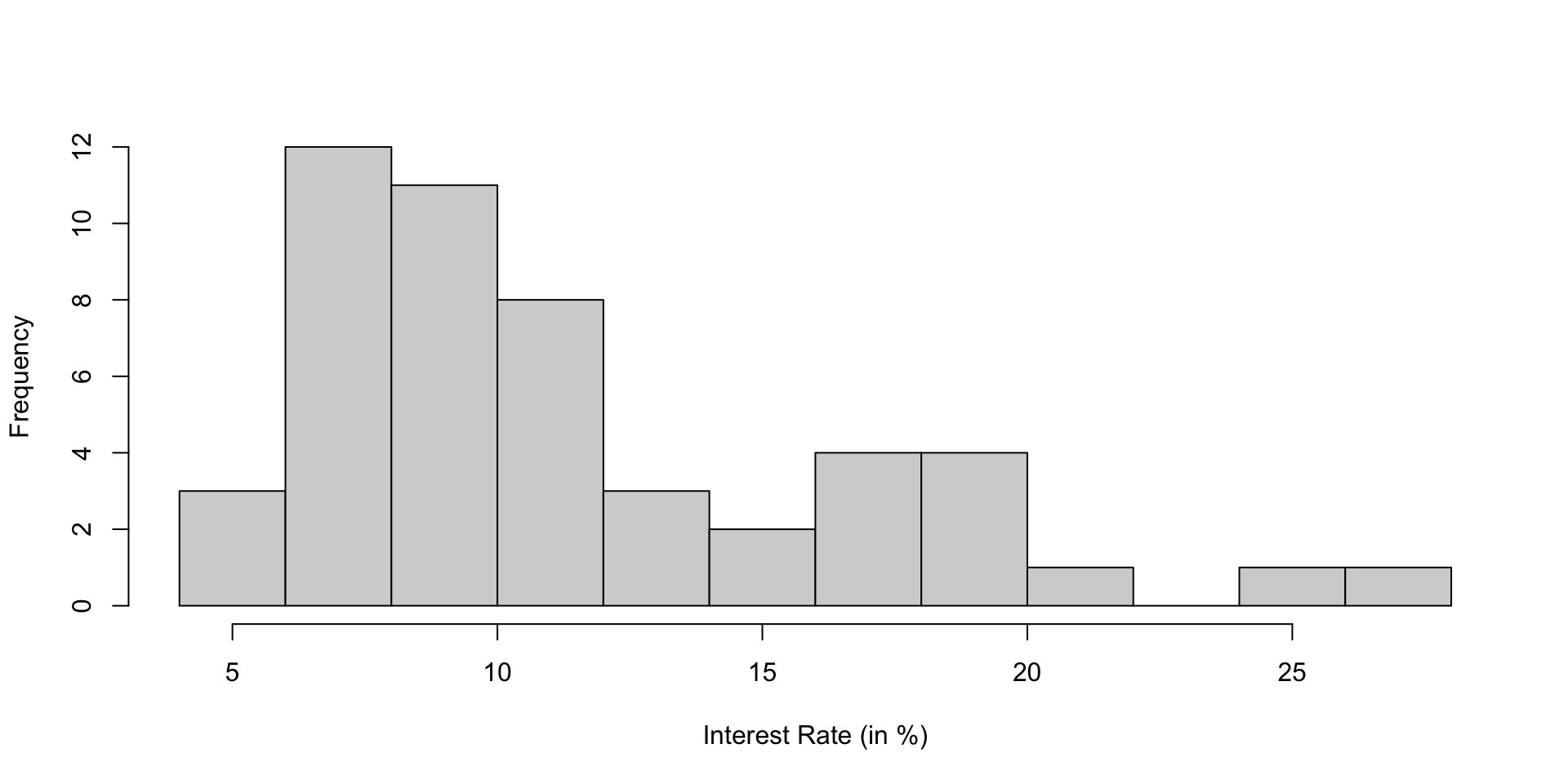
| 4 to 6 | 6 to 8 | 8 to 10 | 10 to 12 | 12 to 14 | 14 to 16 | 16 to 18 | 18 to 20 | 20 to 22 | 22 to 24 | 24 to 26 | 26 to 28 |
|---|---|---|---|---|---|---|---|---|---|---|---|
| 3 | 12 | 11 | 8 | 3 | 2 | 4 | 4 | 1 | 0 | 1 | 1 |
A histogram of interest_rate. This distribution is strongly skewed to the right
Histogram with mean/median
Consider the final exam score for a STAT course:
Code
set.seed(888)
test_scores <- 100*rbeta(500, shape1 = 4.5, shape2 = 2)
hist(test_scores, main = "Left-Skewed Distribution", xlab = "Final Exam Score (in %)", col = "lightblue", border = "black")

# Add vertical lines for mean and median
abline(v = mean(test_scores), col = "red", lty = 2, lw = 2)
abline(v = median(test_scores), col = "blue", lty = 2, lw = 2)

# Add legend
legend("topleft", legend = c("Mean", "Median"), col = c("red", "blue"), lty = 2, lw = 2)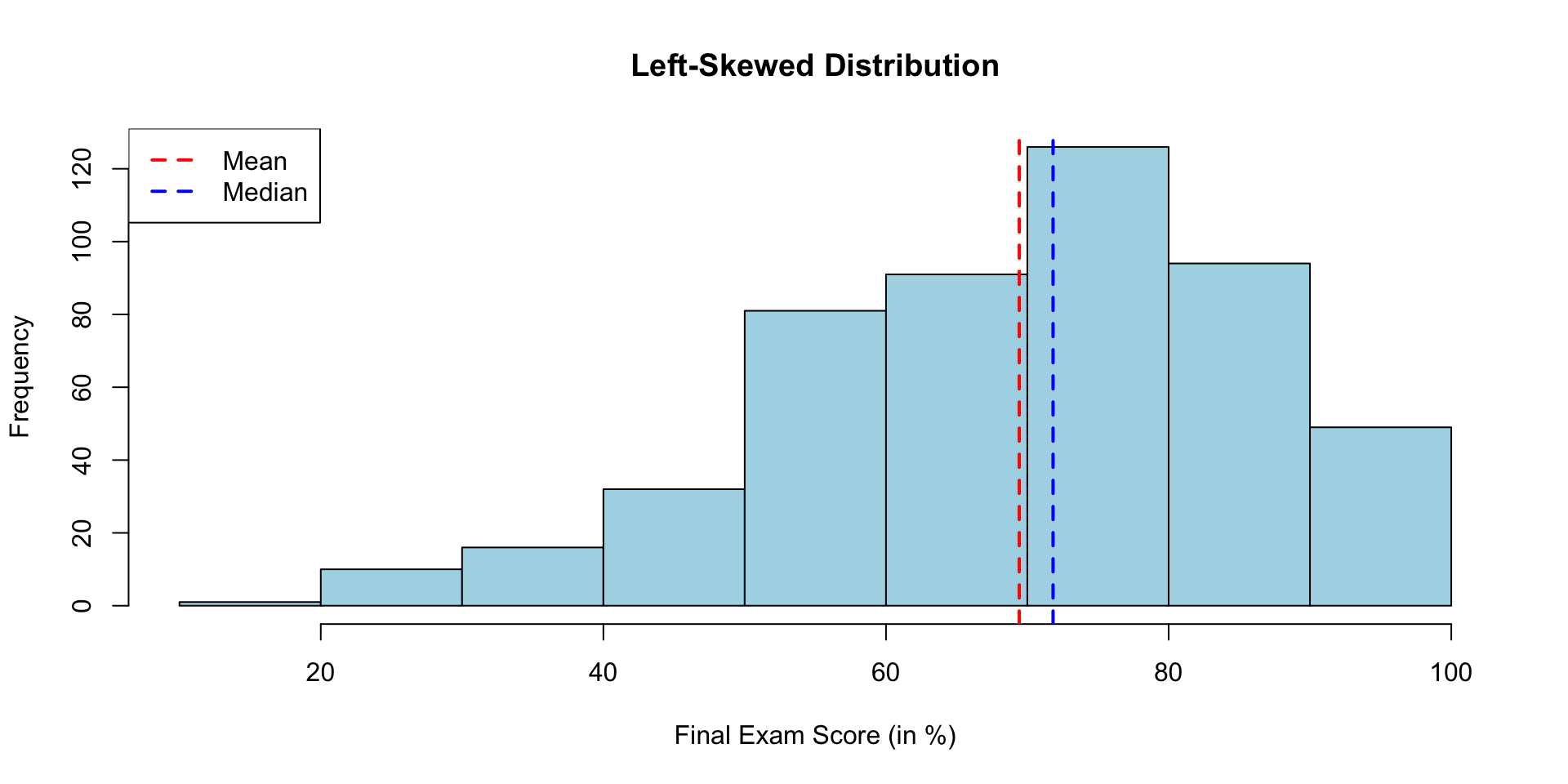
Summary


A vertical dot plot, where points have been horizontally stacked, next to a labeled box plot for the interest rates of the 50 loans. Figure 2.10 (Diez, Barr, and Çetinkaya-Rundel 2016)
Shape of boxplot
Boxplots can also help to identify skewness:

iClicker: Shape
Tip
Distribution shape

Which of the following best describes the shape of the histogram?
- right skewed
- left skewed
- symmetric
- uniform
iClicker Modality
Modality

Identify the number of modes (peaks) in the distribution.
- unimodal
- bimodal
- multimodal
Frequency Table
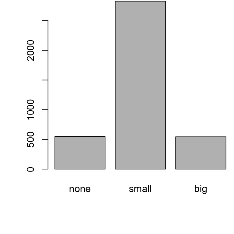
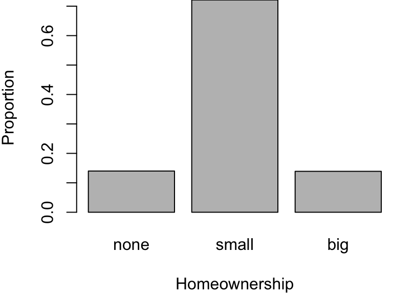
Bar Plot
A bar plot is a common way to display a single categorical variable.

email contingency table

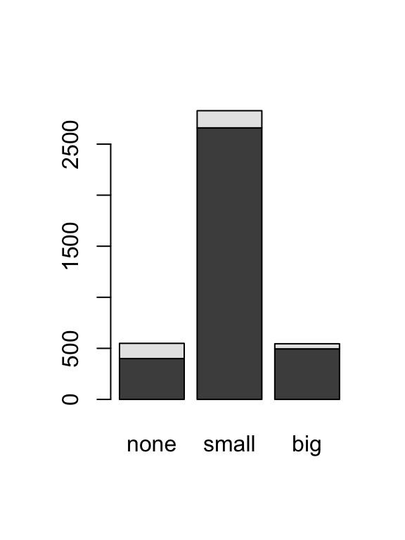
Stacked Bar plot
Side-by-side bar plot
Alternatively, you may prefer to situate your bars side-by-side rather than stacked. In this side-by-side barplot we have opted to use different colours and create a legend.

Side-by-side Boxplot
Similarly, it can be useful to look at side-by-side boxplots.
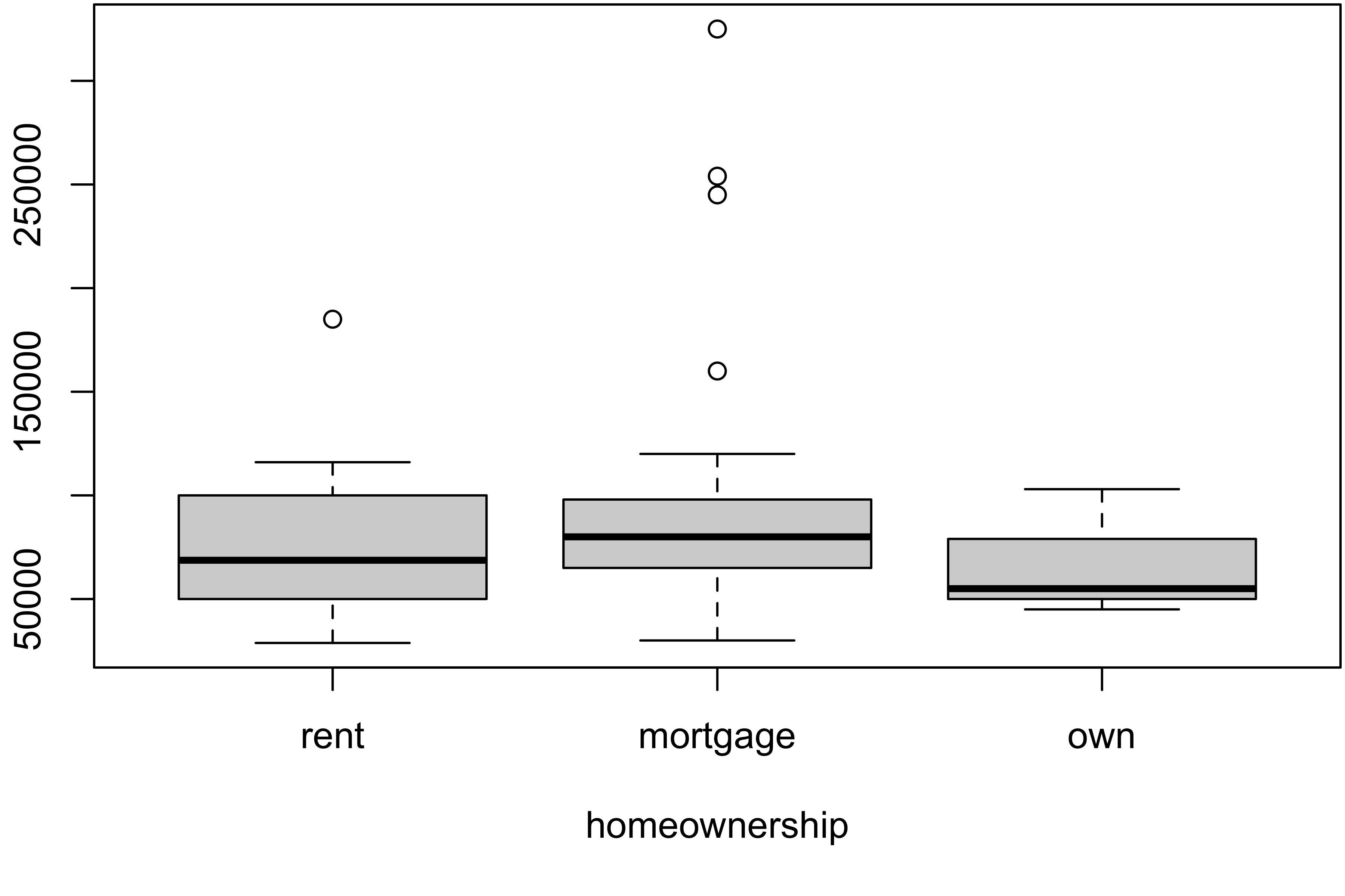
formula notation
The formula notation y ~ x specifies that the variable “y” should be plotted against the levels of the “x” variable.

Code
# Create the stacked histograms
ggplot(loan50, aes(x = annual_income, fill = homeownership)) +
  geom_histogram(binwidth = 10000, color = "black", alpha = 0.7) +
  facet_wrap(~homeownership, ncol = 1, scales = "free_y") +
  labs(
    title = "Histogram of Annual Income by Homeownership",
    x = "Annual Income",
    y = "Count"
  ) +
  theme_minimal()
Diez, D. M., C. D. Barr, and M. Çetinkaya-Rundel. 2016. OpenIntro Statistics. OpenIntro, Incorporated. https://books.google.ca/books?id=wfcPswEACAAJ.