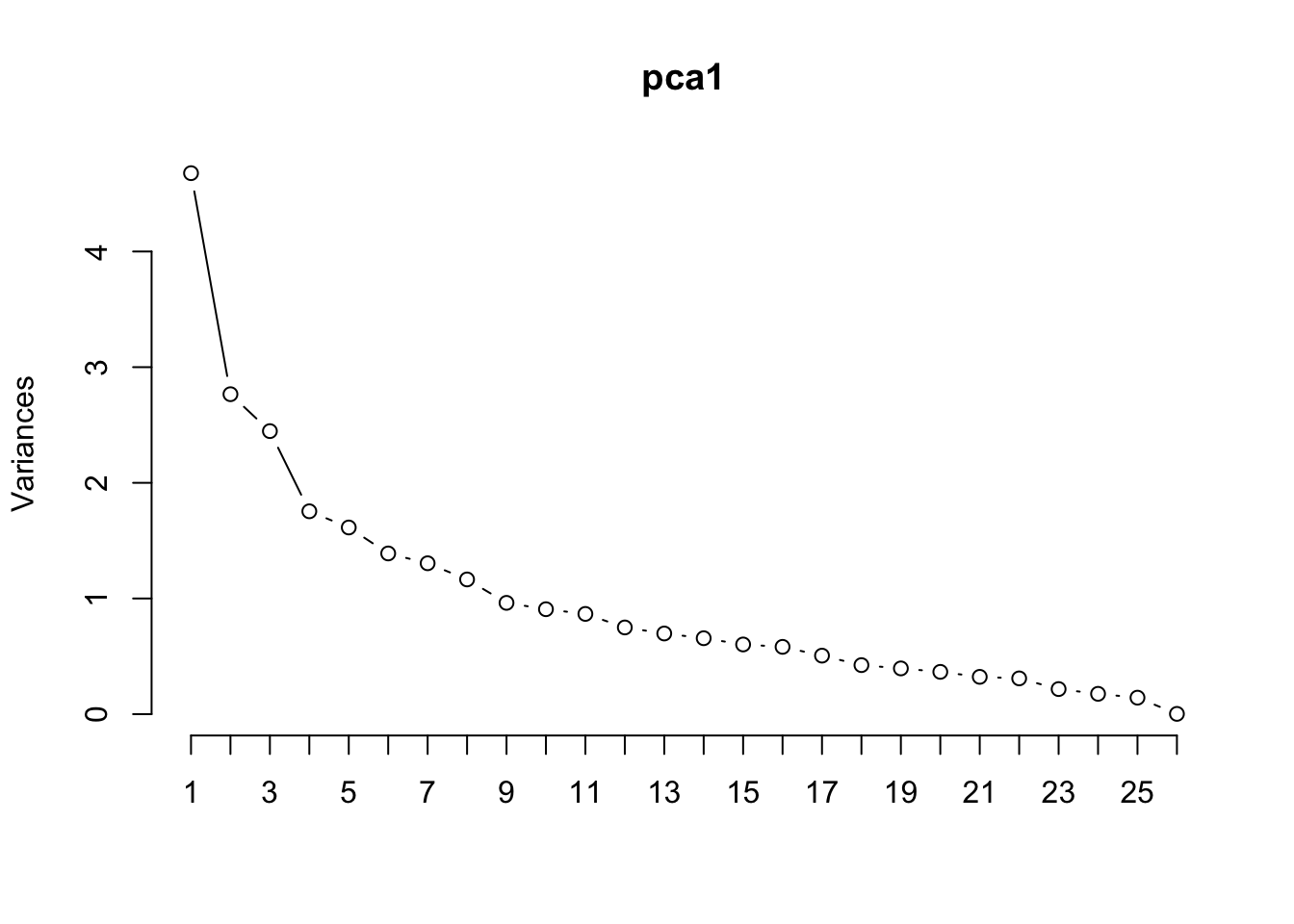
In the scree plot it is not clear how many principal components we should use, maybe three? Let’s try and to understand what these PCs might be correspoding to by investigating the loading matrix.
loading_mat <-round(pca1$rotation[,1:3], 2)
Lets start with the first component. This component has relatively low loading of nearly all the variables. Interestingly, all of the loadings (including those below the threshold) are negative. That is, every variable in the data set is loading in the same direction.
To try and emphasize which features are loading higher with each PC, let’s suppress any loading values less that 0.2 in magnitude:
We might stand to interpret this component as something like “nutrient density”. We would expect any food item that scores low in this PC to be nutrient rich (high in calories, protein, fat, fiber, iron, magnesium, … etc), and anything scoring high would “low-energy” food (like water).
Lets see what the which food items have the lowest scores on this PC:
head(nutrition[order(pca1$x[,1]),1])
[1] "Fruit-flavored drink, powder, with high vitamin C with other added vitamins, low calorie"
[2] "Leavening agents, yeast, baker's, active dry"
[3] "Malted drink mix, chocolate, with added nutrients, powder"
[4] "Rice bran, crude"
[5] "Spices, basil, dried"
[6] "Malted drink mix, natural, with added nutrients, powder"
and the highest scores:
tail(nutrition[order(pca1$x[,1]),1])
[1] "Carbonated beverage, low calorie, cola or pepper-type, with aspartame, without caffeine"
[2] "Tea, herb, chamomile, brewed"
[3] "Tea, herb, other than chamomile, brewed"
[4] "Carbonated beverage, low calorie, other than cola or pepper, with aspartame, contains caffeine"
[5] "Carbonated beverage, club soda"
[6] "Carbonated beverage, low calorie, other than cola or pepper,  without caffeine"
At first glance these food items might seem a bit unintuitive as most of the entries on both lists are drinks. BUT READ CLOSELY! The first, third, and sixth most “nutrient dense” items are actually POWDERED drink mixes. Since these nutritional values are all based on 100g servings, by weight, these powder items are likely packed with sugar (hence very high in calories) and in some cases it even mentions that they have added vitamins. In fact, all of the top 6 are concentrated/dried items. On the other hand the bottom six are liquid drinks as opposed to powdered drinks. These liquid drinks are specifically void of most nutrients.
Lets move on to the second component. Judging by the loading matrix, it appears that any item scoring high on PC2 will have high protein/fat/cholesterol/vitaminB12, and low carbs/fiber/iron/magnesium/manganese/potassium. For the most part, it seems like a measure of protein-dense foods like meat and nuts. Lets look at the top 6 and bottom 6 on this
For the most part it seems like this interpretation is accurate.
Finally, it appears that anything scoring high on the third component will be low in calories and fat, but high in vitamins. So generally speaking, lets just call it “vitamin-dense”.
[1] "Pork, fresh, backfat, raw"
[2] "Butter, whipped, with salt"
[3] "Butter, without salt"
[4] "Butter, salted"
[5] "Nuts, coconut meat, dried (desiccated), not sweetened"
[6] "Butter oil, anhydrous"
The bottom six are no brainers (basically just fats), but the top six are again a bit strange. Again, considering these nutritional values are given according to a weight of 100g, it makes sense that powdered drink mixes and dehydrated vegetables would appear alongside and beef liver (which is very rich in various vitamins and minerals).
PCRegression
Next, we will run PCRegression. To set up a regression problem we’ll need a natural continuous response variable. I think calories is likely the most natural choice since this is one of the most commonly a focal point in nutritional labeling. Since this is unsupervised, we will need to remove calories from the original PCA call. We’ll also remove the character variables food (the name of the food) and group the food-group categorization:
Note how we expanded the default x-axis of the plot using npcs. There’s no clear picture of how many components to retain using a scree plot so let’s look at the summary:
Using the Kaiser criterion would suggest retaining 8 components, note that 8 PCs only retain approximately 65% of the variability in the data. Let’s store the associated scores on those 8 components into an object for future use.
Cool! Everything appears interesting and useful for modelling. Of course, our PCA was done unsupervised — therefore, without respect to what we were trying to model (calories). So perhaps PLS can help us improve…
PLS
To run PLS we will need the pls library:
#install.packages("pls")library(pls)
Now, we will feed the function plsr a formula for calories as a response to all other numeric predictors.
This gives a very different picture…namely that it appears probably 2 components are sufficient (cumulatively explain just over 89% of the variation in calories). Compare that to PCReg — 8 components explained only 79% of the variation in calories. Clearly an improvement. In fact, if we only take the first two components for PCReg…
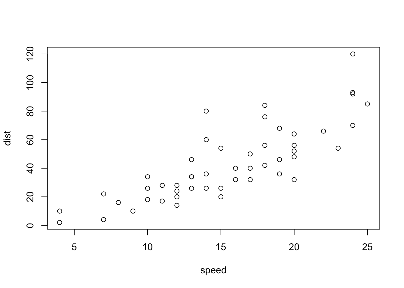
Call:
lm(formula = dist ~ speed, data = cars)

Residuals:
    Min      1Q  Median      3Q     Max
-29.069  -9.525  -2.272   9.215  43.201

Coefficients:
            Estimate Std. Error t value Pr(>|t|)
(Intercept) -17.5791     6.7584  -2.601   0.0123 *
speed         3.9324     0.4155   9.464 1.49e-12 ***
---
Signif. codes:  0 '***' 0.001 '**' 0.01 '*' 0.05 '.' 0.1 ' ' 1

Residual standard error: 15.38 on 48 degrees of freedom
Multiple R-squared:  0.6511,    Adjusted R-squared:  0.6438
F-statistic: 89.57 on 1 and 48 DF,  p-value: 1.49e-12
sum(carlm$residuals^2)
[1] 11353.52
nn <-neuralnet(dist~speed, data=cars, hidden=0)plot(nn)sum((predict(nn, data.frame(speed))-dist)^2)
[1] 11353.52
Note that the neuralnet package can only deal with numeric responses. If we have a binary response, we can basically approximate a classification scheme by pretending we’re modelling the probability (but of course, it might suggest values outside of the realm of probability, aka <0 or >1). Also, neuralnet cannot take simplified formulas such as “Response ~ .” instead, one has to explicitly type out each response and predictor by name in the formula (there are tricks around this, but it’s aggravating regardless).
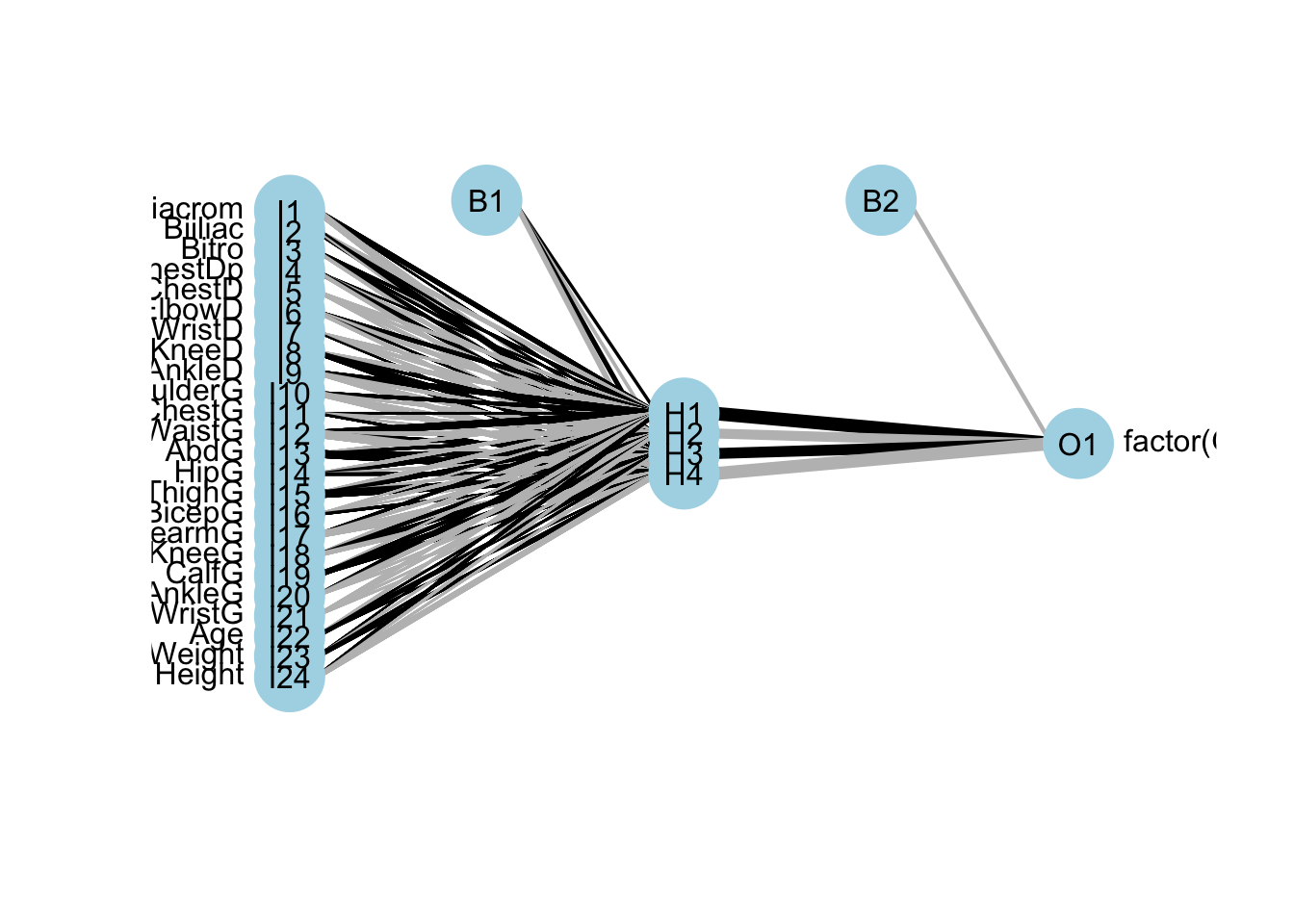
Fortunately, there are many neural network packages out there… nnet is another one. It has no built-in plotting function, so we also install NeuralNetTools for visualization purposes. Let’s look at the body example from class.
# weights:  105
initial  value 356.704610
iter  10 value 8.078480
iter  20 value 0.807377
iter  30 value 0.019682
iter  40 value 0.001804
iter  50 value 0.000120
final  value 0.000086
converged
table(body[,25], predict(nnbod2, type="class"))
      1   2
  0 260   0
  1   0 247
library(NeuralNetTools)plotnet(nnbod2)
0 misclassifications, but again, as discussed in class, this is probably overfitting…let’s set up a training and testing set
# weights:  105
initial  value 169.109314
iter  10 value 3.552025
iter  20 value 2.533965
iter  30 value 1.921988
iter  40 value 1.399205
iter  50 value 1.391963
iter  60 value 1.389062
iter  70 value 1.386696
iter  80 value 1.386382
final  value 1.386325
converged
In lecture, we left it at that. But we can easily setup a loop to investigate if there’s a better option for the number of hidden layer variables according to the testing error. Since it fits relatively quickly, let’s make a quick loop. Note that nnet has an annoying printout whenever it is fitted, the help file doesn’t provide any clear way to silence it…but a little googling can lead us to an argument trace=FALSE.
From this fit, it appears the best neural net (ignoring changing activation functions, number of hidden layers, or any other tuning parameters) will result in a predicted misclassification rate around 1.6%. We can compare this to LDA…
…which appears nearly equivalent to the neural net in terms of predictive power on this data. Importantly though, LDA provides us a structure for inference as well (we can investigate the estimated mean vector of each group, the covariances, decision boundary, etc). What about random forests…
library(randomForest)
randomForest 4.7-1.2
Type rfNews() to see new features/changes/bug fixes.
Call:
 randomForest(formula = factor(Gender) ~ ., data = data.frame(btrain))
               Type of random forest: classification
                     Number of trees: 500
No. of variables tried at each split: 4

        OOB estimate of  error rate: 5.2%
Confusion matrix:
    1   2 class.error
1 127   7  0.05223881
2   6 110  0.05172414
Once more, since the output provides OOB error rates, they are believable for future predictions. That said, let’s look at predicting for the test set for a direct comparison to the LDA and NN models…
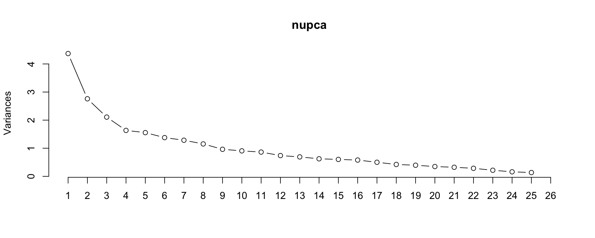
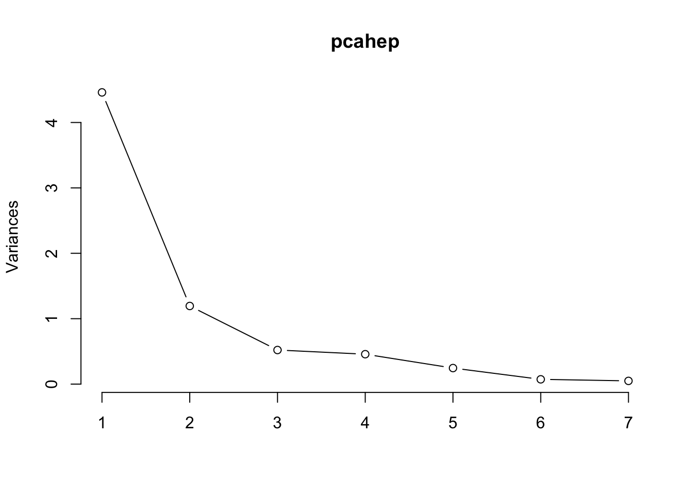
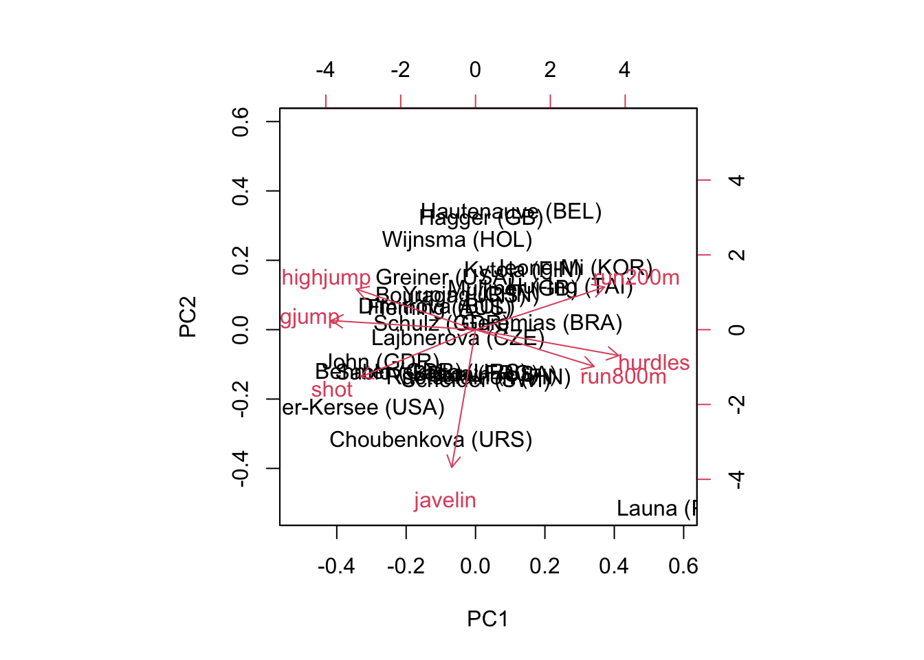
According to the Kaiser criterion, we would retain 2 components which explain 78% of the variation in the data. We can view the data projected onto these components in a biplot…
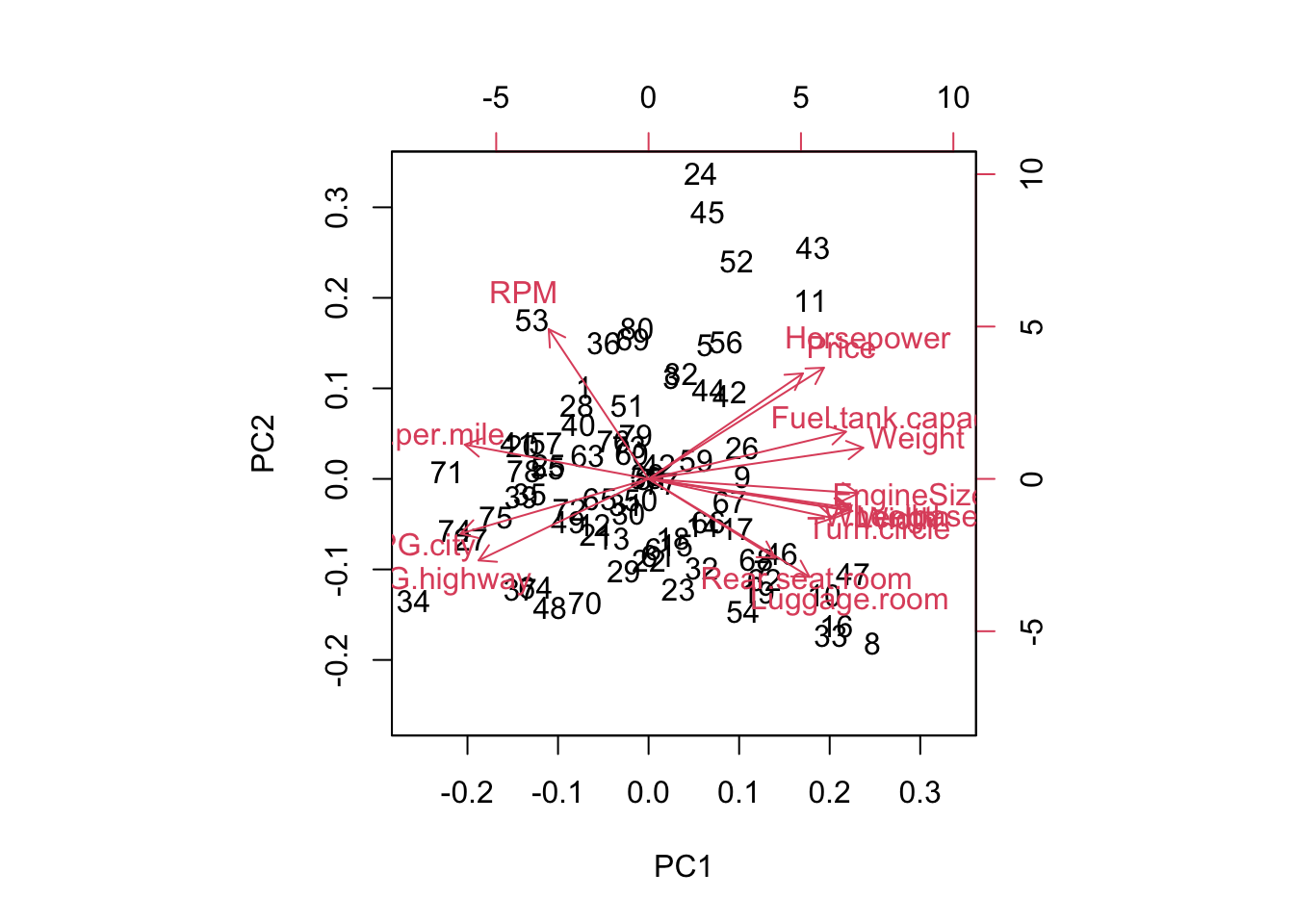
biplot(pcard)
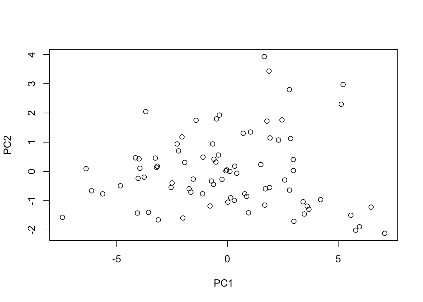
Note that this is equivalent to plotting the scores (which are the projected/rotated data). We can verify this by simply plotting
plot(pcard$x[,1:2])
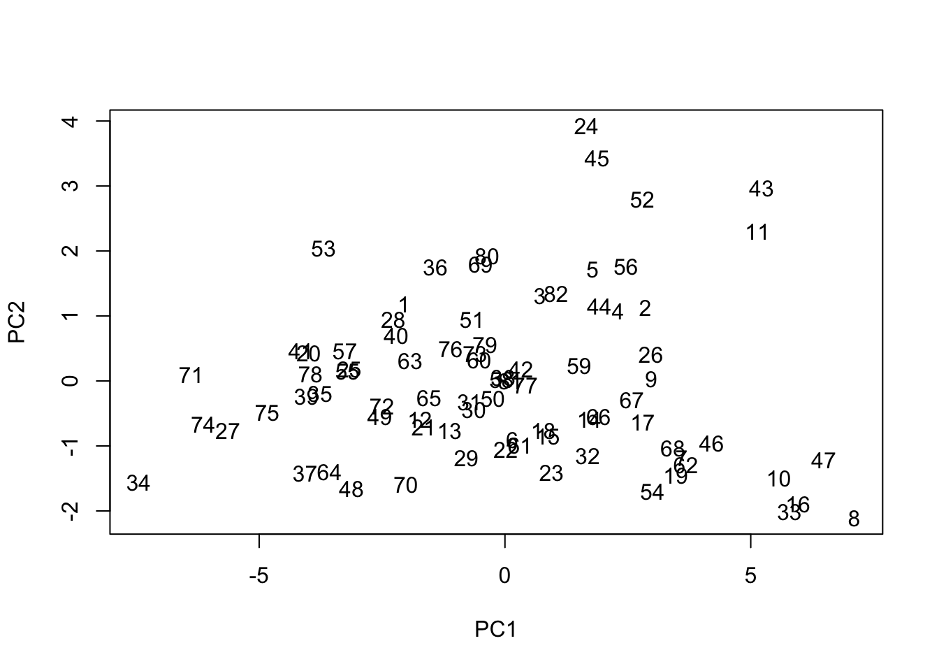
Of course, the biplot labels the data by observation number…easy enough
Let’s actually take a look at the component loadings (eigenvectors) which provide the coefficients of the original variables. We’ll round them so that they are a bit more easily interpreted
Focusing on the first component, we see that the magnitudes of the coefficients are pretty similar across the board. But note that while most are positive-valued, there are several negative-valued coefficients. If we had to summarize the positive ones, most these measurements have something (or some positive correlation) with the size of the vehicle, while the negative ones are related to fuel efficiency (which would be generally negatively correlated with size). As such, we can broadly interpret this first component as the size of the car.
The second component is a bit less clear. Let’s do our best to focus on the larger magnitudes.
So we have a high positive loading of price, horsepower, and RPM, along with large negative loadings for MPG and rear seats, luggage. What would you envision for a car that scores high on this component? Probably sports cars. We could therefore consider this a measure of ‘sportiness’…relatively small, expensive cars with strong engines.
This makes some sense from a rotation standpoint. If the bulk of the variation (first component) will measure cars based on their size contrasted with fuel efficiency, sports cars would not ‘fit in’ with the rest of the data on that component, as they are small cars that are not fuel efficient.
Proof of concept on these components, here are the four cars that score highest on PC1 (size):
    Manufacturer   Model    Type
24         Dodge Stealth  Sporty
45         Lexus   SC300 Midsize
43      Infiniti     Q45 Midsize
52 Mercedes-Benz    300E Midsize
Only the first is actually designated as ‘sporty’, though the next three are all expensive, luxury midsize vehicles. Perhaps we misinterpreted slightly with ‘sportiness’ and should rather designate this component as ‘luxuriousness’…but either way, cars that score highly on it will be expensive and fuel inefficient relative to their actual size.
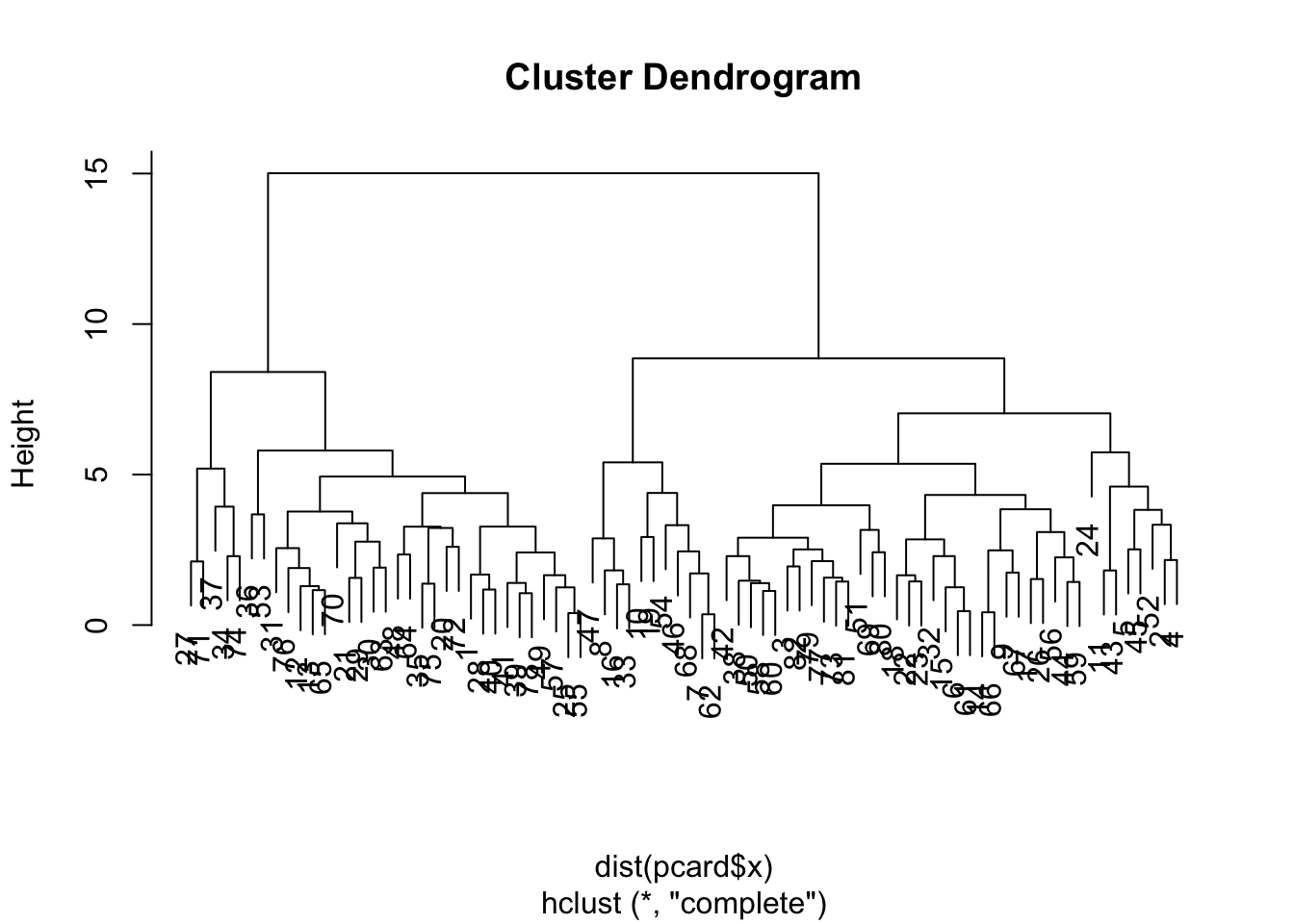
Now that we have the data projected onto the principal components, there is nothing stopping us from moving forward with other analyses we have discussed during this course. For example, let’s perform some clustering on PCA data.
Clustering on PCA
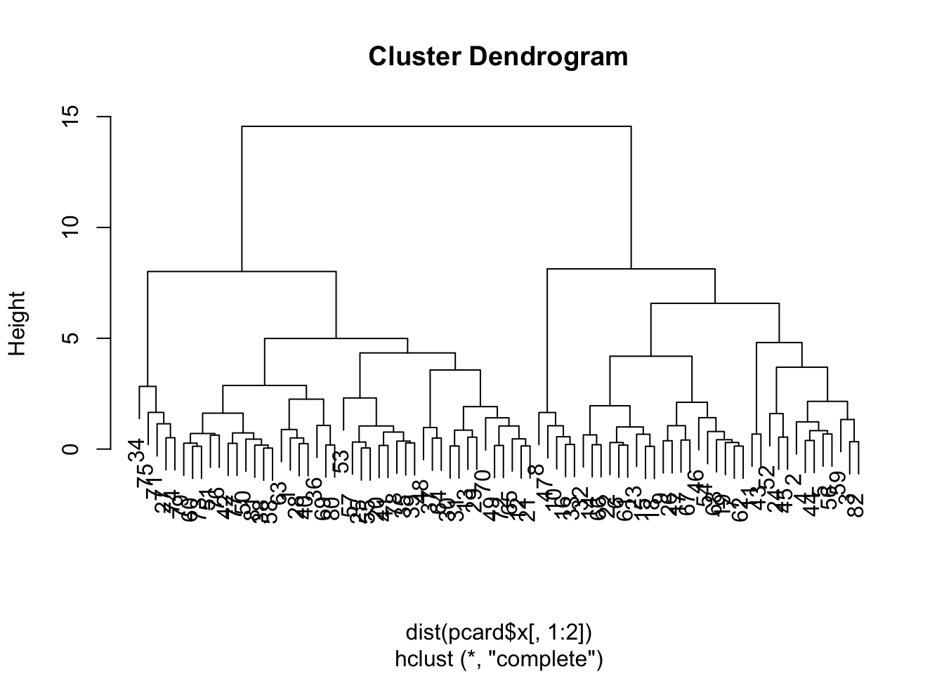
First, let’s show that if we do NOT reduce components, then the distances between observations are retained.
The dendrograms are identical. But frankly, we don’t need to eyeball it, we can have R compare distance matrices. Note that the scale call adds in a bunch of attributes that won’t be held in the prcomp object, so we set check.attributes=FALSE so that we are only comparing the pairwise distances contained in the objects…
This dendrogram suggests two groups. Let’s compare them to car types to see what falls out…
table(card$Type, cutree(pcclust,2))
           1  2
  Compact 13  3
  Large    0 11
  Midsize  2 20
  Small   21  0
  Sporty   9  3
The classification table shows that the predominant group structure on the first two principal components separates out the smaller cars (Compact, Small, Sporty) and larger cars (Midsize, Large). This matches up well with the interpretation on the first principal component (which is where the bulk of variance lies).
Now then, to set this up in a PCRegression type context, we’ll need a natural continuous response variable. I think calories is likely the most natural approach since they can come primarily from both fat and carbs. As such, we will need to remove it from the original PCA call.
Using the Kaiser criterion would suggest retaining 8 components, but that would only retain approximately 65% of the variability in the data. So, let’s pop the scores of the original observations on those 8 components into an object for future use.
Cool! Everything appears interesting and useful for modelling. Of course, our PCA was done unsupervised — therefore, without respect to what we were trying to model (calories).