In this lab, you will explore clustering techniques and cross-validation methods, focusing on hierarchical clustering and k-means clustering. By the end of this lab, you should be able to:
Understand and Implement Hierarchical Clustering:
Comprehend the concepts of single, average, and complete linkage methods in hierarchical clustering.
Apply hierarchical clustering to simulated datasets and interpret dendrograms to identify potential issues like chaining.
Determine the optimal number of clusters by cutting the dendrogram at appropriate heights.
Develop and Apply K-Means Clustering:
Understand the k-means clustering algorithm, including initialization, assignment, and update steps.
Implement the k-means algorithm from scratch and compare its performance with built-in functions.
Analyze the impact of cluster size and shape on the performance of k-means clustering.
Evaluate Clustering Results:
Visualize clustering results to assess the quality and appropriateness of the clusters formed.
Compare different clustering methods and their outcomes on the same dataset.
Apply Methods to Determine Optimal Cluster Numbers:
Use the elbow method to assess the optimal number of clusters for k-means clustering.
Explore the concept of “elbow” in hierarchical clustering through dendrogram analysis.
Understand the Limitations and Assumptions of Clustering Algorithms:
Recognize the assumptions underlying k-means clustering, such as the preference for clusters of similar size and spherical shape.
Identify scenarios where hierarchical clustering may be more appropriate than k-means clustering.
Hierarchical Clustering
In this section we will fit the Hierarchical Clustering algorithm (HC) to some simulated data.
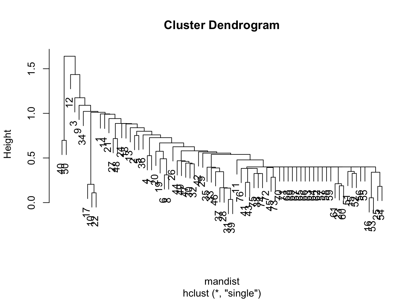
Single linkage chaining
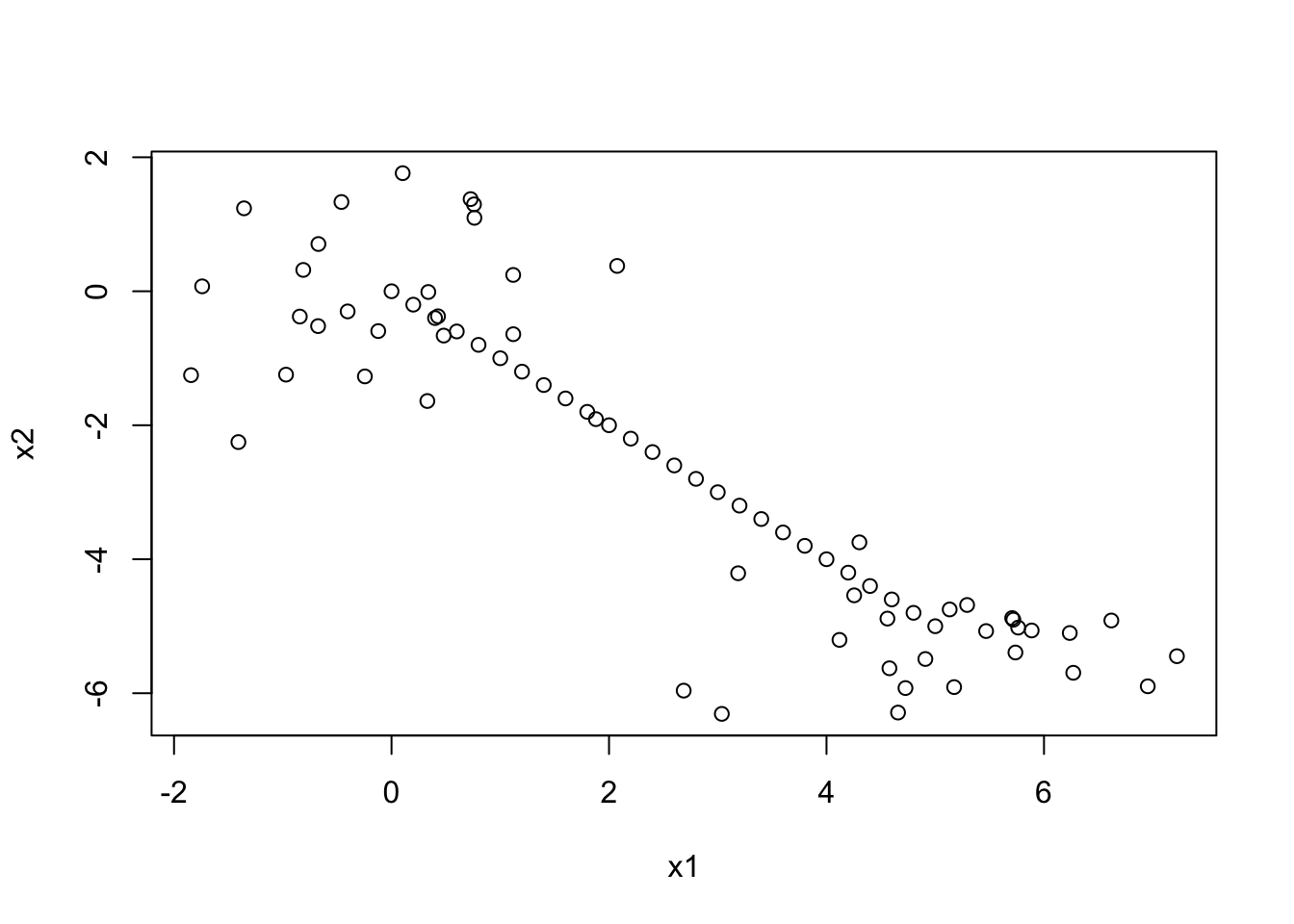
Let’s simulate a weird data set with 2 clusters and a line of points running in between. We’ll use manhattan distance for no particular reason other than showing how to specify it…
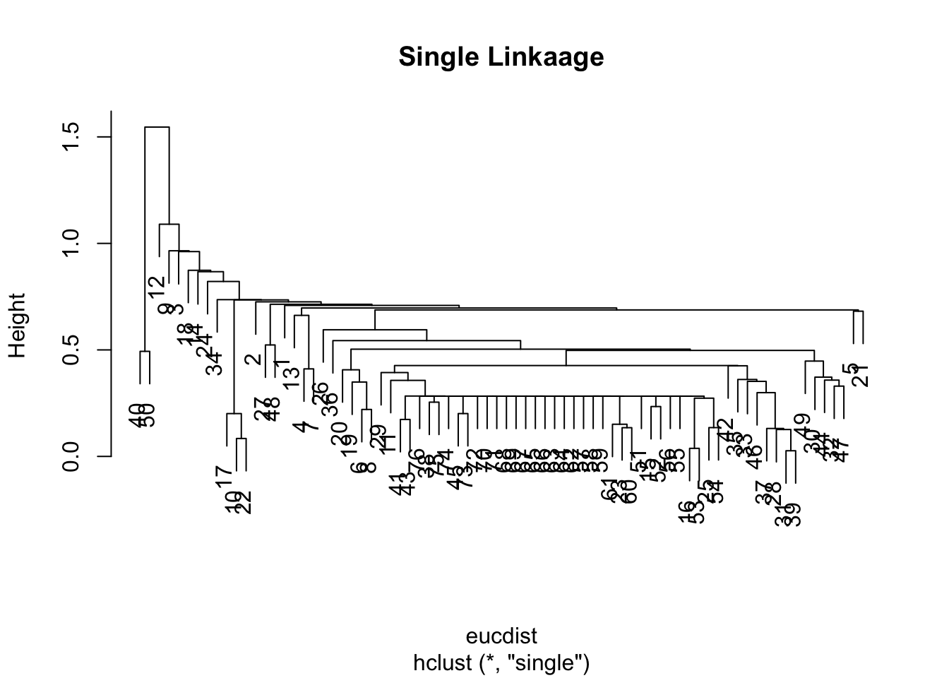
Note that switching to euclidean distance doesn’t fix the issue, but does result in slightly different dendrogram:
eucdist <-dist(datagen,method="euclidean")clus3 <-hclust(eucdist, method="single")plot(clus3, main ="Single Linkaage")
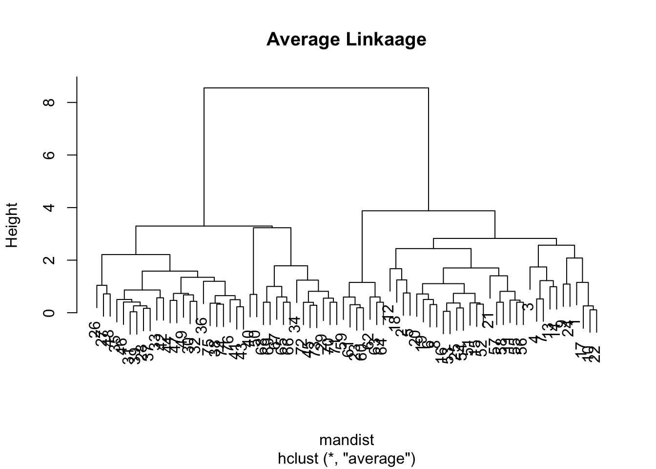
The plots above is a tell-tale sign of the phenomena called “chaining” — essentially that you successively create one-member (i.e. singleton) clusters. This problem tends to only be a concern with single linkage since it only requires one pair of points close, irrespective of all others. Consequently for this data set, we will have major difficulty finding an underlying group structure using single linkage. If, however, we change the average linkage we get a much more better behaved dendrogram:
clus2 <-hclust(mandist, method="average")plot(clus2, main ="Average Linkaage")
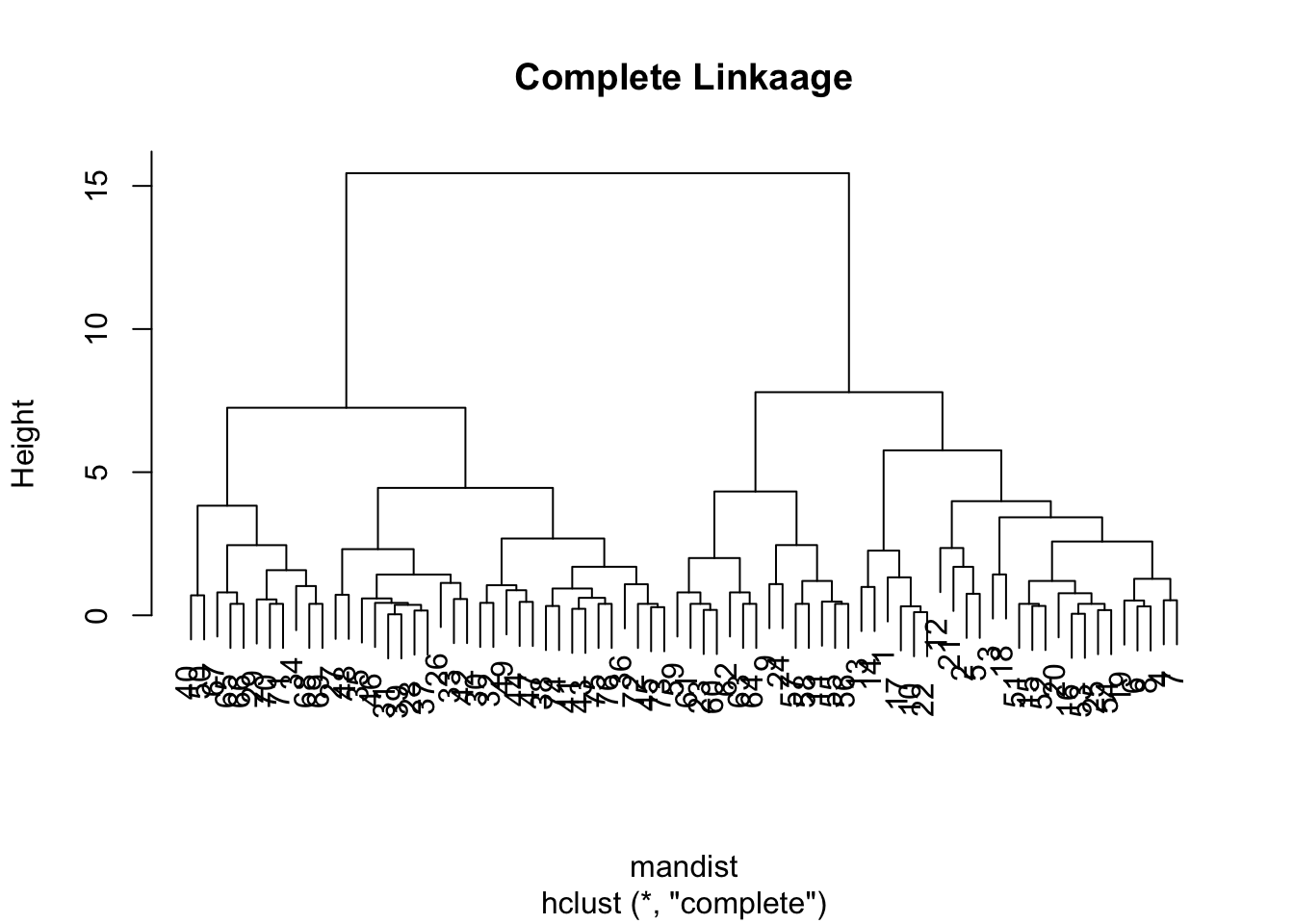
For the sake of completion, let’s observe the dendogram using the complete linkage method (which is the default)
clus4 <-hclust(mandist, method="complete")plot(clus4, main ="Complete Linkaage")
Cutting the Tree
Upon Visual Inspection of Dendrograms, we may decide to cut our tree to obtain clusters. There are two ways in which you can cut the tree. Option 1 is to specify a height threshold in the dendrogram, and the tree is cut at that height.
For instance we might cut the clus2 at a height of 6 and clust4 at 10.
mancom.h <-cutree(clus2, h =6)euccom.h <-cutree(clus4, h =10)
Alternatively, you can specify the number of clusters you want, and the algorithm will cut the tree at a level that produces that number of clusters.
Here we specify where to cut the tree by requesting a specific number of groups, and then we can compare results between the average and complete-linkage two-group solutions:
mancom <-cutree(clus2,2) # same as mancom.heuccom <-cutree(clus4,2) # same as euccom.htable(mancom,euccom)
      euccom
mancom  1  2
     1 39  0
     2  0 37
Notice that these two methods produce the exact same paritioning of the data. Let’s visualize the clusters by colour on the scatterplot:
plot(datagen, col=mancom)
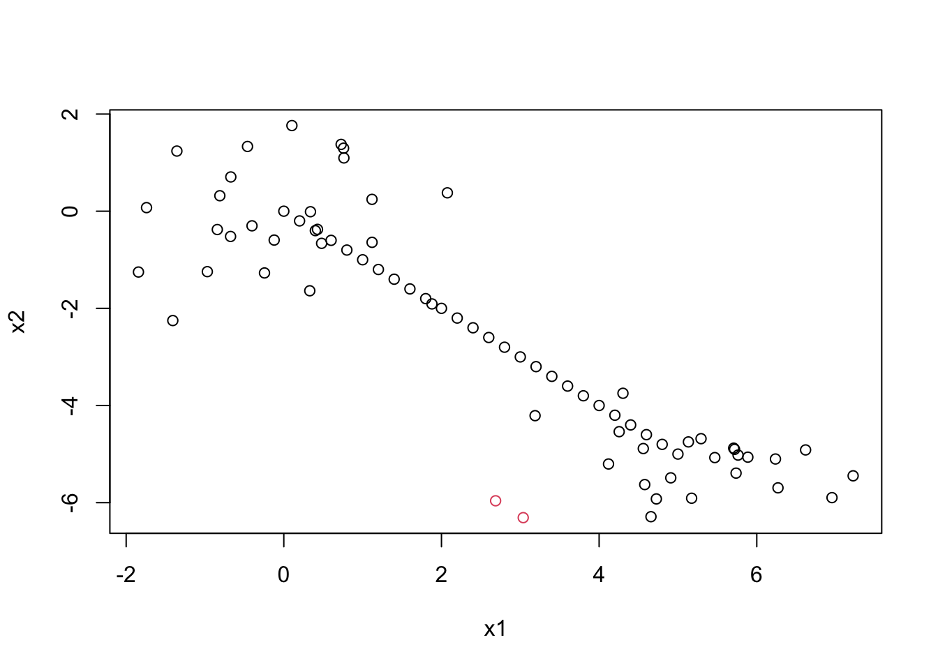
Now let’s compare the Euclidean with single linkage solution with the Euclidean with complete linkage solution.
eucsin <-cutree(clus3,2)table(euccom, eucsin)
      eucsin
euccom  1  2
     1 39  0
     2 35  2
Single linkage makes two groups, one with only a single observation in it!
plot(datagen, col=eucsin)
Kmeans
While there is a built-in function for performing k-means clustering in R, we will code it up from scratch in order to gain some understanding of the algorithm. The two inputs of our function should be: the data x and the number of groups k.
Let’s remind ourselves of the steps of the \(k\)-means:
Start with k random centroids (at the first iteration we will randomly assign k points within our data set as the k centroids)
Assign all observations to their closest centroid (“closest” in terms of euclidean distance)
Recalculate group means. Call these your new centroids.
Repeat 2, 3 until nothing changes.
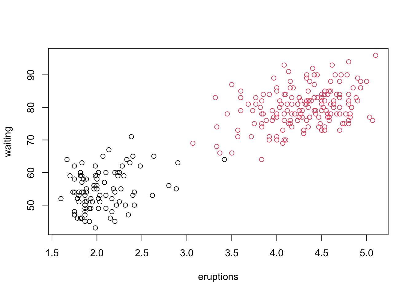
my_k_means <-function(x, k){#1 start with k random centroids centrs <- x[sample(1:nrow(x), k),]#start loop changing <-TRUEwhile(changing){#2a) calculate distances between all x and centrs dists <-matrix(NA, nrow(x), k)# calculate the distance from points to centroidsfor(i in1:nrow(x)){for(j in1:k){ dists[i, j] <-sqrt(sum((x[i,] - centrs[j,])^2)) } }# 2b) assign group memberships (you probably want to provide some overview of apply functions) membs <-apply(dists, 1, which.min)# 3) recalculate new group centroids oldcentrs <- centrs #save for convergence check!for(j in1:k){ centrs[j,] <-colMeans(x[membs==j, ]) }#4) check for convergenceif(all(centrs==oldcentrs)){ changing <-FALSE } }#output memberships membs}set.seed(5314)#debug(my_k_means) #if you wanttest <-my_k_means(scale(faithful), 2)plot(faithful, col=test)
As you can see, we obtain the same result as the built-in version in R.
Determining the optimal number of clusters is crucial for effective clustering analysis. There are several ways to accomplish this.
Visual Inspection of Dendrograms
In hierarchical clustering, we typically examine the dendrogram (the visualization of the merging of clusters) to decide where to cut the tree to form clusters. identify significant jumps in the distance between merged clusters. Cutting the dendrogram at these points can suggest an appropriate number of clusters.
In a dendrogram, the height of each node represents the level of dissimilarity or distance at which clusters are merged during hierarchical clustering. This height is a visual indicator of how similar or different the combined clusters are:
Lower Heights: Clusters that merge at lower heights are more similar to each other. This indicates that the data points within these clusters have smaller dissimilarities.
Higher Heights: Clusters that merge at higher heights are less similar, reflecting greater dissimilarities between the combined clusters.
By examining the heights at which clusters merge, you can gain insights into the structure of your data and determine an appropriate number of clusters. For instance, significant increases in height between successive merges suggest natural divisions in the data, which can guide decisions on where to “cut” the dendrogram to form distinct clusters.
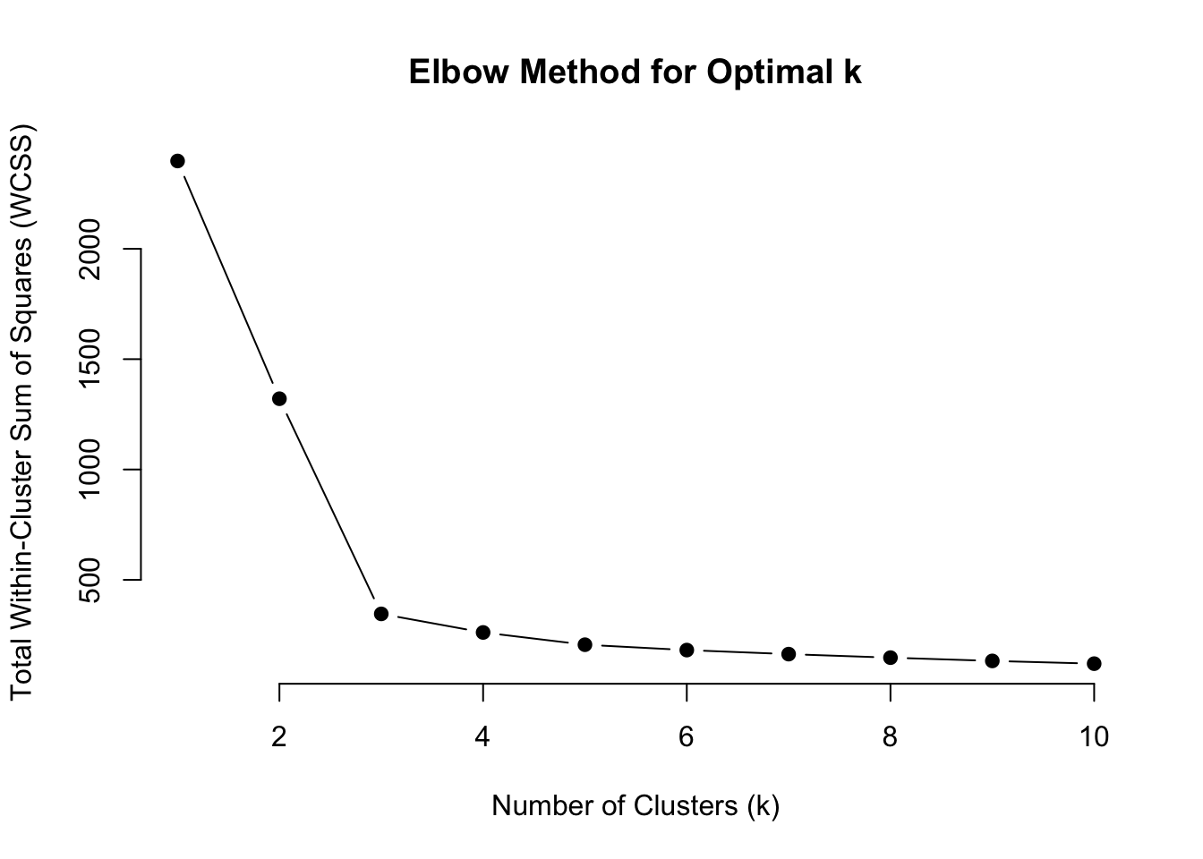
Elbow Method
For kmeans, we typically use the “elbow method”. This method involves plotting the total within-cluster sum of squares (WSS) against the number of clusters, (\(k\)). As \(k\) increases, WSS decreases. Create a plot of WCSS against the number of clusters (this is sometimes called a “scree plot”). The point where the rate of decrease sharply slows (forming an “elbow”) suggests the optimal number of clusters.
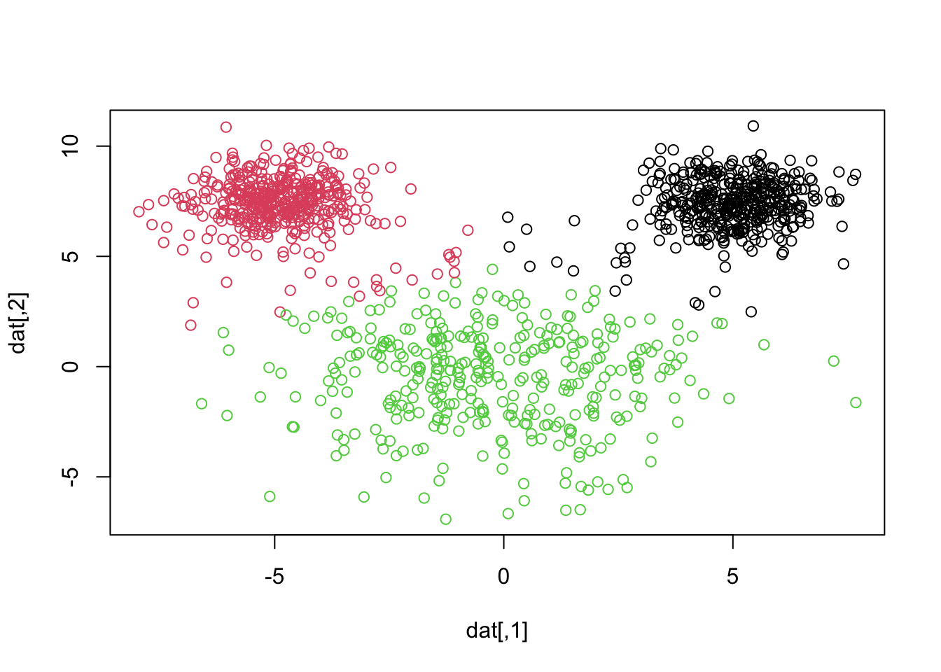
Example: mouse simulation
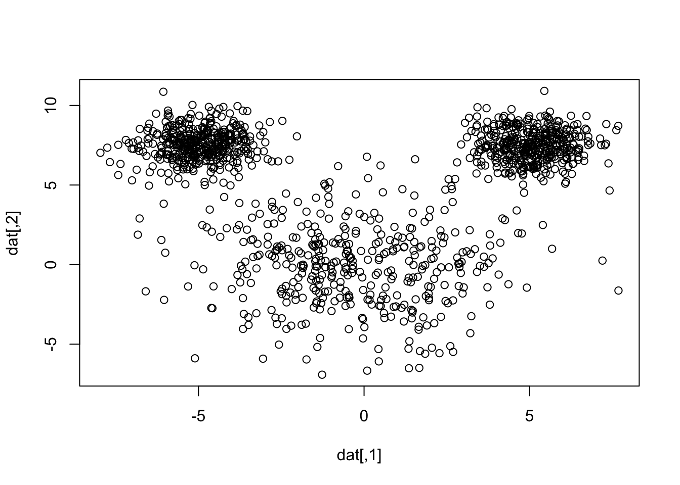
Let’s simulate some data:
library(mvtnorm)set.seed(35151)le <-rmvnorm(400, mean =c(-5,7.5))re <-rmvnorm(400, mean =c(5,7.5))hd <-rmvnorm(400, mean =c(0,0), sigma=7*diag(2) )dat <-rbind(le, re, hd)plot(dat)
So in simulation land, we know the true number of clusters is 3, but let’s pretend we don’t know that.
kmeans
Let’s perform the Elbow Method in order to determine the appropriate number of clusters
# Scale the datascaled_data <-scale(dat)# Set the maximum number of clusters to considerk_max <-10# Initialize a vector to store WCSS for each kwcss <-numeric(k_max)# Compute WCSS for each kfor (k in1:k_max) {set.seed(123) # For reproducibility kmeans_result <-kmeans(scaled_data, centers = k, nstart =25) wcss[k] <- kmeans_result$tot.withinss}
Warning: did not converge in 10 iterations
# Plot the Elbow Curveplot(1:k_max, wcss, type ="b", pch =19, frame =FALSE,xlab ="Number of Clusters (k)",ylab ="Total Within-Cluster Sum of Squares (WCSS)",main ="Elbow Method for Optimal k")
Judging by the scree plot, the “elbow” appears at \(k\) = 3.
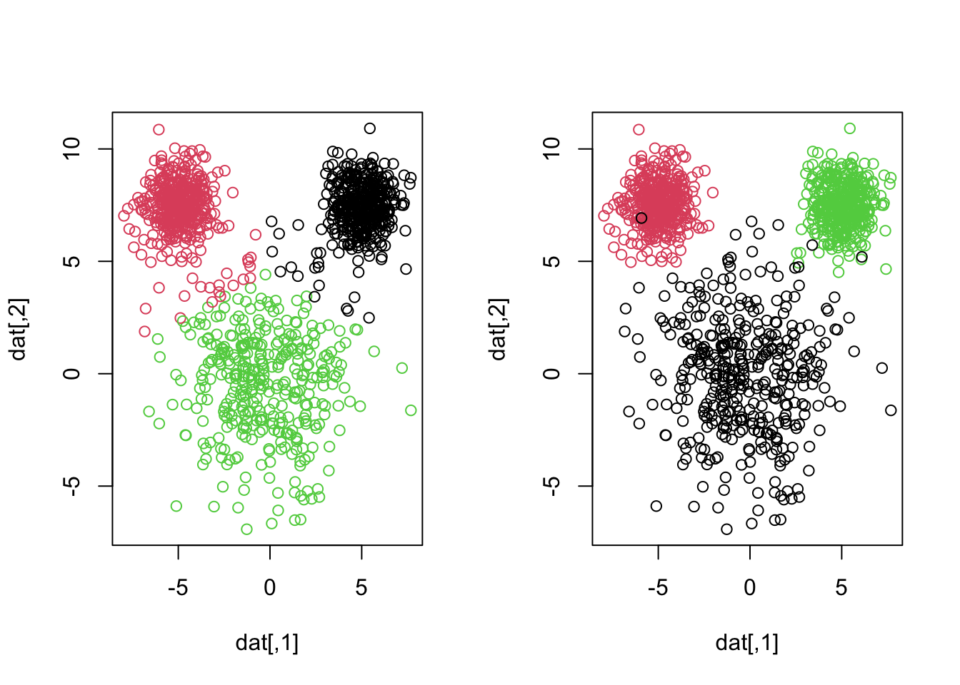
Let’s plot the clusters obtained by k-means when we specify three clusters1:
Note that the number the numerical labels assigned to clusters are arbitrary and do not carry inherent meaning. These labels are determined by the order in which the algorithm processes the data and initializes the centroids. So our corrected labeled observations will no longer necessarily occur on the diagonal! In clustering analysis, especially when comparing results from different algorithms or runs, class matching (also known as cluster alignment) is a crucial step. This process involves aligning clusters from one result to those in another to facilitate meaningful comparisons.
After we do some class matching2 it looks like we are misclassifying 22 + 17 = 39 observations. Notice how the smaller “mouse ears” are assumed larger in k-means, even though the groups are relatively well-separated. We can see this by showing a side by side of the truth and what k-means just gave us3
This is because k-means tries to find clusters that are of roughly equal size. It is imporant to understand this for problems in which your cluster sizes are quite different.
Important
K-means tends to produce clusters of similar sizes because it minimizes the variance within each cluster. In datasets where actual clusters vary significantly in size, k-means may misclassify points, assigning them to larger clusters even if they are closer to smaller ones.
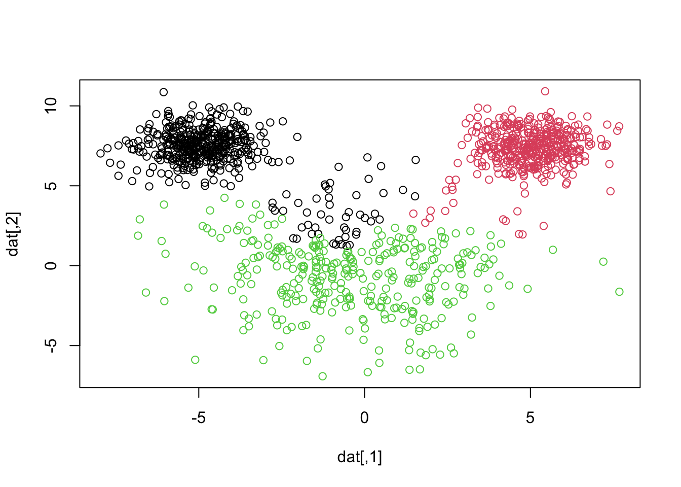
hclust
When we apply hierarchical clustering with complete linkage we get a more reasonable result, but still not perfect.
Try out some of the other linkage options on this data set to see if you can get one that performs better than the above
# average does a bit bettermickhc <-hclust(mickdist, method="average")mickhcres <-cutree(mickhc, 3)plot(dat, col=mickhcres)table(mickhcres, rep(1:3, each =400))
Footnotes
I’ll be using our user-defined function but you can verify that the clusters obtained from the built-in function, kmeans(),results in the same partition.↩︎
In this case, of mickres cluster 2 corresponds to simulated group 1; mickres cluster 1 corresponds to simulated group 2; and mickres cluster 3 corresponds to simulated group 3↩︎
Note that the colours are different because the number the numerical labels assigned to clusters are arbitrary and do not carry inherent meaning↩︎