Data 311: Machine Learning
Lecture 3: Assessing Models
Income (Simulated) Data


Visual breakdown
The blue curve represents \(f\) the true1 underlying relationship between income (\(y\)) and years of education (\(x\)).
The black lines represent the error (\(\epsilon\)) associated with each observation.
Considering more predictors
In general, \(f\) may involve more than one input variable.

ISLR Figure 2.3 Income plotted as a function of years of education and seniority. Here \(f\) is a two-dimensional surface that must be estimated based on the observed data.
Example of Reducible error
Code
# reduce some white space in the top & right margin
par(mar=c(5.1, 4.1, 0.1, 0.1))

# Set up the plotting area for 3 plots in one row
par(mfrow = c(1, 3))  # 1 row, 3 columns of plots

plot(Advertising$TV, Advertising$sales,
     xlab = "TV", ylab = "Sales")

#  makes the columns available as variables
attach(Advertising)

plot(radio, sales)
plot(newspaper, sales)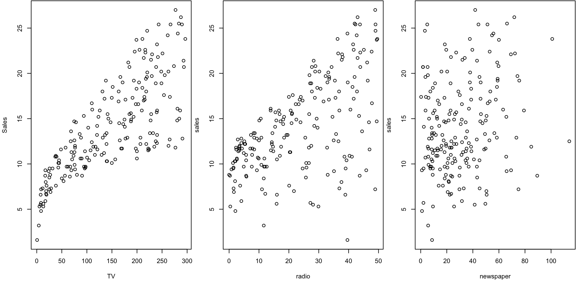
The plot displays sales, in thousands of units, as a function of TV, radio, and newspaper budgets, in thousands of dollars, for 200 different markets.
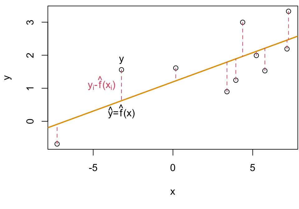
Model Training Process

MSE Visualized
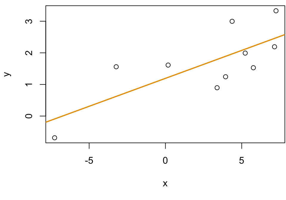
Given some data: \((X, Y)\)

Fit a model \(\hat f\) (plotted in orange)
For each \(x_i\) we have a true value \(y_i\), …
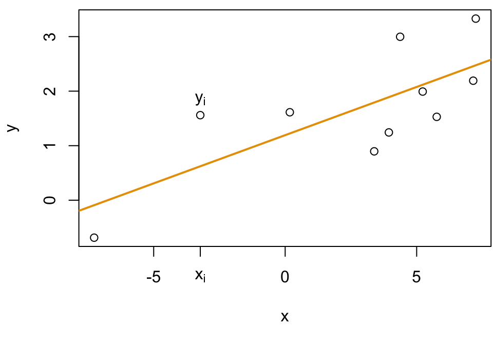
… and predicted value \(\hat f(x_i) = \hat y_i\)
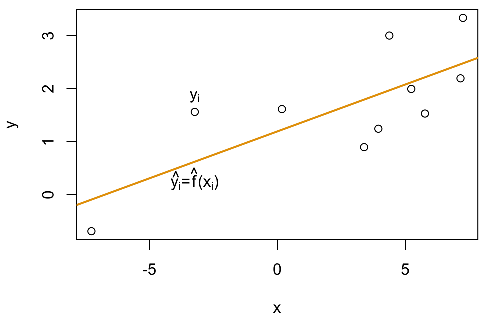
We average the squared differences to get MSE
Discussion Question
Question: Would this be a good model?


Model Fitting
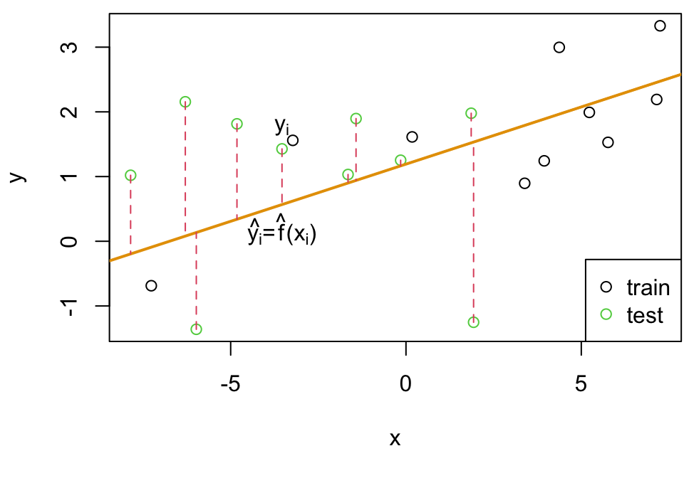
We might find our \(\hat f\) based on training data \(\textbf{X}_{Tr}\) and see how close \(\hat f(x_{n+1},...,x_{n+m})\) predicts \((y_{n+1},...y_{n+m})\)
Recall that \(\textbf{X}_{Te}\) is not used to train the statistical learning method and has never been “seen” by the algorithm.


MSE train = average squared differences using training data

MSE test = average squared differences using the test data
Bias
Bias (of a model) refers to the error that is introduced by approximating a real-life problem, which may be extremely complicated, by a much simpler model.
- High bias can cause an algorithm to miss the relevant relations between features and target outputs (underfitting)


Variance
Variance refers to the amount by which \(\hat f\) would change if we estimated it using a different training data set.
- High variance may result from an algorithm modeling the random noise in the training data (overfitting).
Target Visualizations

Inspired by Essays by Scott Fortmann-Roe
Target Explained (Bias)
![]()
- Low Bias (first row) models approximate the real-life problem well; that is \(\hat f\) will be centered around \(f\) (🎯)
- High Bias (second row) will systematically be “off the mark”; these tend to be models that are too simple
Impact High bias leads to underfitting, where the model performs poorly on both the training set and new, unseen data. It fails to learn the true relationships in the data adequately.
Target Explained (Variance)
![]()
Low variance (first column) indicates that \(\hat f\) would not change much even if we estimated it using a different training data set. (so the hits will all be close together)
High variance (second column) indicates that \(\hat f\) will be very sensitivity to small fluctuations in the training; tend to be models that are overly complex
Impact High variance leads to overfitting, where the model performs well on the training data but poorly on new, unseen data because it is too closely fitted to the quirks of the training set.
Training set 1
Training set #1: This is one example of a potential training set

Training set 2
Training set #2: Here’s another…

Generative Model
Since we know \(f\) we can plot as well

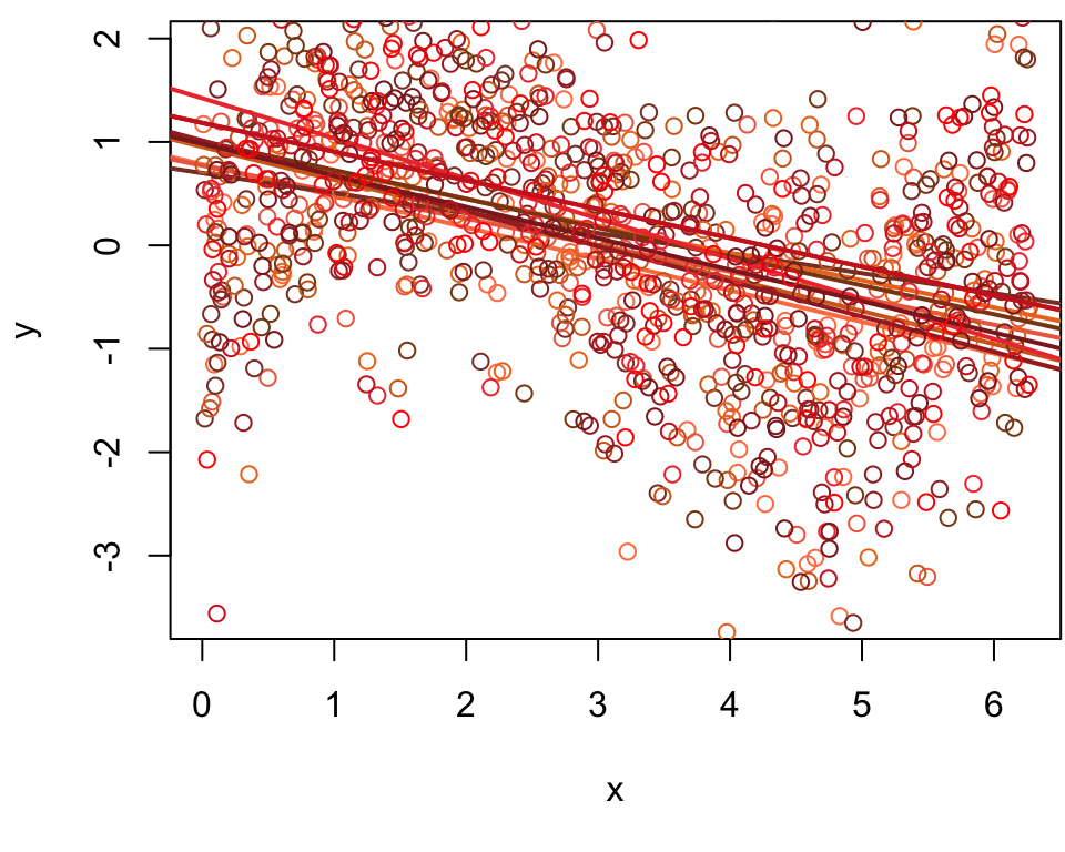
Low Variance High Bias

Training set 1
Let’s start by fitting a simple linear regression (SLR) model to training set #1. The resulting fitted line \(\hat f\) is plotted below

Training set 2
Fitting a SLR to training set #2 will produce this (slightly different) fitted line \(\hat f\)

10 training sets
The fitted line for 10 different fits using 10 different training sets.
Low Bias High Variance

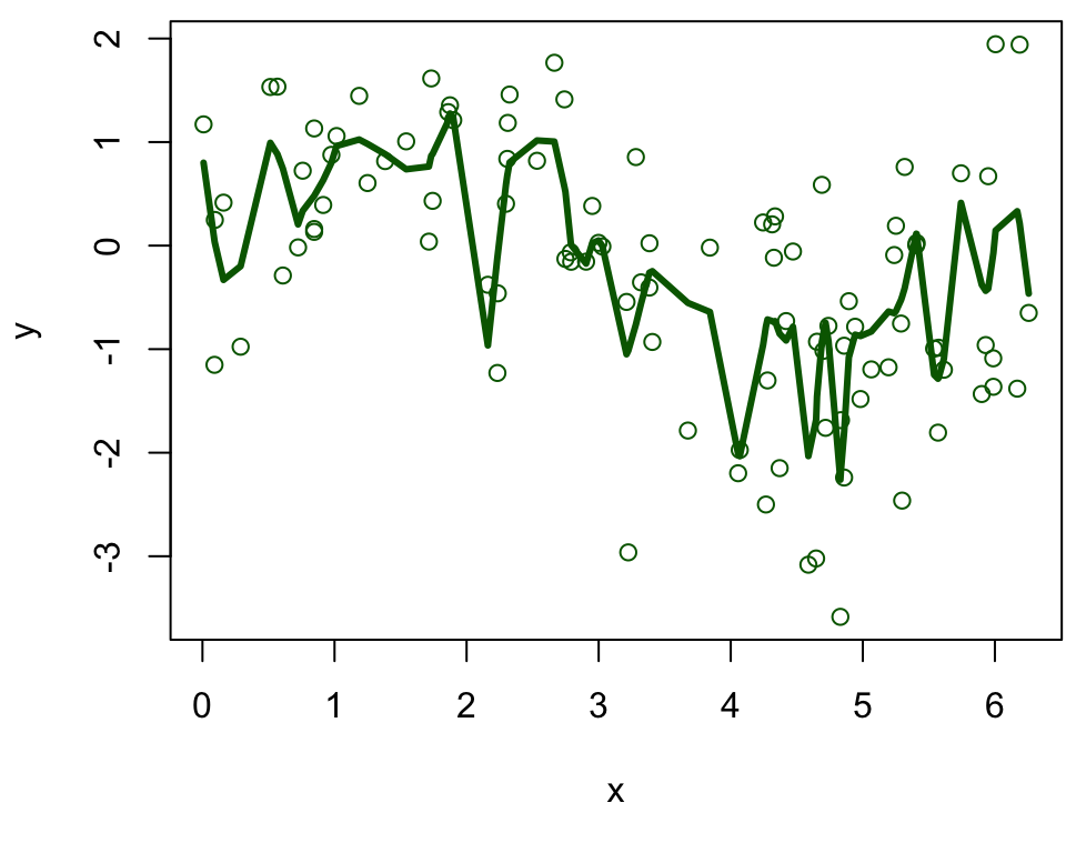
Training set 1
Fitting a highly flexible loess model to training set #1 will produce this fitted curve \(\hat f\)
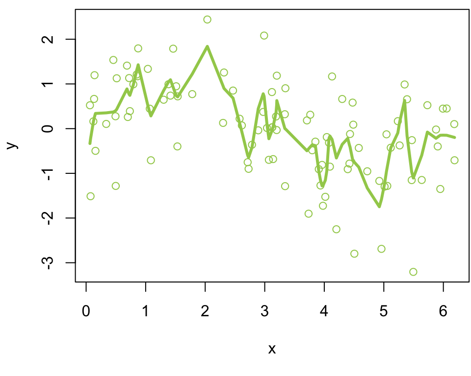
Training set 2
Fitting a highly flexible loess model to training set #2 will produce this (very different) fitted curve \(\hat f\)
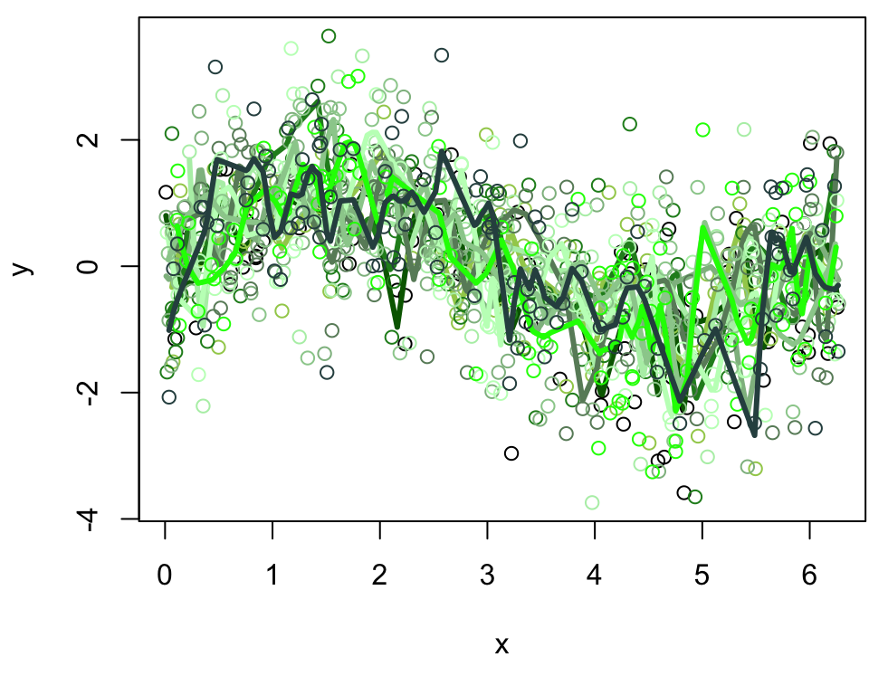
10 training sets
The fitted model for 10 different fits using 10 different training sets.
Low bias and Low variance

Training set 1
Fitting a loess model with medium flexibility to training set #1 will produce this fitted curve \(\hat f\) plotted below
Training set 2
Fitting a loess model with medium flexibility to training set #2 will produce this (different) fitted curve \(\hat f\)

10 training sets
The fitted model for 10 different fits using 10 different training sets.

Average model across simulations
Let’s explore what the average model looks like for each of these scenarios …
Goldilocks Principle

Image adapted from MollyMooCrafts
Bias-Variance Tradeoff visualized

MSE visualized
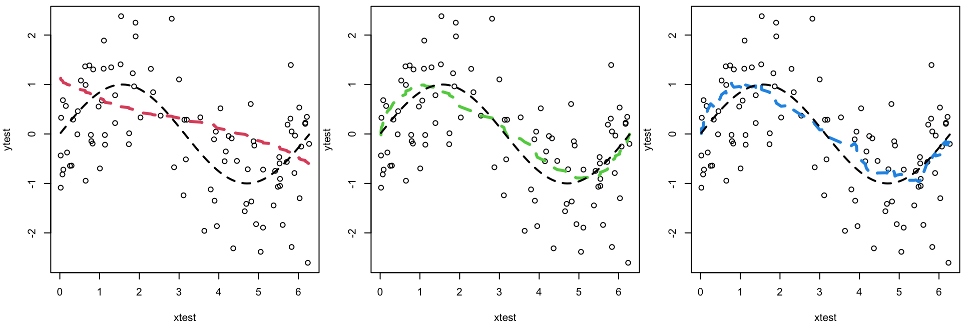
Figure 2.9 (left plot)

ISLR Figure 2.9 (left plot) Data simulated from \(f\), shown in black. Three estimates of \(f\) are shown: the linear regression line (orang ecurve), and two smoothing spline fits (blue and green curves). jump to right-hand panel
Orange curve
High bias, low variance
Low Variance the oranage fit would not have much variability from training set to training set
High Bias it systematically underestimate between 40–80 and overestimate towards the boundaries, for example.
Green curve
Low bias, high variance
As the green curve is the most flexible, it matches the training data very closely
However, it is much more wiggly than \(f\) (ie the “true” generating black curve)
Blue curve
Low bias, low variance
The blue curve strikes the balance between low variance and low bias
As one may expect, the average fitted curve is quite similar to \(f\) (ie the “true” generating black curve)
Figure 2.9 (right)

ILSR Figure 2.9 (right plot) Training MSE (grey curve), test MSE (red curve), and minimum possible test MSE over all methods (dashed line). Squares represent the training and test MSEs for the three fits shown in the left-hand panel.
Test MSE
The orange and green models have high \(\text{MSE}_{Te}\) but for different reasons
- orange is underfitting
- green is overfitting
Blue is close to optimal
Minimizing test MSE
The horizontal dashed line indicates \(\text{Var}(\epsilon)\), the irreducible error
This line corresponds to the lowest achievable test MSE among all possible methods.
Hence, the “blue model” is close to optimal.
Training MSE
The green curve has the lowest training MSE of all three methods, since it corresponds to the most flexible of the three curves fit in the left-hand panel
Training MSE
The orange curve has the highest training MSE of all three methods, since even on the training set, it is not flexible enough to approximate the underlying relationship
Training MSE
The blue curve obtains a similar training and testing MSE.
Comments
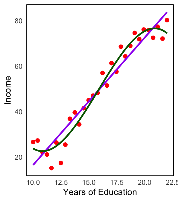
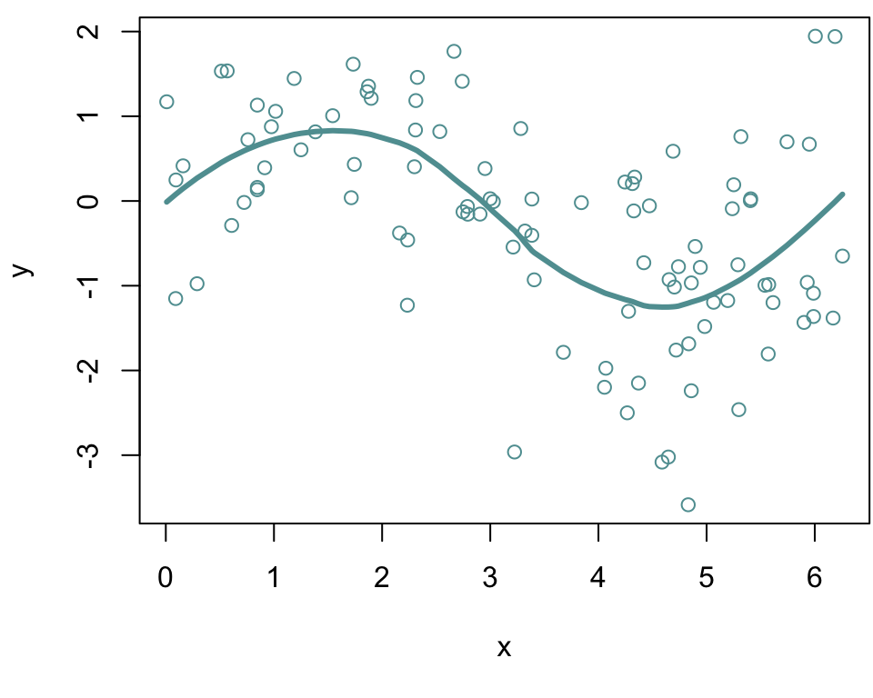
The purple model assumes a straight-line relationship between the predictor (Years of Education) and the response (Income)
However, the true relationship, as indicated by blue curve, is non-linear and follows a curved pattern.
Since the linear model (purple) does not capture the curvature it systematically1 deviates from the true relationship.
This discrepancy contributes to the reducible error since this error could be reduced by fitting a more appropriate model that accounts for the curve, such as a polynomial model (green curve).