Summary This lab will cover how to make predictions, analyze diagnostic plots, identify potential problems in multiple linear regression, and compare multiple regression models using the test MSE. For more details, consults your textbook (ILSR2 Section 3.3.3. and Lab 3.6).
Learning outcomes
By the end of this lab students will be able to:
Fit polynomial regression models
Assess linear model assumptions using diagnostic plots in R
Create a training and testing set
Fit a KNN regression model
Calculate predictions based on a fitted models
Compare various regression models using test MSE
Prediction
Let’s fit a linear regression model to the Auto dataset available in the ISLR2 package.
Let’s begin by splitting the data into a training and testing set. We’ll choose 60% for the training set and 40% for the test set.
# store the index for the training set:set.seed(2023)n <-nrow(Auto)# this will sample 235 number from 1 -- 392 without replacementtrain <-sample(n, round(.6*n))# this will be the index of samples in our test settest <-setdiff(1:n, train)
fit1 attempts to explain gas mileage (in mpg mpg) using the predictor variable of the engines horsepower horsepower.
fit1 <-lm(mpg~horsepower, data = Auto, subset = train)summary(fit1)
Call:
lm(formula = mpg ~ horsepower, data = Auto, subset = train)

Residuals:
    Min      1Q  Median      3Q     Max
-13.376  -2.911  -0.294   2.545  15.464

Coefficients:
            Estimate Std. Error t value Pr(>|t|)
(Intercept) 39.32363    0.86238   45.60   <2e-16 ***
horsepower  -0.15205    0.00769  -19.77   <2e-16 ***
---
Signif. codes:  0 '***' 0.001 '**' 0.01 '*' 0.05 '.' 0.1 ' ' 1

Residual standard error: 4.658 on 233 degrees of freedom
Multiple R-squared:  0.6265,    Adjusted R-squared:  0.6249
F-statistic: 390.9 on 1 and 233 DF,  p-value: < 2.2e-16
Judging by the very low p-values for \(\beta_1\) (slope), it appears that there a relationship between the predictor and the response. Since the sign for slope is negative (\(\hat\beta_1\) =-0.1578) we expect this relationship to be negative, that is, as the horsepower of our engine increase, gas mileage tends to go down. This relationship would also appear to be relatively strong as indicated by the high \(R^2\) value = 0.6049 (ie approximately 60% of the variance in the response is being explained by the simple model.
Prediction on the test set
To see how we predict on the test set we could use
pred_test =predict(fit1, Auto[test,])
We can compare the predicted values to the actual values on an individual basis:
To find the predicted mpg associated with a horsepower of say 90, we could use the predict function (see ?predict.lm for the help file; note that the newdata argument must be a data frame data structure):
predict(fit1, data.frame("horsepower"=90))
       1
25.63914
We could have constructed this prediction “by hand”, by obtaining the line of best fit and substituting in 90 for x but this obviously takes a little bit more work:
coef(fit1)
(Intercept)  horsepower
 39.3236312  -0.1520498
x <-90coef(fit1)["(Intercept)"] +coef(fit1)["horsepower"]*x
(Intercept)
   25.63914
It is also handy to note that we could see all the fitted \(\hat y_i\) values using the following command:
N.B. when using predict your data need to be in a data frame and the predictors need to be named in the same way as your training data.
Prediction and Confidence Bands
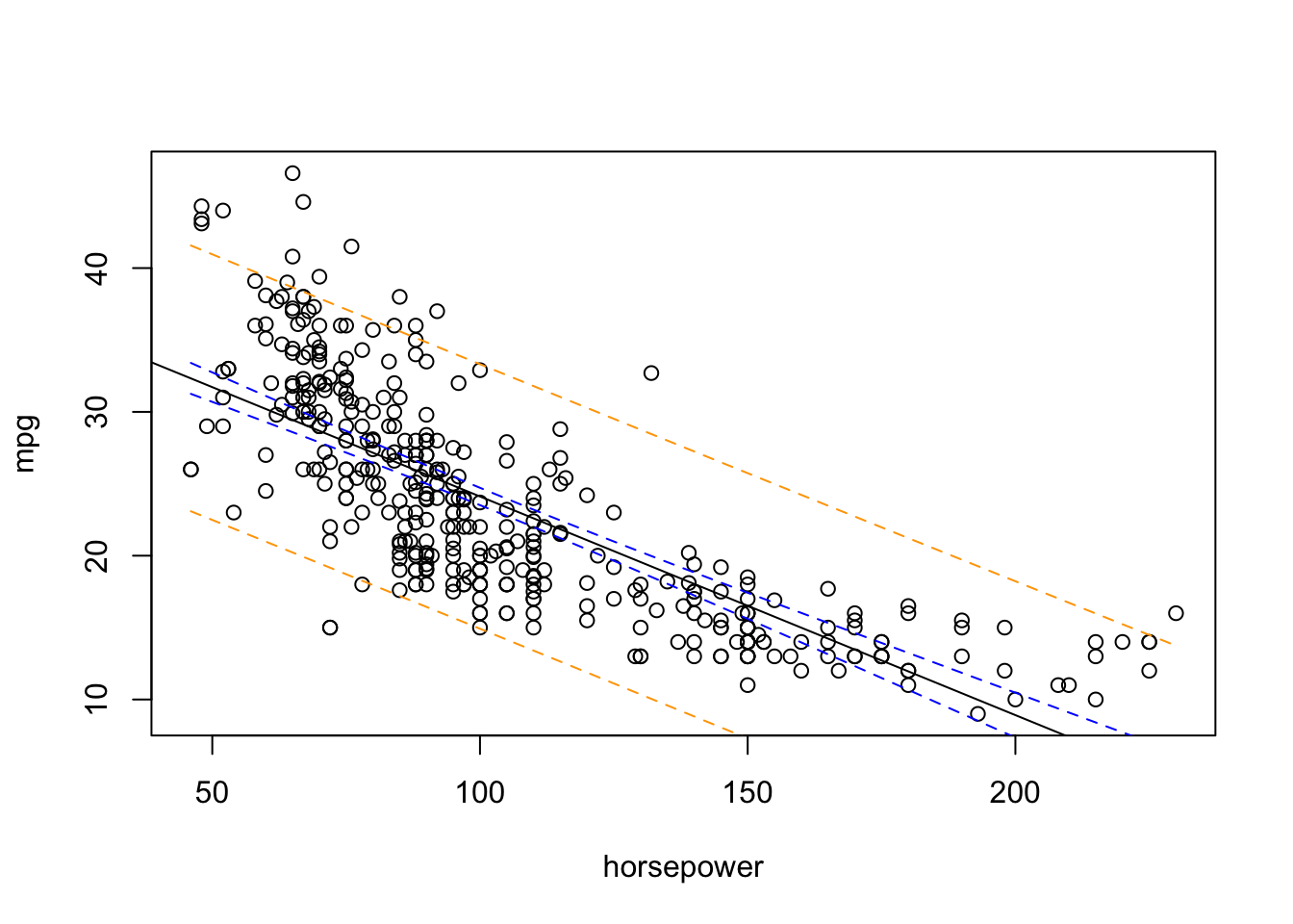
To create a band similar to the one we saw in lecture, you will need to create a sequence of plausible x values. For our purpose I will just take the observed range of hosepower values within our data set.
plot(mpg ~ horsepower, data = Auto)abline(fit1)# Create a new data frame for prediction intervalsnew_data <-data.frame("horsepower"=seq(min(Auto$horsepower), max(Auto$horsepower), length.out =100))# Confidence bandconf_interval <-predict(fit1, newdata=new_data, interval="confidence", level =0.95)head(conf_interval)
Prediction intervals are always wider than confidence intervals, because they incorporate both the error in the estimate for \(f(X)\) (the reducible error) and the uncertainty as to how much an individual point will differ from the population regression plane (the irreducible error)
Diagnostics
While the conclusions we made above may seem appropriate based on the R output, we would be amiss to not check the assumptions of this model before we jump to any conclusions. Recall that the assumptions for a linear regression model are that:
There exists an (at least approximate) linear relationship between \(Y\) and \(X\).
The distribution of \(\epsilon_i\) has constant variance.
\(\epsilon_i\) is normally distributed.
\(\epsilon_i\) are independent of one another. For example, \(\epsilon_2\) is not affected by \(\epsilon_1\).
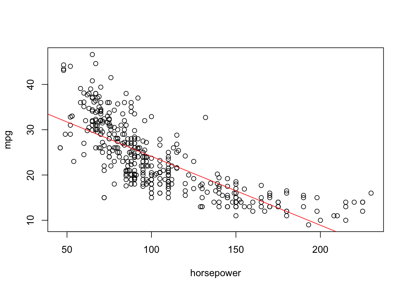
To check the first assumption, we may like to look at the scatterplot with the line of best fit. As demonstrated below, it would appear that the response and predictor variable have a curved relationship rather than a linear one.
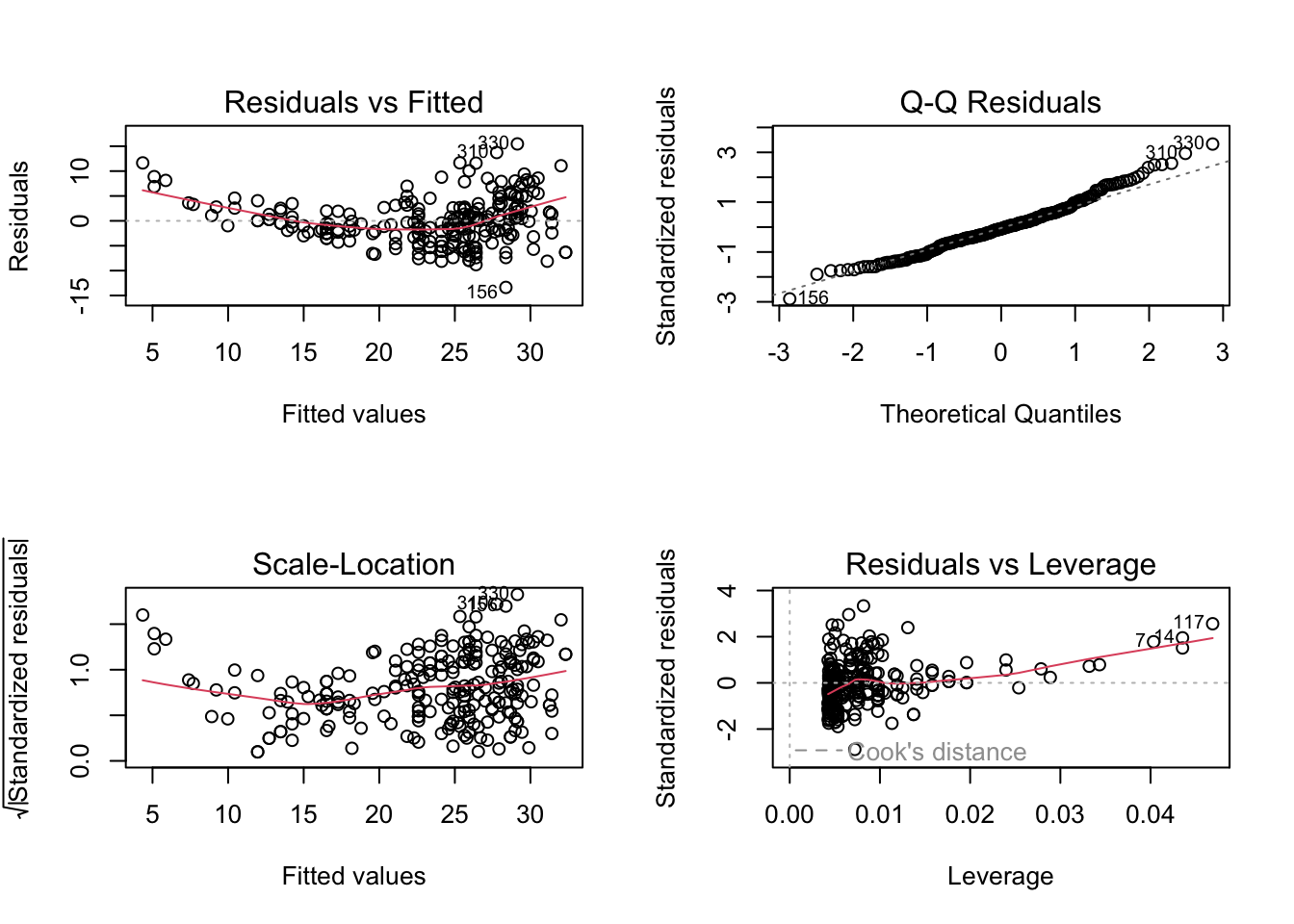
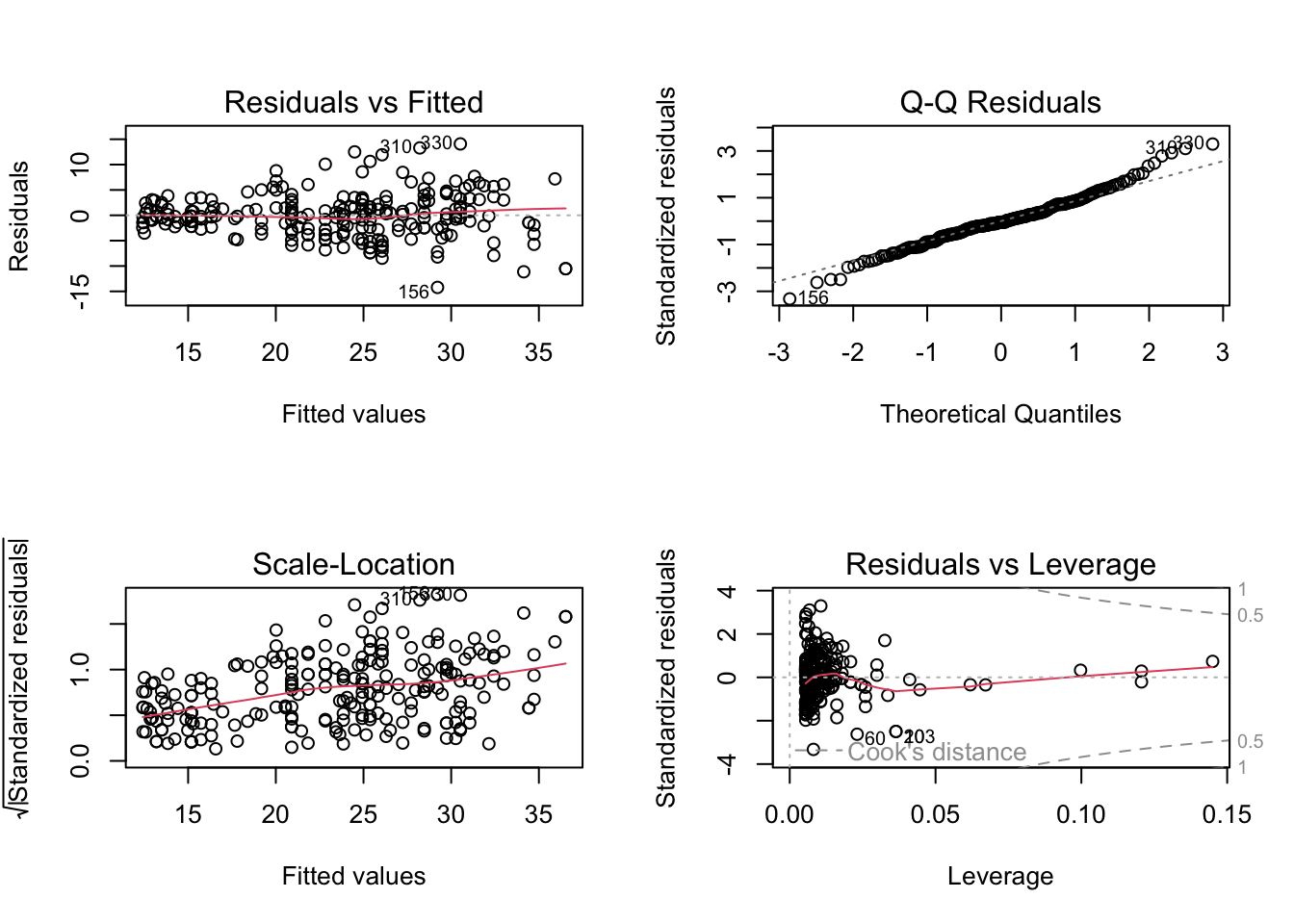
We could also explore the diagnostic plots produced when call plot() on the output of an lm() object. To see them all in one plot, let’s change the panel layout of our plot window to store 4 figures (in this case in a 2 by 2 matrix) (for more details see ?par). In other words we could call:
par(mfrow=c(2,2))plot(fit1)
A strong U-shaped pattern can be seen in the residual plot (located in top left corner) of the diagnostic plots below. This U-shape—and in general, any strong pattern—in the residuals indicates non-linearity in the data.
Polynomial Regression
We can extend the linear model to accommodate non-linearity by transforming predictor variables. For this particular example, the relationship between mpg and horsepower appears to be curved. Consequently, a model which includes a quadratichorsepower term, may provide a better fit.
Note that \(\sim\) in R indicates a formula object; for more details see ?formula. In formula mode, ^ is used to specify interactions (eg. ^2 denotes all second order interactions from the preceding term). So in order to use the caret to denote the arithmetic squared function, we need to insulate the term using the I() function. Alternatively, we could call/define a new variable, say hp2, that stores the squared values of hoursepower squared.
To fit this linear model—and YES this a linear model (i.e. a multiple linear regression model with \(X_1 =\)horsepower and \(X_2\) = horsepower\({}^2\) as predictors 1—we have a choice between the following two set-ups:
Unsurprisingly, this MSE test is lower than the MSE test obtained by the simple linear regression model.
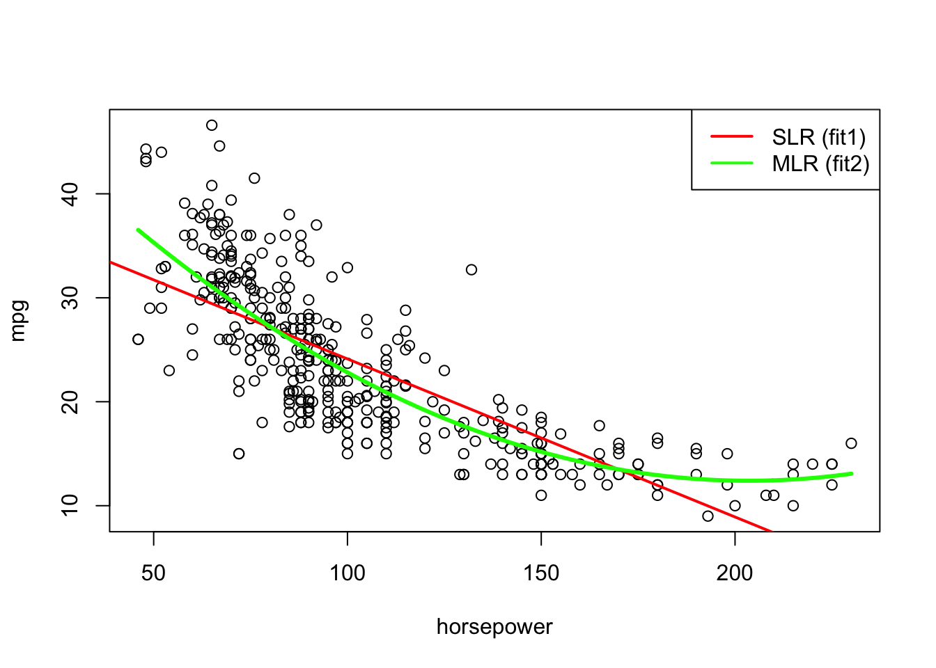
Lets compare the two fits on the scatterplot. It appears the fit with the squared horsepower is fitting the data much better:
# to create a smoother curve lets create a sequence# of plausible x values based on the range of x's in # our data frame:newdata <-data.frame(horsepower=seq(min(Auto$horsepower), max(Auto$horsepower), length.out =1000))newdata$pred1 <-predict(fit2, newdata)plot(mpg ~ horsepower, data = Auto)abline(fit1, col="red", lwd=2)lines(newdata$horsepower, newdata$pred1, col ="green", lwd=3)legend('topright', lwd =2,lty=1, col=c("red","green"), legend=c("SLR (fit1)","MLR (fit2)"))
Higher Order polynomial regression
We could now fit higher order terms (eg. horsepower\(^3\), horsepower\(^4\), ), however, we run the risk of overfitting. Note the use of poly() for creating higher-order polynomials. For instance, the eight-degree polynomial model (fit8) found below appears to be too wiggly. (This relates back to our bias and variance tradeoff).
As can be seen with the MSE test calculation below, this curve is not as generalizable as the second-degree polynomial regression model (i.e. fit2 with MSE test = 20.820224)
As we can see from the MSE test, the highly flexible tenth-degree polynomial regression model (fit6) obtains a lower MSE test than the simpler fifth-degree polynomial model (fit4) indicating that we entering the overfitting territory.
Sticking with fit2, we can now replot our diagnostic plots to investigate assumptions. The first assumption of linearity can be checked in the residual plots. Note that the 3d plotting of this data in R is not as straight forward as their 2d counterparts. But we visualize the linear assumption in MLR with 2 predictors as having points lying approximately on a 2D plane in our 3D space (having x, y, and z variables equal to horsepower, mpg and horsepower\(^2\), respectively).
par(mfrow=c(2,2))plot(fit2)
While there is no more curvature in our residual plots, we are prehaps seeing some evidence of heteroscedasticity In other words, assumption 2 may be violated. In addition, our QQ-plot suggests that the residuals are not normally distributed (we are seeing high amounts of deviation at the extremities).
Outliers and high leverage points
As seen in the Scale-Location graph, it appears there may also been some outliers in our data. Using the ISLR recommendation, we can check the observations whose studentized residuals and observe which ones are greater than 3.
which(rstudent(fit2)>3)
310 330
 40 148
It appears from the Residuals vs Leverage graph that a number of points could be high leverage points. To investigate the top, say 5, observations having the highest cooks distance, we could do the following:
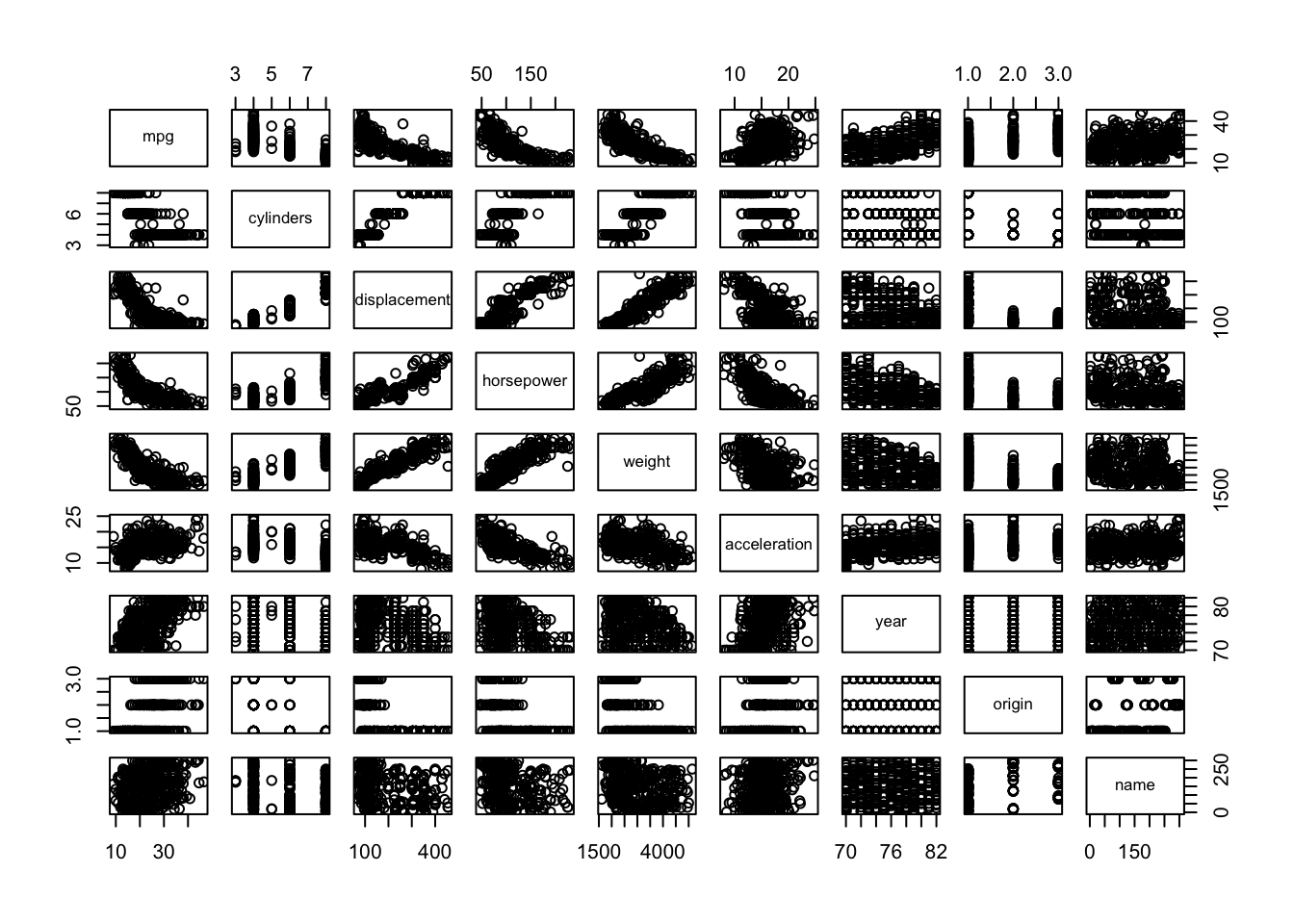
Now lets consider a MLR model using more predictors from the Auto data from above. We discussed in lecture how some of these predictor variables might be correlated with one another. To investigate this, lets have a look at a scatterplot matrix which includes all of the variables in the data set using the pairs() function.
pairs(Auto)
We can see that horespower and displacement for example are highly correlated. We might also decide to look at the matrix of correlations between the variables using the function cor().
# remove "name" (since it is not numeric)cor(Auto[,names(Auto)!="name"])
Notice that the correlation between horespower and displacement is very high (0.8972570) as is the correlation between cylinders and displacement is very high (0.9508233).
KNN Regression
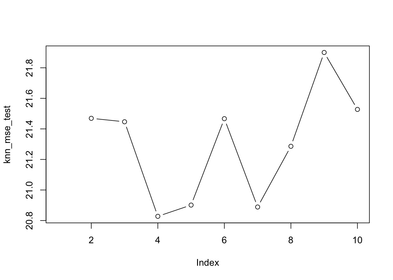
Below is the example from our KNN Regression example. We will be using the knnreg function from the carret package as a demo. There was some discussion in class about the best way we might choose \(K\). In practice the most common way to do this is to use cross-validation. While this will be covered later on in the course, for now, one solution we might just plot the error (e.g. MSE test) as a function of \(k\) and select the value of \(k\) corresponding to best, i.e. lowest MSE test.
library(caret)
Loading required package: ggplot2
Attaching package: 'ggplot2'
The following object is masked from 'Auto':

    mpg
Loading required package: lattice
train_data <- Auto[train, ]test_data <- Auto[-train, ] # same as Auto[test, ] knn_mse_test =NULLy = Auto[test,]$mpgfor (k in2:10){ kmod <-knnreg(mpg~horsepower, data = Auto, subset = train, k = k) yhat =predict(kmod, Auto[test,]) knn_mse_test[k] =mean((y - yhat)^2)}plot(knn_mse_test, type ="b")
In this case, since \(k\)=4 obtained the smallest MSE test, we would select the KNN model with 4 nearest neighours (which obtained a MSE test of 20.827562). We can plot the fitted model using:
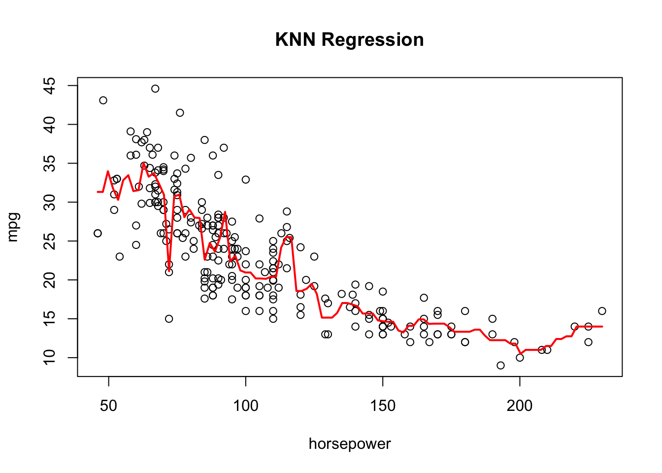
plot(mpg~horsepower, data=Auto[train,], main="KNN Regression")kmod4 <-knnreg(mpg~horsepower, data = Auto, subset = train, k =4)knn_yhat =predict(kmod4, new_data)lines(new_data$horsepower, knn_yhat, col="red", lwd=2)
Notably, this model still appears to be too “wiggly” and appears to be overfitting to the training set.
Conclusion
In this lab we’ve fitted six variations of the regression model, performed some diagnostic checks and compared results with the non-parameter KNN regression model. Overall, the best model (as determined by the MSE test) is the second order polynomial regression model.
\(MSE_{test}\)
Model
Fitted R object
27.703637
Simple linear regression
fit1
20.820224
Second order polynomial regression
fit2
21.2296584
Third order polynomial regression
fit3
20.9027872
Fifth order polynomial regression
fit4
20.8993936
Eighth order polynomial regression
fit5
20.923951
Tenth order polynomial regression
fit6
20.827562
KNN regression with \(k\)=4 nearest nighbours
kmod4
Footnotes
recall that we will include all higher and lower order terms because of the hierarchy principal↩︎