Lecture 14: Clustering
DATA 101: Making Prediction with Data
University of British Columbia Okanagan
Introduction
-
So far we have dealt with the following supervised problems based on patterns learned from labeled training data:
- classification where we use one or more variables to predict labels of a categorical variable of interest
- regression where we use one or more variables to predict value of a continuous variable of interest
- However, not all datasets come with pre-assigned labels, …
Clustering
-
Clustering is a method for exploring unlabeled data to identify patterns and potential groupings.
- .e.g. separate a data set of documents into groups that correspond to topics
This can be helpful at the exploratory data analysis stage as a tool for understanding complex datasets.
Cluster Assignments as Features
-
Even when data is labeled, these clusters can be used for many purposes, such as generating new questions or improving predictive analyses (via feature engineering).
- e.g cluster a data set of human genetic information into groups that correspond to ancestral subpopulations (which we later use a predictor in a classification problem involving some disease)
- In this course, clustering will be used only for exploratory analysis, i.e., uncovering patterns in the data.
Notation
- Clustering is a fundamentally different kind of task than classification or regression.
- In particular, both classification and regression are supervised tasks where there is a response variable (a category label or value), and we have examples of past data with labels/values that help us predict those of future data.
- By contrast, clustering is an unsupervised task, as we are trying to understand and examine the structure of data without any response variable labels or values to help us.
Blessing or curse?
This approach has both advantages and disadvantages.
-
Clustering requires unlabelled data which is inherently more easy to obtain than labelled data
- e.g. cancer data does not need to be assess and labelled by a physician
However the task of clustering is a lot more challenging since we don’t have labelled examples to guide us.
Assessment
- With classification, we can use a test data set to assess prediction performance.
- In clustering, there is no response variable, so it is not as easy to evaluate the “quality” of a clustering.
- In this course we will use visualization to ascertain the quality of a clustering, and leave rigorous evaluation for more advanced courses.
Clustering Algorithms
As with classification and regression, there are a there are many possible methods that we could use to cluster our observations to look for subgroups.
In this lecture, we focus one of the most popular (and easiest) methods; K-means algorithm (Lloyd 1982)
Palmer Penguins
As an illustrative example we use a data set from the palmerpenguins R package (Horst, Hill, and Gorman 2020).
This data set was collected by Dr. Kristen Gorman and the Palmer Station, Antarctica Long Term Ecological Research Site, and includes measurements for adult penguins found near there (Gorman, Williams, and Fraser 2014).
Sample
We focus on using two variables—penguin bill and flipper length (both in millimeters) and take a subset of 18 observations of the original data, which standardize.
Code
library(tidyverse)
library(tidymodels)

# Set a seed for reproducibility
set.seed(11630447)

# randomly sample 18 penguins
sampled_penguins = penguins %>%
  sample_n(18) %>%
  select(flipper_length_mm, bill_length_mm)

# standardized the two variables of interest
penguins_recipe <- recipe(~., data = sampled_penguins) %>%
  step_scale(all_numeric()) %>%
  step_center(all_numeric())

standardized_penguins <- penguins_recipe %>%
  prep() %>%
  bake(new_data = NULL)

# rename the columns (to match the book)
standardized_penguins <- standardized_penguins %>%
  rename(flipper_length_standardized = flipper_length_mm,
         bill_length_standardized = bill_length_mm)

standardized_penguins
Scatterplot
Next, we can create a scatter plot using this data set to see if we can detect subtypes or groups in our data set.
Visual Inspection
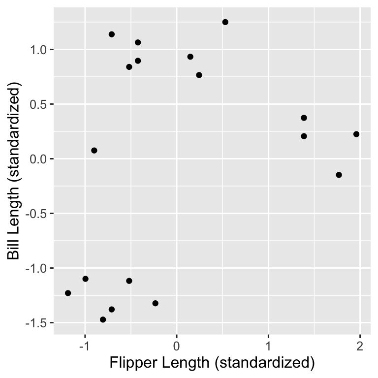
We might suspect there are 3 subtypes of penguins:
- small flipper and bill length group,
- small flipper length, but large bill length group, and
- large flipper and bill length group.
Moving to Automated approach
- Data visualization is a great tool to give us a rough sense of such patterns when we have a small number of variables.
- But if we are to group data—and select the number of groups—as part of a reproducible analysis, we need something a bit more automated.
- Additionally, finding groups via visualization becomes more difficult as we increase the number of variables we consider when clustering.
Clustering Algorithms
- The way to rigorously separate the data into groups is to use a clustering algorithm.
- We will focus on the K-means algorithm, a widely used and often very effective clustering method, combined with the elbow method for selecting the number of clusters.
- This procedure will separate the data into groups; the next slide shows these groups denoted by colored scatter points.
Clustering Results
Code
library(tidyclust)
kmeans_spec <- k_means(num_clusters = 3) |>
    set_engine("stats")

kmeans_fit <- workflow() |>
    add_recipe(penguins_recipe) |>
    add_model(kmeans_spec) |>
    fit(data = sampled_penguins)


clustered_data <- kmeans_fit |>
                    augment(sampled_penguins)

cluster_plot <- ggplot(clustered_data,
  aes(x = flipper_length_mm,
      y = bill_length_mm,
      color = .pred_cluster),
  size = 2) +
  geom_point() +
  labs(x = "Flipper Length",
       y = "Bill Length",
       color = "Cluster") +
  scale_color_manual(values = c("dodgerblue3",
                                "darkorange3",
                                "goldenrod1")) +
  theme(text = element_text(size = 12))

cluster_plot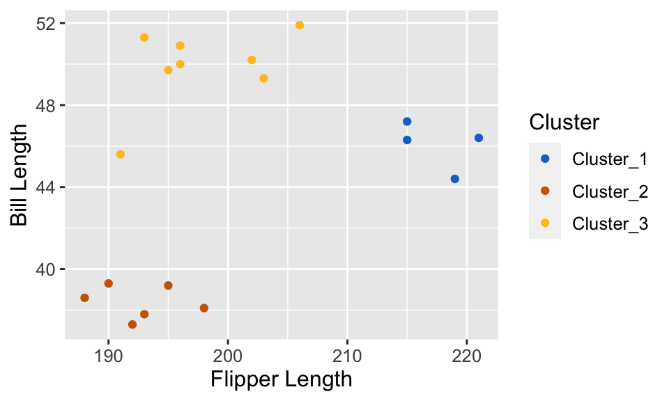
Understanding Clusters
- K-means, and clustering algorithms in general, will output meaningless cluster label (typically whole numbers: 1, 2, …)
- What these labels actually represent? Well, we don’t know (that’s what makes this an unsupervised problem!)
In simple where we can easily visualize date, we can give human-made labels based on their positions on the plot:
orange cluster: small flipper length and small bill length,
yellow cluster: small flipper length and large bill length,
blue cluster: large flipper length and large bill length.
K-means
K-means is a procedure that partitions a data into K distinct, non-overlapping subsets called clusters
The objective of this procedure is to minimize the sum of squared distances within each cluster (i.e. making the clusters as tight and compact as possible)
This within-cluster sum-of-squared-distances (WSSD) will also serve as a metric for assessing the “quality” of a partitions (i.e. the resulting cluster assignments).
K-means algorithm
- Initialization: Randomly select K centroids.
- Assignment: Assign each data point to the nearest centroid.
- Update: Recalculate centroids based on assigned points.
- Iteration: Repeat assignment and update steps until convergence.
See Alison Horst’s gif here
Key Parameters
- Like KNN, the user is asked to supply K (the number of desired clusters) upfront.
- In other words, K is a user-specified tuning parameter
- For KNN we saw how we can use cross-validation to decide on a good choice for it’s tuning parameter (also a \(k\) but there referring to the number of nearest neighbours)
- Unlike in classification, we have no response variable and cannot perform cross-validation with some measure of model prediction error.
Choosing K
- Underfitting: If you choose a small K, you may end up with clusters that are too broad and do not capture the underlying structure of the data.
- Overfitting: If you choose a large K, you might create clusters that are too specific, capturing noise in the data rather than meaningful patterns.
- For K-means we will use the common “elbow method” to determine the number of clusters.

Fig 9.10 from textbook: Clustering of the penguin data for K clusters ranging from 1 to 9. Cluster centers are indicated by larger points that are outlined in black.
Elbow Method
For each of the K-group solutions on the previous page we could calculate the total WSSD.
If we plot the total WSSD versus the number of clusters, we see that the decrease in total WSSD levels off (or forms an “elbow shape”) when we reach roughly the “right” number of clusters
Choosing the K that coincides with “elbow” point (i.e. where the reduction in sum of squared distances slows down) is called the “eblow method”.

Fig 9.12from textbook: Total WSSD for K clusters ranging from 1 to 9.
Pros and cons
Strengths
- Easy to understand and computationally efficient.
- Scalable, i.e. it works well with large datasets.
Limitations
- Sensitive to Initial Centroids
- Doesn’t perform well with non-spherical clusters.
Let’s look at the code
Practical Tips
As discussed in KNN (another distance-based approach), you should always consider standardizing variables before applying K-means.
Due to the random nature of this algorithm, it is suggested to run K-means multiple times (with different initializations) and choose the best (in terms of WSSD) result.
–>
–>
–>
–>
–>