library(tidyverse)
library(tidymodels)
sacramento <- read_csv("data/sacramento.csv")

# Split into training and testing
set.seed(1234)
sacramento_split <- initial_split(sacramento, prop = 0.75, strata = price)
sacramento_train <- training(sacramento_split)
sacramento_test <- testing(sacramento_split)Lecture 13: Linear Regression
DATA 101: Making Prediction with Data
Dr. Irene Vrbik
University of British Columbia Okanagan
Outline
- We have solved all our predictive problems—both classification and regression—using K-nearest neighbors (KNN)-based approaches.
- In the context of regression, there is another commonly used method known as linear regression.
- Today we cover the basic concept of linear regression, how to use them using tidymodels, and its strengths and weaknesses.
Introduction
- Like KNN regression, simple linear regression involves predicting a numerical response variable (like race time, house price, or height).
- How it makes those predictions for a new observation is quite different from KNN regression.
- Instead of looking at the \(k\) nearest neighbors and averaging over their values for a prediction, simple linear regression creates a line of best fit through the training data and makes prediction using the line.
Simple Linear Regression
- Linear regression is a statistical method used to model the relationship between a dependent variable and one or more independent variables by fitting a linear equation to the observed data.
- “Simple” linear regression (or SLR for short) involves only one predictor (aka independent) variable and one1 response (aka dependent) variable.
Sacramento housing data
Let’s return to the Sacramento housing data and remind ourselves of the predictive question:
Can we use the size of a house in the Sacramento, CA area to predict it’s sale price?
To answer this question using SLR, we need to draw a straight line that best fits our training data points.
Data
As per usually, we will start by splitting our data into a trainging and testing set.
Data frame
Scatterplot
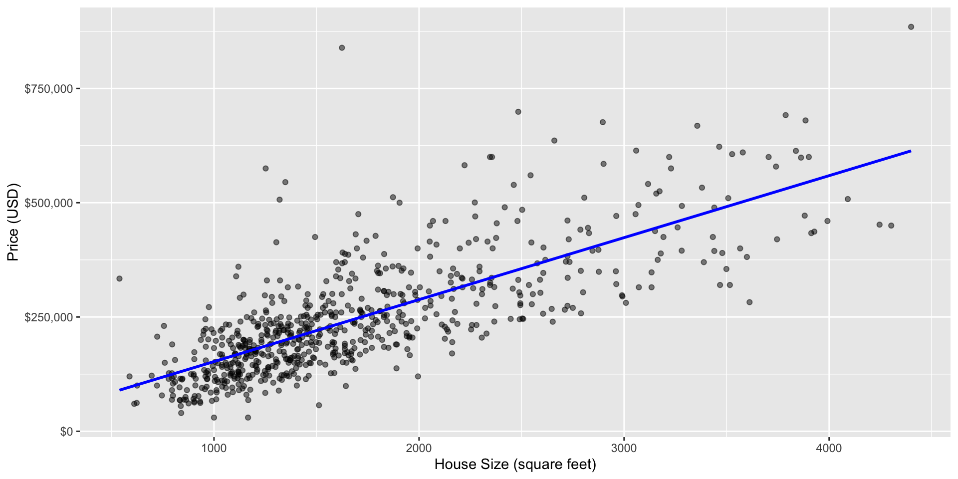
Scatter plot of sale price versus size with line of best fit
Equation of the Line
The equation for the straight line is:
\[ \text{house sale price} = \beta_0 + \beta_1 \cdot(\text{house size (square feet)}) \] where
- \(\beta_0\) is the \(y\)-intercept (the price when house size = 0)
- \(\beta_1\) is the slope (the change in price as you increase house size)
Parameters
- The \(\beta\)s are the so-called parameters of our model, often referred to as regression coefficients.
- Using the data to find the line of best fit is equivalent to finding coefficients \(\beta_0\) and \(\beta_1\) that parametrize (correspond to) the line of best fit.
Interpreting Coefficients
The slope indicates the average change in \(Y\) for every 1 unit increase in \(X\)
- In our example the slope, \(\beta_1\), indicates the average change in price for each additional square-foot.
The y-intercept, \(\beta_0\), is the predicted value of \(Y\) when \(X\) is zero
- In our context (and many practical examples), this is not very meaningful; a house cannot be 0 square-feet!
Prediction
Once we have estimates of the coefficients (denoted by \(\hat \beta_i\)), we can predict the price of a new house, say with 2,000 square feet by plugging it into the equation
\[\begin{align*} \text{house sale price} &= \hat\beta_0 + \hat\beta_1 \cdot(\text{house size (square feet)}) \end{align*}\]Graphically, predictions will always lie on the line of best fit …
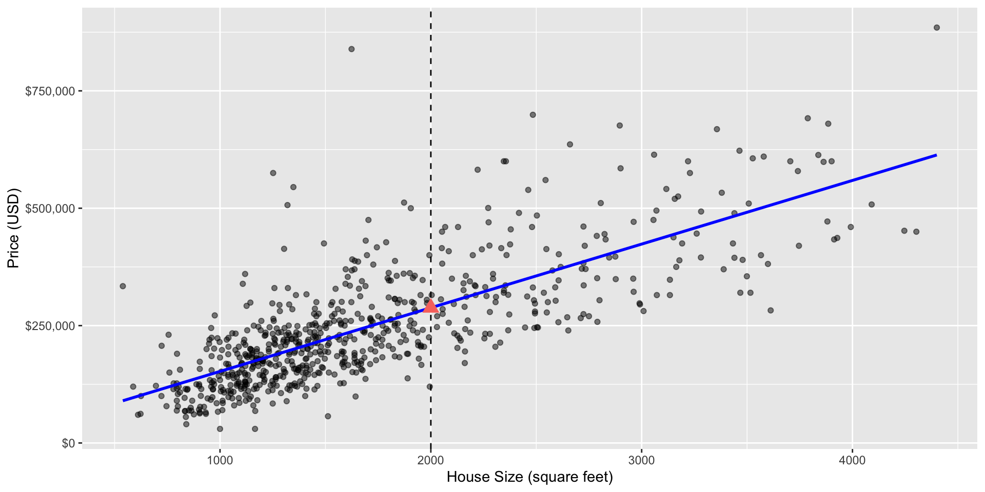
Scatter plot of sale price versus size with line of best fit and a red triangle at the predicted sale price for a 2,000 square-foot home.
Line of “best” fit
- The line that best represents the relationship between the independent and dependent variables.
- It is used for making predictions and understanding the strength and direction of the relationship.
- The “best” line is that one that that minimizes the sum of squared differences between observed and predicted values.
Plotted Differences

Scatter plot of sale price versus size with red lines denoting the vertical distances between the predicted values and the observed data points (this was taken on a smaller subset of the scramento data plotted in Fig 8.4 of the textbook).
Linear regression in R
We can perform simple linear regression in R using tidymodels in a very similar manner to how we performed KNN regression
Recall for tidymodels, we need to specify the type (model function), mode (classification or regression), and engine (aka package)
You can see in the parnsip look-up table that we have many engine options but we will use the most common:
lm
Model specification
Putting these together in a workflow:
A note on pre-processing
You will notice that we did not standardize (aka , i.e. scale and center) our predictors.
In linear regression, standardize does not affect the fit1
So you can standardize if you want but if you leave the predictors in their original form, the coefficients are usually easier to interpret
Model output
══ Workflow [trained] ══════════════════════════════════════════════════════════
Preprocessor: Recipe
Model: linear_reg()

── Preprocessor ────────────────────────────────────────────────────────────────
0 Recipe Steps

── Model ───────────────────────────────────────────────────────────────────────

Call:
stats::lm(formula = ..y ~ ., data = data)

Coefficients:
(Intercept)         sqft
    16872.4        135.6
Fitted line
Our estimated coefficients are (intercept) \(\hat \beta_0\) = 1.6872403^{4} and \(\hat \beta_1\) (slope) 135.578479. This means that the equation of the line of best fit is
price = 16,872.4 + 135.58 \(\times\) sqft
In words” the model predicts that houses start at $12,292 for 0 square feet, and that every extra square foot increases the cost of the house by $140.
Coefficients
Alternatively you can extract your coefficients using the following code:
Prediction
Finally, we predict on the test data set to assess how well our model does:
Evalution
Let’s extract some useful metrics to see how well the model is performing.
Visualization
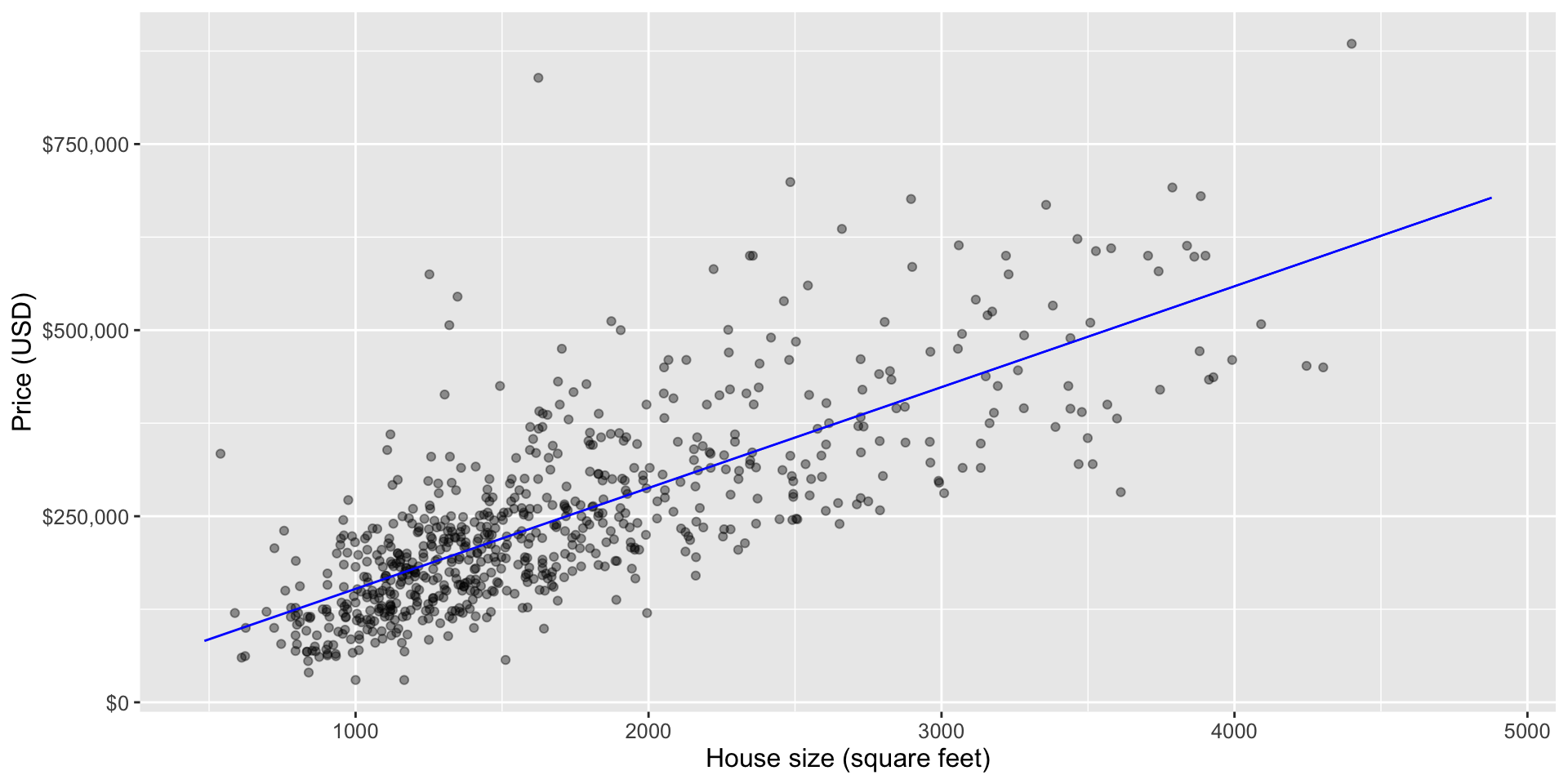
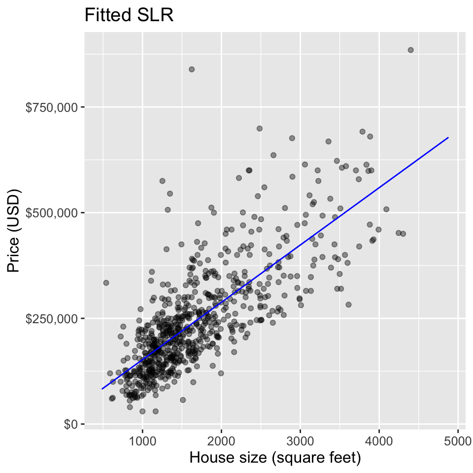
To visualize the simple linear regression model, we can plot the predicted house sale price across all possible house sizes we might encounter.
Since our model is linear, we only need to compute the predicted price of the minimum and maximum house size, and then connect them with a straight line.
We superimpose this prediction line on a scatter plot of the original housing price data, so that we can qualitatively assess if the model seems to fit the data well.
Plotting the fitted regression line
sqft_prediction_grid <- tibble(
    sqft = c(sacramento |> select(sqft) |> min(), # min square-feet
        sacramento |> select(sqft) |> max()))     # max square-feet

sacr_preds <- lm_fit |>             # predict on grid
  predict(sqft_prediction_grid) |>
  bind_cols(sqft_prediction_grid)

lm_plot_final <- ggplot(sacramento_train, aes(x = sqft, y = price)) +
  geom_point(alpha = 0.4) +
  geom_line(data = sacr_preds, color = "blue",
            mapping = aes(x = sqft, y = .pred)) +
  xlab("House size (square feet)") + ylab("Price (USD)") +
  scale_y_continuous(labels = dollar_format()) +
  theme(text = element_text(size = 12))

lm_plot_final
Plotting the fitted regression line
Smooth
Note that this is the same plot that is produced when you run the following:
Smooth
Comparing SLR and KNN
Now that we have a general understanding of simple linear and KNN regression, we can compare and contrast these methods as well as the predictions made by them.
To start, let’s look at the visualization of the simple linear regression model predictions for the Sacramento real estate data (predicting price from house size) and the “best” KNN regression model obtained from the same problem discussed last lecture
KNN regression code
## -----------------------------------------------------------------------------
sacr_recipe <- recipe(price ~ sqft, data = sacramento_train) |>
  step_scale(all_predictors()) |>
  step_center(all_predictors())


## -----------------------------------------------------------------------------
sacr_spec <- nearest_neighbor(weight_func = "rectangular",
                              neighbors = tune()) |>
  set_engine("kknn") |>
  set_mode("regression")


## -----------------------------------------------------------------------------

set.seed(4123456)
sacr_vfold <- vfold_cv(sacramento_train, v = 5, strata = price)

sacr_wkflw <- workflow() |>
  add_recipe(sacr_recipe) |>
  add_model(sacr_spec)


## -----------------------------------------------------------------------------


set.seed(4851670)
gridvals <- tibble(neighbors = seq(from = 1, to = 200, by = 3))

sacr_results <- sacr_wkflw |>
  tune_grid(resamples = sacr_vfold, grid = gridvals) |>
  collect_metrics() |>
  filter(.metric == "rmse")


## -----------------------------------------------------------------------------

# rmspe_vs_k <- ggplot(sacr_results, aes(x = neighbors, y = mean)) +
#   geom_point() +
#   geom_line() +
#   labs(x = "Number of Nearest Neighbors (K)", y = "RMSPE Estimate")


## -----------------------------------------------------------------------------

# show only the row of minimum RMSPE
sacr_min <- sacr_results |>
  filter(mean == min(mean))

## -----------------------------------------------------------------------------


# rmspe_vs_k + geom_vline(xintercept = sacr_min$neighbors, linetype = "dotted") +
#   geom_text(aes(x = sacr_min$neighbors, y = 100000, label = paste("K =", sacr_min$neighbors)))


## -----------------------------------------------------------------------------

kmin <- sacr_min |> pull(neighbors)

sacr_spec <- nearest_neighbor(weight_func = "rectangular",
                              neighbors = kmin) |>
  set_engine("kknn") |>
  set_mode("regression")

sacr_fit <- workflow() |>
  add_recipe(sacr_recipe) |>
  add_model(sacr_spec) |>
  fit(data = sacramento_train)

## -----------------------------------------------------------------------------
sacr_summary <- sacr_fit |>
  predict(sacramento_test) |>
  bind_cols(sacramento_test) |>
  metrics(truth = price, estimate = .pred) |>
  filter(.metric == 'rmse')


## -----------------------------------------------------------------------------

# range of plausible house sizes
sqft_prediction_grid <- tibble(
    sqft = seq(
        from = sacramento |> select(sqft) |> min(),
        to = sacramento |> select(sqft) |> max(),
        by = 10
    )
)

# predicted price of these hypothetical houses
sacr_preds <- sacr_fit |>
  predict(sqft_prediction_grid) |>
  bind_cols(sqft_prediction_grid)

# scatter plot of price vs. square footage
plot_final <- ggplot(sacramento, aes(x = sqft, y = price)) +
  geom_point(alpha = 0.4) +
  # superimpose prediction line
  geom_line(data = sacr_preds,
            mapping = aes(x = sqft, y = .pred),
            color = "blue") +
  xlab("House size (square feet)") +
  ylab("Price (USD)") +
  scale_y_continuous(labels = dollar_format()) +
  ggtitle(paste0("K = ", kmin)) +
  theme(text = element_text(size = 12))
Linear Example

Comparison of SLR and KNN
SLR RMSPE= 85603.6 and KNN RMSPE= 89985.31
- Recall that the RMSPE is calculated from predicting on the test data set that was not used to train/fit the models.
- The RMSPE for SLR is slightly lower (i.e. better) than KNN’s.
- Considering that the SLR model is also more interpretable, we would likely choose to use the SLR over KNN for this example
Extrapolation
Predicting outside the range of the observed data is known as extrapolation; as seen, the models behave differently:
- KNN becomes “flat” at the boundaries. Since price likely continues to grow with size, this likely doesn’t match reality.
- SLR predicts a constant slope which may predicted a negative price for a small house which is nonsensical.
Warning
Extrapolation should be approached with extreme caution, especially when the underlying process may change, and assumptions may no longer hold.
Linear vs KNN Regression
Linear Regression
- Pro: Interpretability, e.g. slope: change in \(Y\) for a one-unit change \(X\).
KNN Regression
- Con: Lack of interpretibility
- Con: assumptions of linearity
- Pro: Can model non-linear relationships
Non-linear example

In this example, the relationship between x and y is nonlinear (sinusoidal). SLR assumes a linear relationship and may not capture the underlying pattern well. KNN, is more flexible and able to approximate the nonlinearity, potentially providing a better fit to the data.
Non-linear relationships
When the relationship between the response and the predictor is not linear, KNN regression may fare better.
SLR will underfit (have high bias), meaning that model/predicted values do not match the actual observed values very well.
Models that underfit tend to have a high RMSPE when assessing model prediction quality on a test data set AND a high RMSE on the training data.
Multivariate Linear Regression (MLR)
Real-world scenarios often involve multiple factors influencing the outcome.
As in KNN classification/regression, we can move beyond the “simple” case of only one predictor to multiple predictors, known as multivariable (or multivariate) linear regression.
MLR can improve predictions by allowing us to handle complex relationships and gain a more comprehensive understanding of the relationships within the data.
A note about multiple variables
Warning
Having more predictors is not always better
We have the same concerns regarding multiple predictors as in the settings of KNN regression/classification.
Section 6.8 offers some strategies on how to pick a subset of useful variables as well as how irrelevant variables can influence the performance of a model.
While this is an important topic, it is beyond the scope of the course.
Equation of the Line
The equation for multiple linear regression may now look like this:
\[ \texttt{price} = \beta_0 + \beta_1 \cdot(\texttt{sqft}) + \beta_2 \cdot(\texttt{beds}) \] where
- \(\beta_0\) is the \(y\)-intercept (the price when house size = 0)
- \(\beta_1, \beta_2\) are the regression coefficients associated house size (in square-feet) and the number of bedrooms, respectively.
Multivariate Regression in R
To do this, we follow a very similar approach to what we did for KNN regression: we just add (using
+) more predictors to the model formula in the recipe.Recall: we do not need to use cross-validation to choose any parameters, nor do we need to standardize (i.e., center and scale) the data for linear regression.
MLR visualization
MLR Sacramento Fit
mlm_recipe <- recipe(price ~ sqft + beds, data = sacramento_train)

mlm_fit <- workflow() |>
  add_recipe(mlm_recipe) |>
  add_model(lm_spec) |>
  fit(data = sacramento_train)

mlm_fit
══ Workflow [trained] ══════════════════════════════════════════════════════════
Preprocessor: Recipe
Model: linear_reg()
── Preprocessor ────────────────────────────────────────────────────────────────
0 Recipe Steps
── Model ───────────────────────────────────────────────────────────────────────
Call:
stats::lm(formula = ..y ~ ., data = data)
Coefficients:
(Intercept) sqft beds
60525.9 156.1 -23731.2 MLR Parameters
Equation
We can fill in the estimated values into our equation: \[\begin{align*} \texttt{price} &= \hat\beta_0 + \hat\beta_1 \cdot(\texttt{sqft}) + \hat\beta_2 \cdot(\texttt{beds}) \\ &= 60526+ 156 \cdot(\texttt{sqft}) - 23731 \cdot(\texttt{beds}) \\ \end{align*}\]
- \(\hat \beta_0\) is the vertical intercept of the hyperplane (the price when both house size and number of bedrooms are 0)
- \(\hat \beta_1\) is the slope for the first predictor (how quickly the price changes as you increase house size, holding number of bedrooms constant)
- \(\hat \beta_2\) is the slope for the second predictor (how quickly the price changes as you increase the number of bedrooms, holding house size constant)
Comparing between models
As discussed earlier, more predictors does not necessarily imply a better model.
We should question how well multivariable linear regression is doing as compared to the other tools we have, such as SLR and multivariable KNN regression.
To make this comparison we can compare the prediction error of the methods on the test data, i.e. the RMSPE for each of the models.
MLR Test Predictions
Model comparison
Comparing the with RMSPEs from before, MLR obtains the smallest prediction error, indicating that two predictors provided a slightly better fit on test data than our model with just one.
| model | RMSPE |
|---|---|
| KNN regression | 85603.60 |
| Simple Linear Regression | 89985.31 |
| Muliple linear regression | 83332.36 |
Word of Warning
The addition of predictors to a model may sometimes lead to a decrease in performance
Two common scenarios where this can occur are when dealing with outliers and collinear predictors.
Outliers
Outliers are data points that deviate significantly from the overall pattern of the data.
When not handled properly, they can disproportionately influence the model’s parameter estimates, leading to a model that is overly influenced by extreme observations.
This can result in poor generalization to new, unseen data and decreased overall model performance.

Fig 8.8 from textbook: Scatter plot of a subset of the data, with outlier highlighted in red.

Fig 8.9 from textbook: Scatter plot of the full data, with outlier highlighted in red. Notice the affect of this outlier is less when we have more data.
Collinear Predictors:
Collinearity (or multicollinearity) is when two or more predictor variables in a model are highly correlated1
This relationship can lead to issues in the estimation of the regression coefficients, and it affects the interpretation and reliability of the model.
To put another way, small changes to the data can results in large changes in the estimated coefficients that describe the plane of best fit.

Fig 8.10 from textbook: Scatter plot of house size (in square feet) measured by person 1 versus house size (in square feet) measured by person 2.
Sacramento Data
Rerunning linear regression model on three different subsets of the date, we get very coefficients:
\[\begin{align*} \texttt{price} = 3682 + 312\cdot\texttt{sqrt1} + 182 \cdot\texttt{sqrt}\\ \texttt{price} = 20596 + 312\cdot\texttt{sqrt1} -172 \cdot\texttt{sqrt}\\ \texttt{price} = 6673 + 312\cdot\texttt{sqrt1} + 104 \cdot\texttt{sqrt} \end{align*}\]Collinearity happens quite commonly in practice
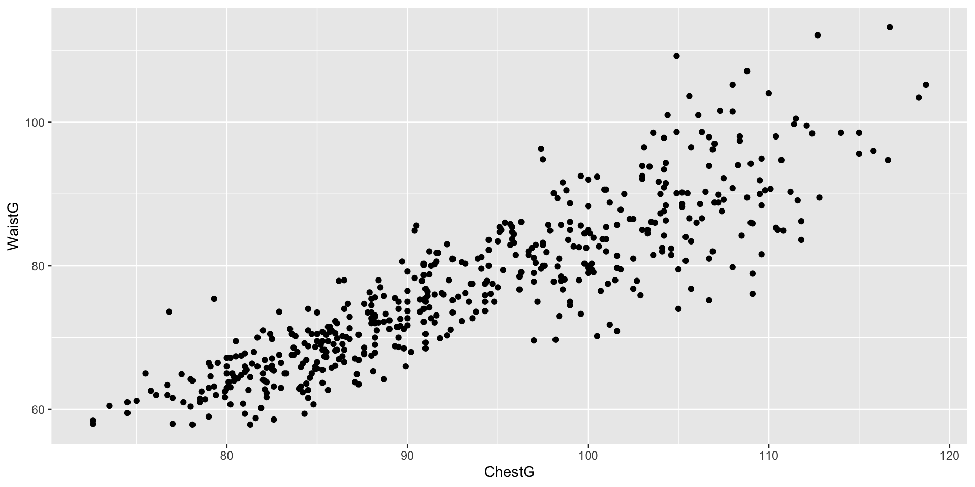
Example of two predictors from the body dataset from the gclus package.
Designing new predictors
- There are a wide variety of cases where the predictor variables do have a meaningful relationship with the response variable, but that relationship does not fit the assumptions of the regression method you have chosen.

For example, a data frame df with two variables—x and y—with a nonlinear relationship between the two variables will not be fully captured by simple linear regression

Instead of trying to predict the response y using a linear regression on x, we might try to regress y on a cubic function of x
Feature Engineering
-
So before performing regression, we might create a new predictor variable
zusing the mutate function: The process of transforming predictors (and potentially combining multiple predictors in the process) is known as feature engineering.
Comments
The process of transforming predictors (and potentially combining multiple predictors in the process) is known as feature engineering1
This will rely on a deep understanding of the problem as well as the models.
Warning
Note: Feature engineering is part of tuning your model, and as such you must not use your test data to evaluate the quality of the features you produce. You are free to use cross-validation, though!
Comments