A stepping stone for developing modes: help to refine/determine parameters and test assumptions
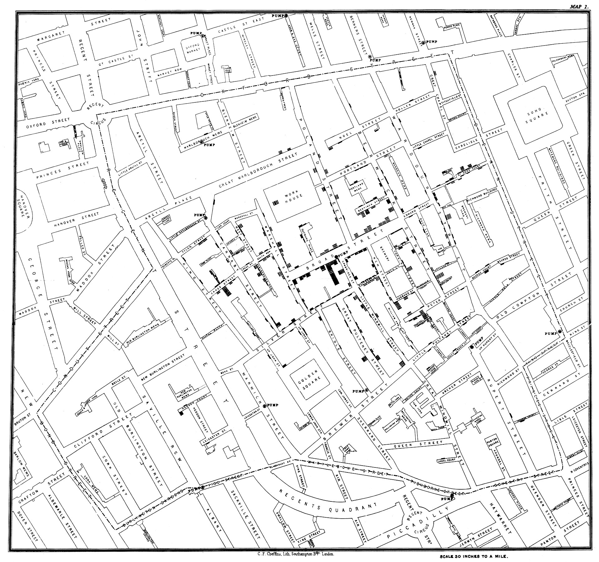
Cholera Outbreak
The dot plot used by John Snow to illustrate the cluster of cholera cases around the pump on Broad Street. Image source: [Wikipedia (John Snow, 2023)]
John Snow
Minimize Noise
Colours: use sparingly; too many can be distracting, create false patterns, and detract from the message.
Overplotting: when multiple data points overlap to the extent that individual points cannot be distinguished.
Size: Only make the plot area (where the dots, lines, bars are) as big as needed. Simple plots can be made small.
Axis manipulation: don’t adjust the axes to zoom in on small differences.
EU labour market
A bar chart created by the German economic development agency GTAI which boasts that German workers are more motivated and work more hours than do workers in other EU nations. Data scoure: Eurofound 2014
Do you think it is fair to say that Germans are more motivated and work more hours than do workers in other EU nations?
In this way, we have a series of R commands which “build-up” our graphic until we are satisfied with it.
Advantages of ggplot2
Consistency and Clarity: produces clearer and more organized code, making it easier to understand and reproduce your plots.
Layered Approach: uses a layered approach where you add different components (geometric objects, statistical transformations, facets) to build a plot step by step.
Data-Driven Aesthetics: You can map data variables to aesthetics like color, size, and shape, creating dynamic visualizations where the plot adapts to changes in your data.
Faceting: provides built-in support for faceting, allowing you to split data into multiple subplots based on one or more categorical variables.
Community and Ecosystem large and active user community, which means that you can find ample resources, tutorials, and support.
Reproducibility: The structured nature of ggplot2 code and the fact that it’s based on R means that your plots can be part of reproducible workflows.
qplot
qplot() is a shortcut designed to be familiar if you’re used to base plot()
The basic syntax looks like this:
library(ggplot2)qplot(x,y, ..., data)
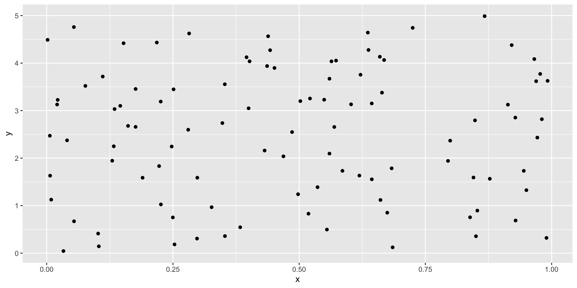
Example: scatter plot
We can recreate the scatter plot from using qplot() using the following code: (output on next slide)
As you may notice, plots produced in ggplot2 have a very distinct look from the ones made in base.
Faceting
qplot() can create multi-panel plots using facets. We can specify our desired groups using y~x.
y~. creates a single row of plots with each panel corresponding to a unique levels of y (i.e. the row faceting variable)
.~x creates a single column of plots with each panel corresponding to a unique levels of x (i.e. the column faceting variable)
|y~x| forms a matrix of plots whose rows and columns represents a combination of the levels of x and y
Facets
Facets are a powerful feature in data visualization that allow you to split a single plot into multiple smaller subplots based on one or more categorical variables.
Faceting enables you to compare and contrast different subsets of your data within the same visualization.
Faceting in qplot() accepts a formula
It uses facet_wrap() or facet_grid() depending on whether the formula is one- or two-sided
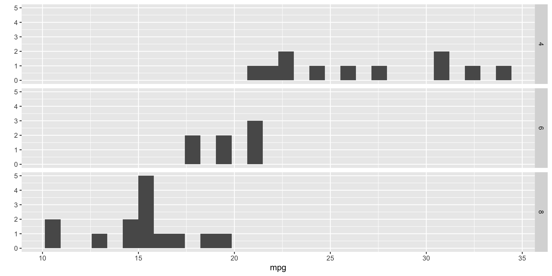
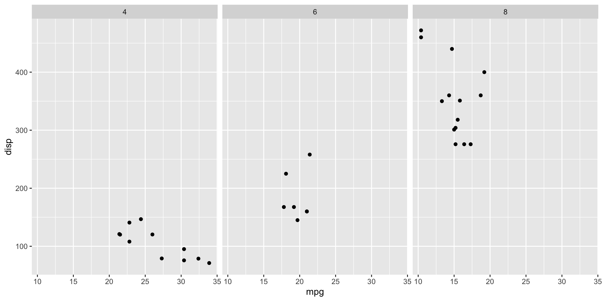
Example: mtcars
Let’s plot the side-by-side scatter plots for mpg (Miles/(US) gallon) vs. disp (Displacement (cu.in.)) for each cyl (Number of cylinders: 4, 6, 8) in the mtcars data set.
Notice that when we just specify one variable, qplot() plots a histogram rather than a scatter plot
When cyl appears on the left-hand side of the tilde the subplots are plotted row-wise (i.e. along the \(y\)-axis)
When cyl appears on the right-hand side of the tilde the subplots are plotted column-wise (i.e. along the \(x\)-axis)
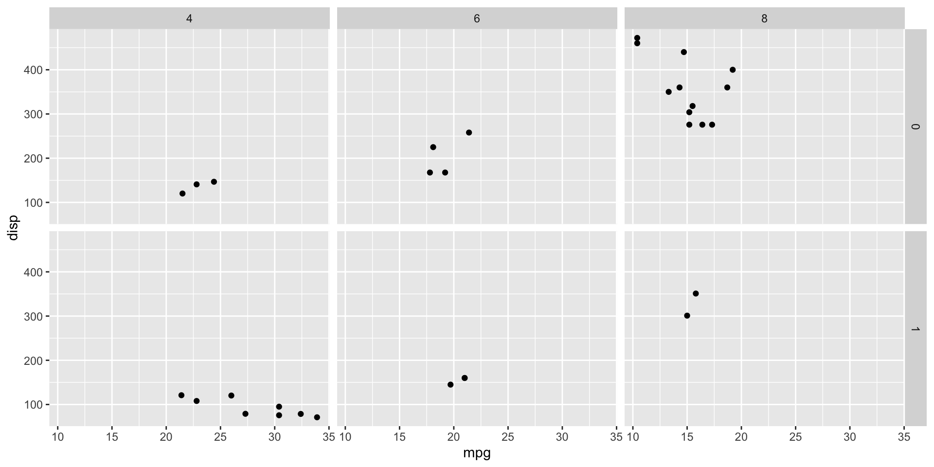
We can faceting with two discrete variables using the y~x formula
Faceting with two discrete variables
qplot(mpg, disp, data = mtcars, facets = am~cyl)
Colours
Rather than representing this information in distinct side-by-side plots, I may want to create a single plot and and distinguish the groups of 4, 6, and 8 cylinder cars using colours or shapes.
In ggplot2 terms, we could change the colour aesthetics (latter referenced as aes) according the to factor cyl.
ggplot2 will automatically pick the colours, and the displays the legend.
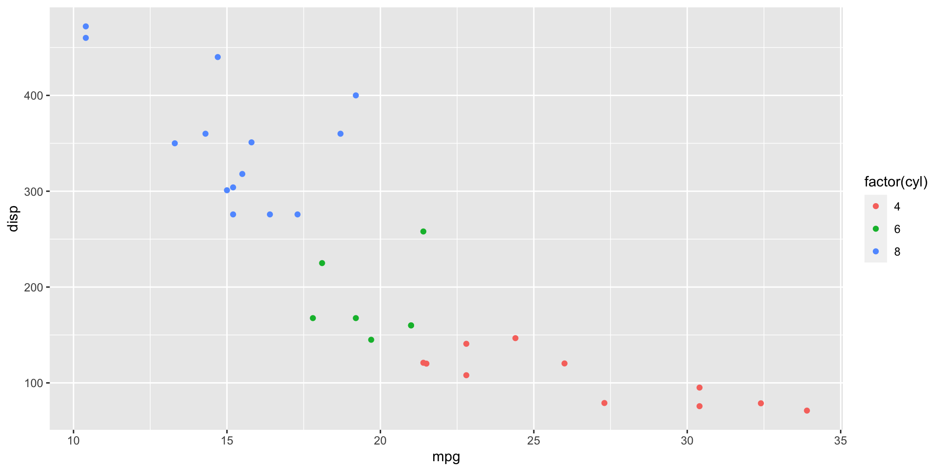
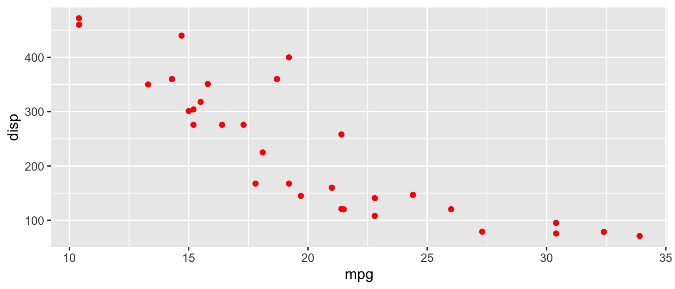
Scatterplot with colour legend
qplot(mpg, disp, data = mtcars, color =factor(cyl))
A scatter plot for mpg vs. disp (displacement) where points are coloured according to cyl type
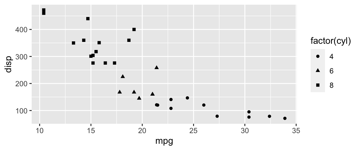
Scatterplot with shape legend
We could have distinguished our cylinders by shapes instead.
qplot(mpg, disp, data = mtcars, shape =factor(cyl))
Note: to control the size and aspect ratio of plots use the fig.width and fig.height. Theout.width` chunk option is used to control the display width of the generated plot when it is embedded in the final document
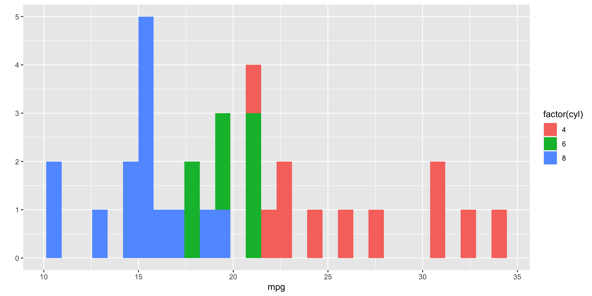
Stacked histogram
What might you expect the following code to produce?
Rather than specifying graphical features of our plot with arguments in a function, we will add them (literally by using +) to a ggplot object layer by layer.
Grammar of Graphics
The Grammar of Graphics is a foundational framework for creating data visualizations.
It provides a structured approach to visualizing data, emphasizing the importance of consistency and repeatability in creating graphics.
The concept was introduced by Leland Wilkinson and is implemented in various data visualization libraries, including ggplot2 in R. The
Key components
Required:
Data: The dataset you want to visualize.
Aesthetic Mapping: How data variables are mapped to visual properties (e.g., x and y positions, colors, sizes).
Geometric Objects: The shapes and marks used to represent data points (e.g., points, lines, bars).
Optional:
Statistical Transformation: Optional data summarization or transformation (e.g., mean, median).
Facets: How data is split into subplots for easier comparison.
Coordinates: The system that specifies how data points are arranged in the plot (e.g., Cartesian, polar).
Identify your data and basic aestheics (identify \(x\) and \(y\) variables for example)
Save this to an R object (which will be ggplot class); standard convention is to call this object g.
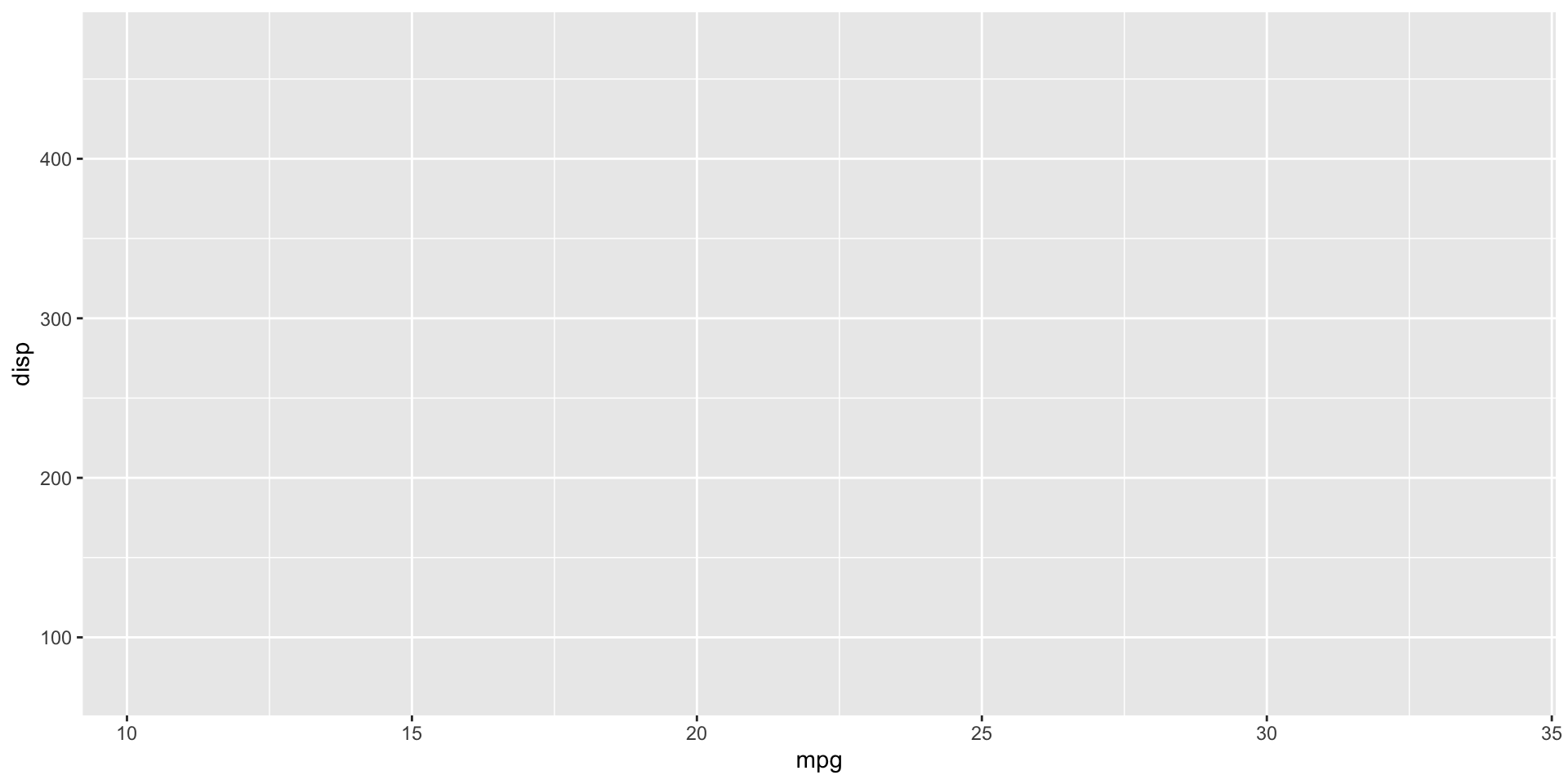
library(ggplot2)g =ggplot(mtcars, aes(mpg, disp)) # this will not plot anythingclass(g)
[1] "gg" "ggplot"
Blank canvas
ggplot(mtcars)
Axis
ggplot(mtcars, aes(mpg, disp))
g
Let’s save this to an object:
# this will not plot anything# mpg is on the x-axis# disp is on the y-axisg =ggplot(mtcars, aes(mpg, disp)) # need to call the ggplot # object to plot/view
At minimum a ggplot requires: data, a geom function, and aes mapping.
Geometric markings
Now we will need to add geometric markings on this plot using some <GEOM_FUCNTION>. Examples include:
geom_point() creates geometric points
geom_bar() creates barplots
geom_boxplot() creates a boxplot
geom_histogram() creates a histogram
geom_density() creates a smoothed density estimates
Adding layers
To add the geometric object layers we could write:
g +geom_point()
geom smooth
We can keep adding on layers, e.g. let’s add a smoothed line or curve to a scatter plot, helping to visualize trends or relationships in the data.
g +geom_point() +geom_smooth(method ="lm")
Themes
We can change the theme from gray to black and white.
g +geom_point() +theme_bw()
Faceting with ggplot
g +geom_point() +facet_grid(.~cyl)
To create panels we need the faceting functions: facet_wrap() or facet_grid().
Changing defaults
We can override the default axis labels or legend keys using the following helper functions:
xlab(), ylab(), ggtitle() to modify axis, legend, and plot labels1
We can manage geom objects using argument in the geom_function, e.g.
geom_point(color = ___, size=____, alpha=_____)
where alpha controls the transparency.
Example
g +geom_point(color ="red")
Comment
When you specify color within a geom_*() function, you are setting a static, constant color for the entire layer.
When you specify color within the aes() function, you are mapping a variable to color, which makes the color a function of the data.
In ggplot2, you can specify the aesthetics (aes) at various levels of your plot creation including within individual geom_*() functions (layers) …
Colour with factor variable
# g = ggplot(mtcars, aes(mpg, disp)) # aes can be given at this levelg +geom_point(aes(color=factor(cyl))) # or this level
We can add colours and legends by specifying parameter aesthics.
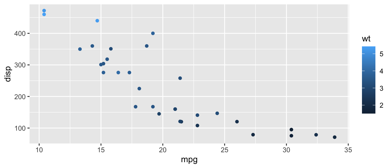
Colour with continuous variable
# g = ggplot(mtcars, aes(mpg, disp)) g +geom_point(aes(color=wt)) # continuous variable for colour
When our variable is continous, ggplot2 uses a gradient color scale instead.
Alpha transparency
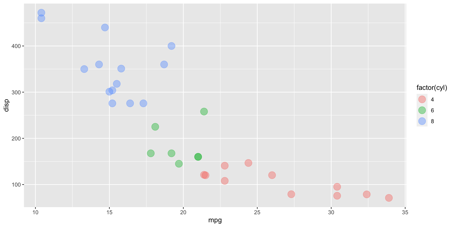
p = g +geom_point(aes(color=factor(cyl)), alpha=0.4, size=5); p
We change the transparency of points using alpha (0 = see through 1 = opaque). Notice how “coincidence points” (ie overlapping) points are more obvious with a more transparent point. size is used to make the points (5x) bigger.
Modify labels
p +labs(title="Old cars", x="Miles per Gallon", y ="Displacement",color ="Number of Cylinders") # changes legend title
Notice how labels were added on a separate line of code.
Final remarks
ggplot2 is a very powerful and flexible tool for creating good looking graphics.
While the learning curve may be a little steeper than with base R, ggplot2 over base R for plotting offers several advantages that make it a popular choice for data visualization.
This is only a short demonstration of the power of this package.
Explore the difference features using the references provided


Comments
Notice that when we just specify one variable,
qplot()plots a histogram rather than a scatter plotWhen
cylappears on the left-hand side of the tilde the subplots are plotted row-wise (i.e. along the \(y\)-axis)When
cylappears on the right-hand side of the tilde the subplots are plotted column-wise (i.e. along the \(x\)-axis)We can faceting with two discrete variables using the
y~xformula