Click for answer
#B. In multiple regression using KNN for two predictors, our predictions form a flexible plan and wiggly plan as apposed to mutiple linear regression that our prediction fall on a flat plane.Summary: This lab focuses on Linear Regression. The content for this lab has been copied from the textbook’s worksheet on Chapter 8.
There is no assignment for this lab.
Here are some warm-up questions on the topic of multiple regression to get you thinking before we jump into data analysis.
In multivariate k-nn regression with one outcome/target variable and two predictor variables, the predictions take the form of what shape?
A. a flat plane
B. a wiggly/flexible plane
C. A straight line
D. a wiggly/flexible line
E. a 4D hyperplane
F. a 4D wiggly/flexible hyperplane
#B. In multiple regression using KNN for two predictors, our predictions form a flexible plan and wiggly plan as apposed to mutiple linear regression that our prediction fall on a flat plane.In simple linear regression with one outcome/target variable and one predictor variable, the predictions take the form of what shape?
A. a flat plane
B. a wiggly/flexible plane
C. A straight line
D. a wiggly/flexible line
E. a 4D hyperplane
F. a 4D wiggly/flexible hyperplane
#C In simple linear regression , our predictions form a straight line since we only have 1 predictor.In multiple linear regression with one outcome/target variable and two predictor variables, the predictions take the form of what shape?
A. a flat plane
B. a wiggly/flexible plane
C. A straight line
D. a wiggly/flexible line
E. a 4D hyperplane
F. a 4D wiggly/flexible hyperplane
# A### Run this cell before continuing.
# run install.package("cowplot") in your console if you don't have it already
library(cowplot)
library(tidyverse)
library(repr)
library(tidymodels)
options(repr.matrix.max.rows = 6)Consider this small and simple dataset:
simple_data  <- tibble(X = c(1, 2, 3, 6, 7, 7),
               Y = c(1, 1, 3, 5, 7, 6))
options(repr.plot.width = 5, repr.plot.height = 5)
base <- ggplot(simple_data, aes(x = X, y = Y)) +
    geom_point(size = 2) +
    scale_x_continuous(limits = c(0, 7.5), breaks = seq(0, 8), minor_breaks = seq(0, 8, 0.25)) +
    scale_y_continuous(limits = c(0, 7.5), breaks = seq(0, 8), minor_breaks = seq(0, 8, 0.25)) +
    theme(text = element_text(size = 20))
base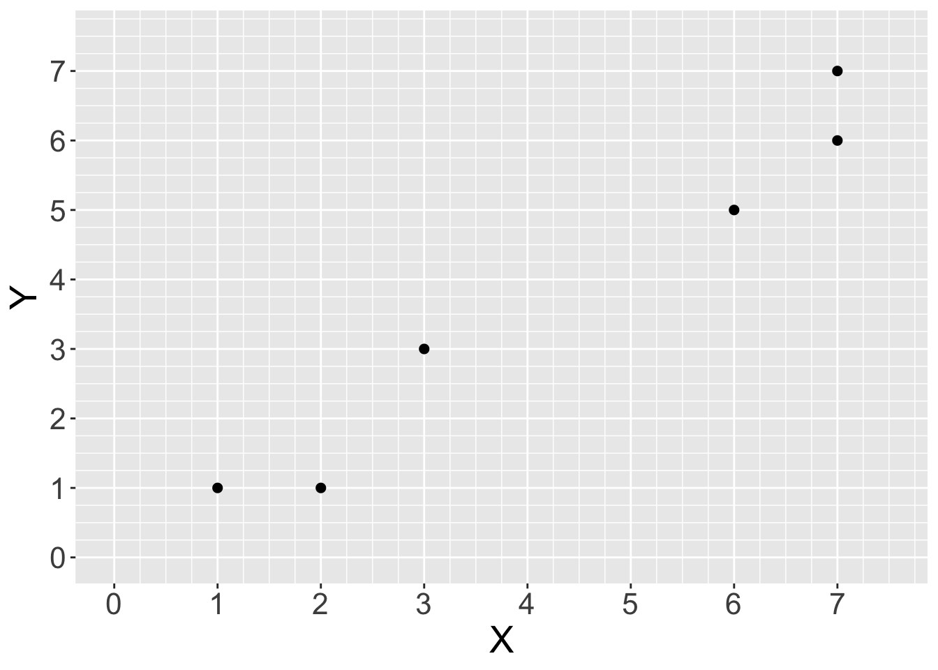
Now consider these three potential lines we could fit for the same dataset:
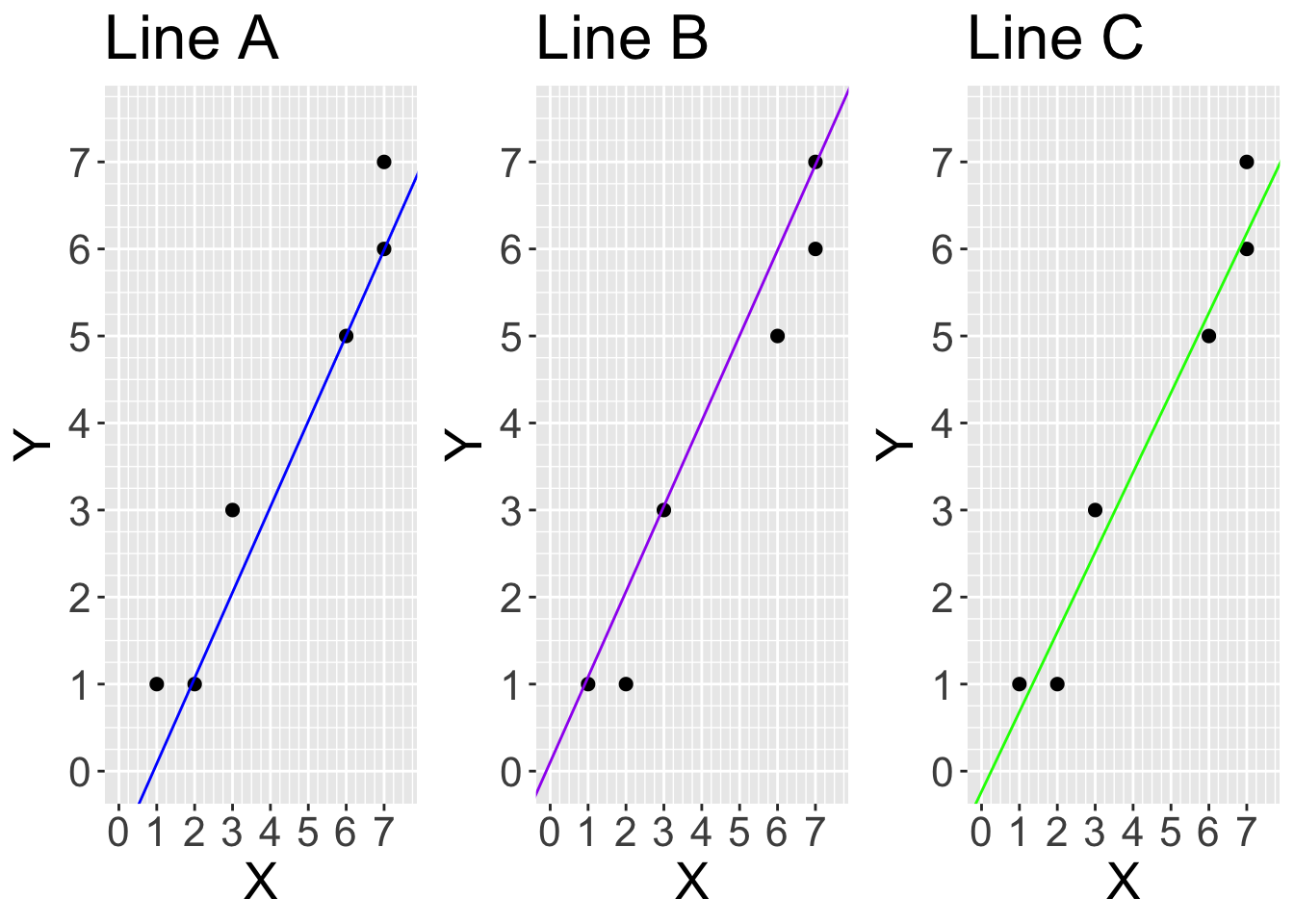
Use the graph below titled “Line A” to roughly calculate the average squared vertical distance between the points and the blue line.
#run this code
options(repr.plot.width = 9, repr.plot.height = 9)
line_a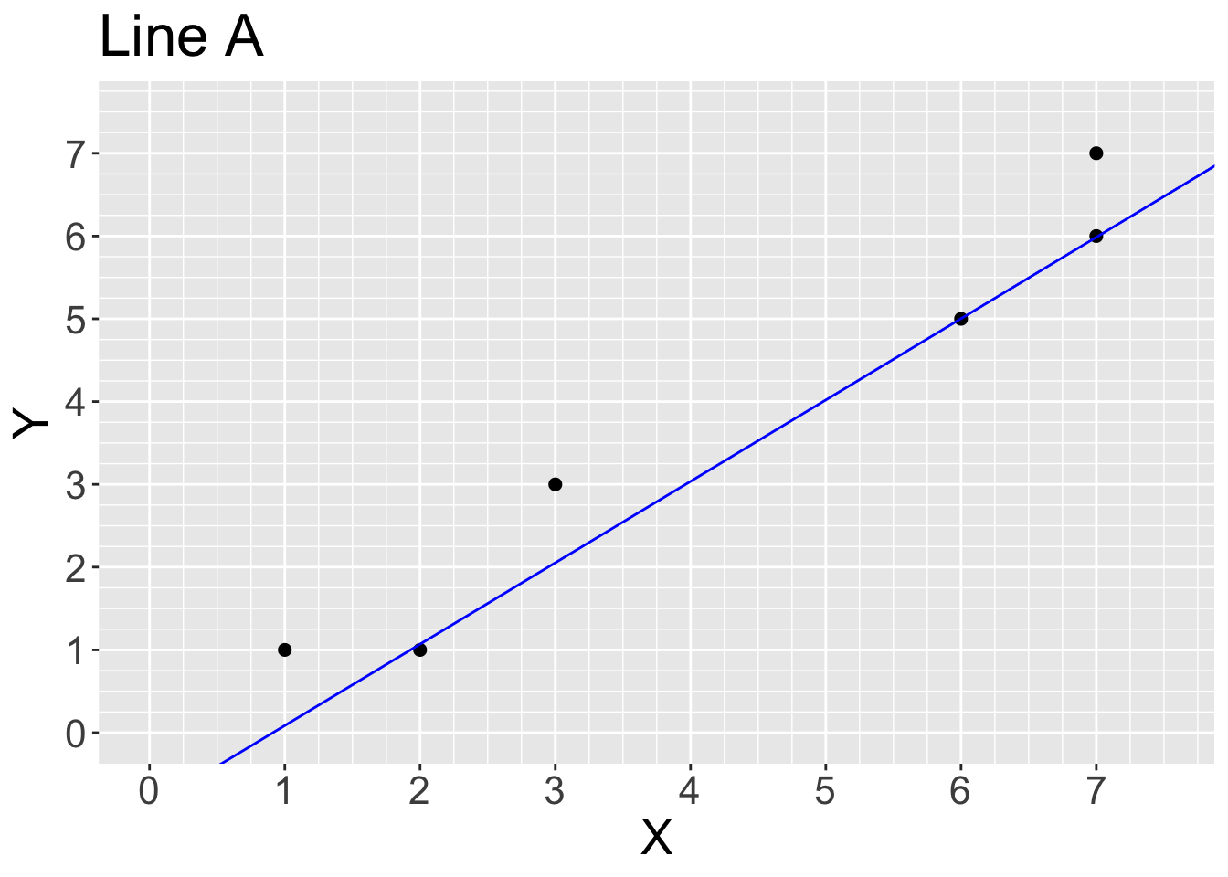
# we should calculate the distance between each y and predicted y (yhat) for all the datapoints. predicted values fall on the straight line, so for example, data point at x =1, yhat is 0. The squareed vertical distance (residual) is (1-0)^2 = 1. if we repeat this for all data points and get the average:

y <- c(1, 1, 3, 5, 7, 6)
yhat_A <- c(0,1,3,2,6,6) #looking at graph
mean((y-yhat_A)^2)
[1] 1.833333Use the graph titled “Line B” to roughly calculate the average squared vertical distance between the points and the purple line.
options(repr.plot.width = 9, repr.plot.height = 9)
line_b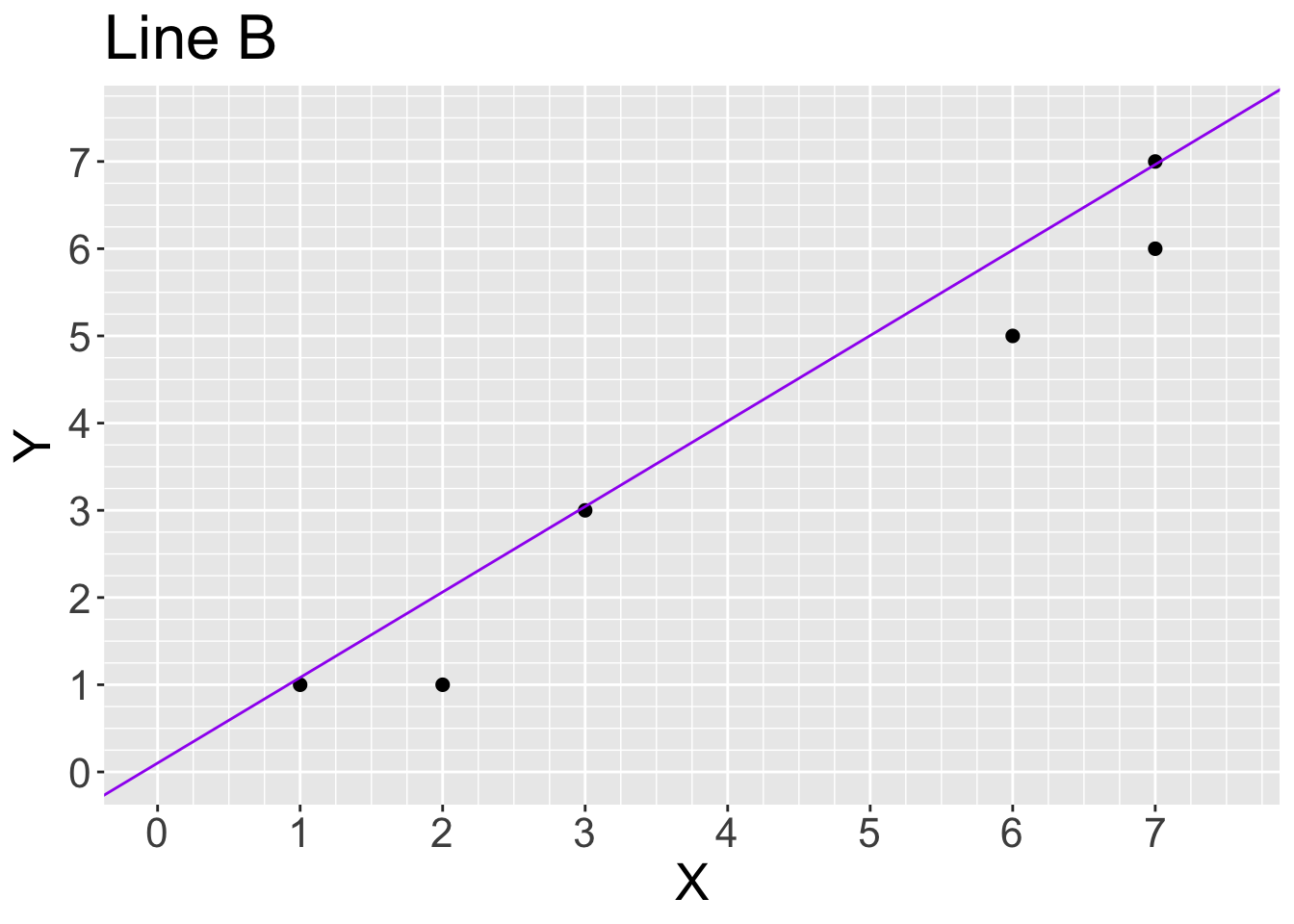
#Similar to the previous part

yhat_B <- c(1,2,3,6,7,7) #looking at graph
mean((y-yhat_B)^2)
[1] 0.5Use the graph titled “Line C” to roughly calculate the average squared vertical distance between the points and the green line.
options(repr.plot.width = 9, repr.plot.height = 9)
line_c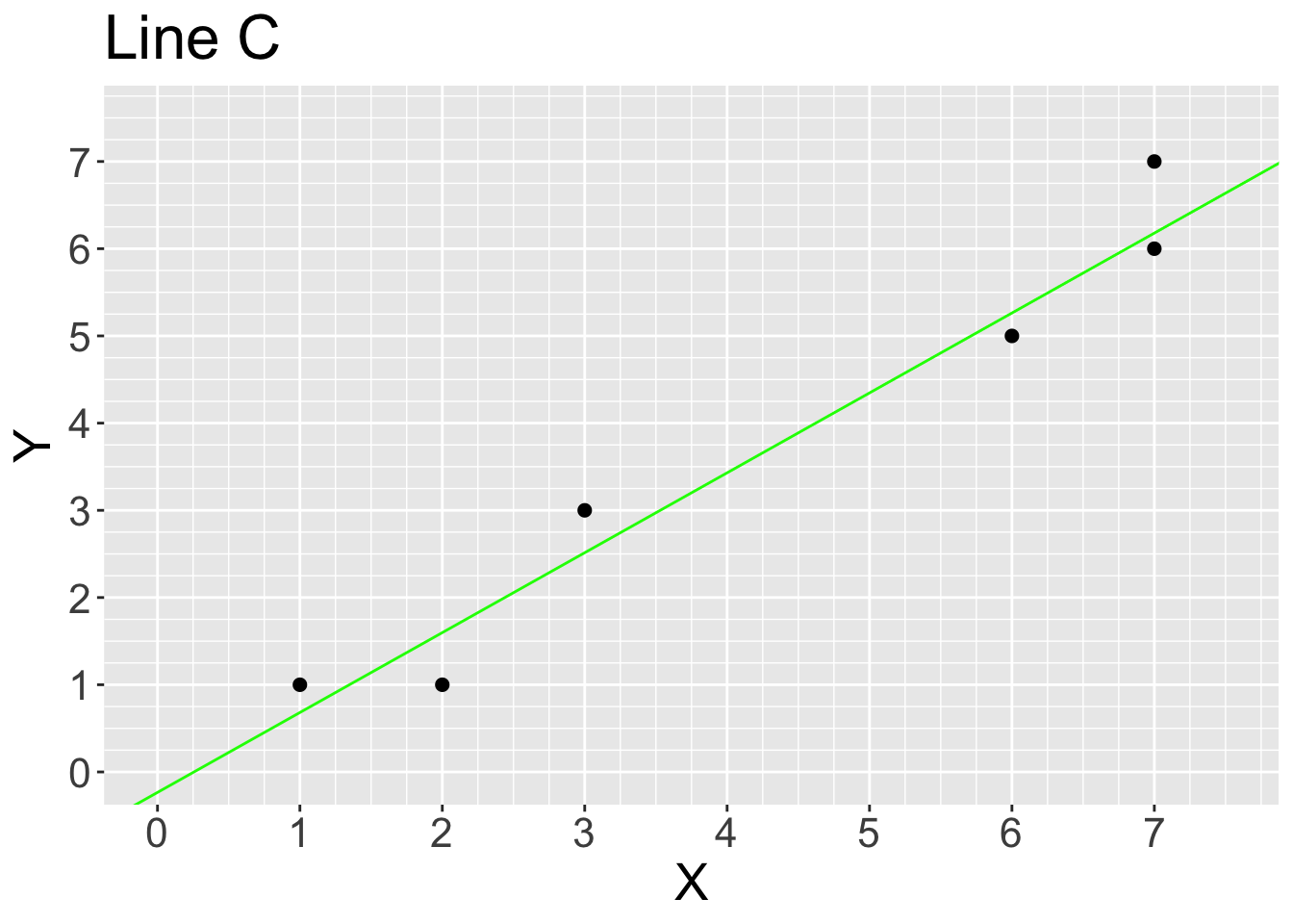
# Read values of the graph to a precision of 0.25, we get the following values
yhat_C <- c(0.75,1.5,2.5,5.25,6.25,6.25)
mean((y-yhat_C)^2)
[1] 0.2083333Based on your calculations above, which line would linear regression by ordinary least squares choose given our small and simple dataset? Line A, B or C?
# Ordinary least squuares find the line the has the minimum mean of squared residuals to be the best fitted line, based on our calculation in three prevoius questions, Line C has the min average vertical distance.
Source: https://media.giphy.com/media/BDagLpxFIm3SM/giphy.gif
Remember our question from last week: what features predict whether athletes will perform better than others? Specifically, we are interested in marathon runners, and looking at how the maximum distance ran per week during training predicts the time it takes a runner to end the race?
This time around, however, we will analyze the data using simple linear regression rather than \(k\)-nn regression. In the end, we will compare our results to what we found last week with \(k\)-nn regression.
First, load the data and assign it to an object called marathon.
marathon <- read_csv("../data/marathon.csv")Rows: 929 Columns: 13
── Column specification ────────────────────────────────────────────────────────
Delimiter: ","
dbl (13): age, bmi, female, footwear, group, injury, mf_d, mf_di, mf_ti, max...
ℹ Use `spec()` to retrieve the full column specification for this data.
ℹ Specify the column types or set `show_col_types = FALSE` to quiet this message.#or
#marathon <- read_csv("data/marathon.csv")Similar to what we have done for the last few weeks, we will first split the dataset into the training and testing datasets, using 75% of the original data as the training data. Remember, we will be putting the test dataset away in a ‘lock box’ that we will comeback to later after we choose our final model. In the strata argument of the initial_split function, place the variable we are trying to predict. Assign your split dataset to an object named marathon_split.
Assign your training dataset to an object named marathon_training and your testing dataset to an object named marathon_testing.
set.seed(2000) ### DO NOT CHANGE

#... <- initial_split(..., prop = ..., strata = ...)
#... <- training(...)
#... <- testing(...)set.seed(2000)
marathon_split <- initial_split(marathon, prop = 0.75, strata = time_hrs)
marathon_training<- training(marathon_split)
marathon_testing<- testing(marathon_split)Using only the observations in the training dataset, create a scatterplot to assess the relationship between race time (time_hrs) and maximum distance ran per week during training (max). Put time_hrs on the y-axis and max on the x-axis. Assign this plot to an object called marathon_eda. Remember to do whatever is necessary to make this an effective visualization.
# .... <- .... |>
#    ggplot(.....) +
#        geom_...() +
#        ...("Maximum Distance Ran per \n Week During Training (mi)") +
# ...("Race Time (hours)")marathon_eda <- marathon_training |>
ggplot(aes(x = max, y = time_hrs)) +
geom_point(color = 'dodgerblue', alpha = 0.4) +
xlab("Maximum Distance Ran per \n Week During Training (mi)") +
ylab("Race Time (hours)")
marathon_eda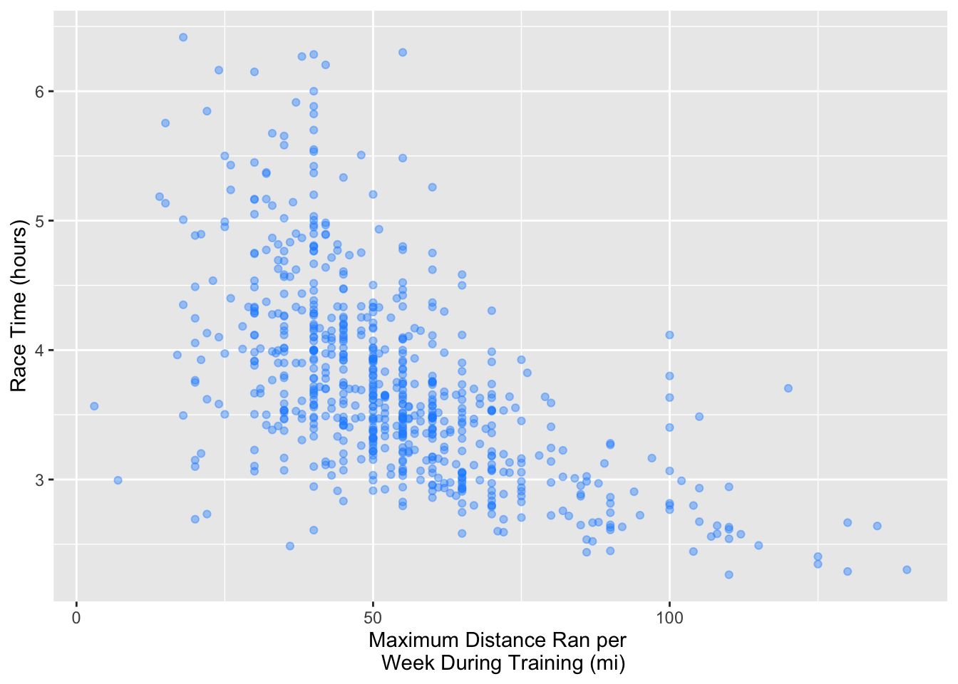
Now that we have our training data, the next step is to build a linear regression model specification. Thankfully, building other model specifications is quite straightforward since we will still go through the same procedure (indicate the function, the engine and the mode).
Instead of using the nearest_neighbor function, we will be using the linear_reg function to let tidymodels know we want to perform a linear regression. In the set_engine function, we have typically set "kknn" there for \(k\)-nn. Since we are doing a linear regression here, set "lm" as the engine. Finally, instead of setting "classification" as the mode, set "regression" as the mode.
Assign your answer to an object named lm_spec.
#.... <- linear_reg() |>
#.....(...) |>
#set_mode(...)lm_spec <- linear_reg() |>
set_engine("lm") |>
set_mode("regression")After we have created our linear regression model specification, the next step is to create a recipe, establish a workflow analysis and fit our simple linear regression model.
First, create a recipe with the variables of interest (race time and max weekly training distance) using the training dataset and assign your answer to an object named lm_recipe.
Then, create a workflow analysis with our model specification and recipe. Remember to fit in the training dataset as well. Assign your answer to an object named lm_fit.
#... <- recipe(... ~ ..., data = ...)

#... <- workflow() |>
#       add_recipe(...) |>
#       add_model(...) |>
# fit(...)lm_recipe <- recipe(time_hrs ~ max, data = marathon_training)
lm_fit <- workflow() |>
add_recipe(lm_recipe) |>
add_model(lm_spec) |>
fit(data = marathon_training)
lm_fit══ Workflow [trained] ══════════════════════════════════════════════════════════
Preprocessor: Recipe
Model: linear_reg()
── Preprocessor ────────────────────────────────────────────────────────────────
0 Recipe Steps
── Model ───────────────────────────────────────────────────────────────────────
Call:
stats::lm(formula = ..y ~ ., data = data)
Coefficients:
(Intercept) max
4.8794 -0.0215 Now, let’s visualize the model predictions as a straight line overlaid on the training data. Use the predict and bind_cols functions on lm_fit to create predictions for the marathon_training data. Name the resulting data frame marathon_preds.
Next, create a scatterplot with the marathon time (y-axis) against the maximum distance run per week (x-axis) from marathon_preds. Use an alpha value of 0.4 to avoid overplotting. Plot the predictions as a black line over the data points. Assign your plot to a variable called lm_predictions. Remember the fundamentals of effective visualizations such as having a human-readable axes titles.
options(repr.plot.width = 8, repr.plot.height = 7)

# marathon_preds <- ... |>
#   predict(...) |>
#   bind_cols(...)
#
# lm_predictions <- marathon_preds |>
#     ...(aes(x = ..., y = ...)) +
#         geom_point(... = 0.4) +
#         geom_line(
#             mapping = aes(x = ..., y = ...),
#             color = "blue") +
#         xlab("...") +
#         ylab("...") +
# theme(text = ...(size = 20))marathon_preds <- lm_fit |>
predict(marathon_training)|>
bind_cols(marathon_training)
lm_predictions <- marathon_preds |>
ggplot(aes(x = max, y = time_hrs)) +
geom_point(alpha = 0.4) +
geom_line(
mapping = aes(x = max, y = .pred),
color = "black") +
xlab("Maximum Distance Ran per \n Week During Training (mi)") +
ylab("Race Time (hours)") +
theme(text = element_text(size = 20))
lm_predictions
Great! We can now see the line of best fit on the graph. Now let’s calculate the \(RMSPE\) using the test data. To get to this point, first, use the lm_fit to make predictions on the test data. Remember to bind the appropriate columns for the test data. Afterwards, collect the metrics and store it in an object called lm_test_results.
From lm_test_results, extract the \(RMPSE\) and return a single numerical value. Assign your answer to an object named lm_rmspe.
#... <- lm_fit |>
#         predict(...) |>
#         bind_cols(...) |>
#         metrics(truth = ..., estimate = ..)

#... <- lm_test_results |>
#          filter(...) |>
#          select(...) |>
# ...lm_test_results <- lm_fit |>
predict(marathon_testing) |>
bind_cols(marathon_testing) |>
metrics(truth = time_hrs, estimate = .pred)
lm_rmspe <- lm_test_results |>
filter(.metric == "rmse") |>
select(.estimate) |>
pull()
lm_rmspe[1] 0.5504829Now, let’s visualize the model predictions as a straight line overlaid on the test data. First, create a scatterplot to assess the relationship between race time (time_hrs) and maximum distance ran per week during training (max) on the testing data. Use and alpha value of 0.4 to avoid overplotting. Then add a line to the plot corresponding to the predictions from the fit linear regression model. Remember to do whatever is necessary to make this an effective visualization.
Assign the plot to an object called lm_predictions_test.
options(repr.plot.width = 8, repr.plot.height = 7)

# test_preds <- ...

# lm_predictions_test <- ...options(repr.plot.width = 8, repr.plot.height = 7)
test_preds <- lm_fit |>
predict(marathon_testing) |>
bind_cols(marathon_testing)
lm_predictions_test <- test_preds |>
ggplot(aes(x = max, y = time_hrs)) +
geom_point(alpha = 0.4) +
geom_line(
mapping = aes(x = max, y = .pred),
color = "black") +
xlab("Maximum Distance Ran per \n Week During Training (mi)") +
ylab("Race Time (hours)") +
theme(text = element_text(size = 20))
lm_predictions_test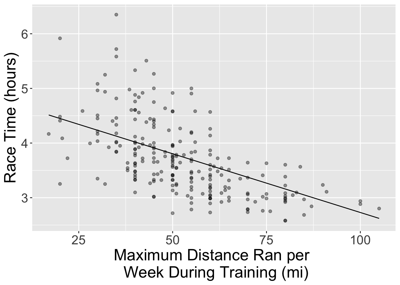
Compare the test RMPSE of k-nn regression (0.544 from last worksheet) to that of simple linear regression, which is greater?
A. \(k\)-nn regression has a greater RMSPE
B. Simple linear regression has a greater RMSPE
C. Neither, they are identical
lm_test_rmpse <- test_preds |>
  metrics(truth = time_hrs, estimate = .pred) |>
  filter(.metric == "rmse") |>
          select(.estimate) |>
          pull()
lm_test_rmpse
[1] 0.5504829# B, SLM has slightly worse (larger) value for RMSPEWhich model does a better job of predicting on the test dataset?
A. \(k\)-nn regression
B. Simple linear regression
C. Neither, they are identical
# B, I would choose simple linear regression, even though it has sightly larger RMSE because it's more intrepretable compared to KNN. Note that in this case, the neglactable differences between RMSPE shifted our decision toward Simple Linear Regression, for the cases with a significant difference, we should choose the one with smallest RMSPE.Given that the linear regression model is a straight line, we can write our model as a mathematical equation. We can get the two numbers we need for this from the coefficients, (Intercept) and time_hrs.
# run this cell
lm_fit
══ Workflow [trained] ══════════════════════════════════════════════════════════
Preprocessor: Recipe
Model: linear_reg()
── Preprocessor ────────────────────────────────────────────────────────────────
0 Recipe Steps
── Model ───────────────────────────────────────────────────────────────────────
Call:
stats::lm(formula = ..y ~ ., data = data)
Coefficients:
(Intercept) max
4.8794 -0.0215 Which of the following mathematical equations represents the model based on the numbers output in the cell above?
A. \(Predicted \ race \ time \ (in \ hours) = 4.88 - 0.02 * max \ (in \ miles)\)
B. \(Predicted \ race \ time \ (in \ hours) = -0.02 + 4.88 * max \ (in \ miles)\)
C. \(Predicted \ max \ (in \ miles) = 4.88 - 0.02 * \ race \ time \ (in \ hours)\)
D. \(Predicted \ max \ (in \ miles) = -0.02 + 4.88 * \ race \ time \ (in \ hours)\)
#A